
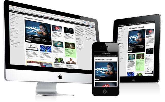

Mobile devices are a must-have today. All of us are using them. Depending on the situation, we are browsing websites on big monitors in our offices, on smaller monitors on our home laptops or tablets, and even on our smartphones when we are away from home. Non-responsive websites usually look good and give the best user experience on bigger screens. On the other hand, there are websites optimized for mobile devices, and they usually look bad on monitors. One approach is to create and maintain two websites, one for desktops and one for mobile devices. However, web masters of such websites need to spend more time maintaining two separate websites.
The best solution is at the same time the most complex for development. It gives a flawless user experience on all screen sizes while the webmaster maintains only one site. The responsive Joomla template is able to "respond" correctly depending of the visitor's screen resolution. The same content will be shown on all devices, but the layout will be changed according to the screen resolution for the best user experience.
There are many solutions today that make responsive designs possible. Some of the most popular are incorporated in the Hot Responsive Joomla Template. The first is jQuery Masonry, which makes boxes from Joomla and K2 articles and "builds" output on screen depending on available screen space. The second is jQuery Infinite Scroller, which prevents loading of all articles at once. It loads articles set by set and therefore prevents and prevents showing too many articles on screen. Last but not least is jQuery Mobile, a framework which optimizes especially interactive elements on websites and makes them easily accessible for users with touch screens.
This template is pretty different from everything we made so far. Therefore, you would need to invest some time to learn how it works and what options are available to you. For this purpose, we created several pages that explain specific functions of this template. Please read the documentation pages on the template demo to get a better idea of how Hot Responsive works.
Template Screen Shots
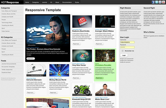
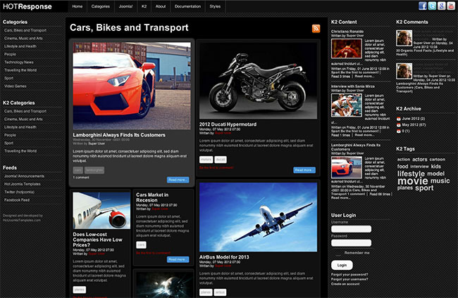
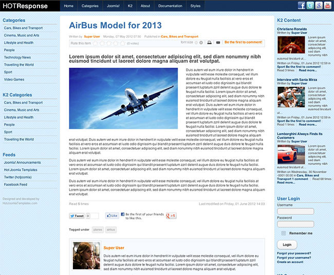
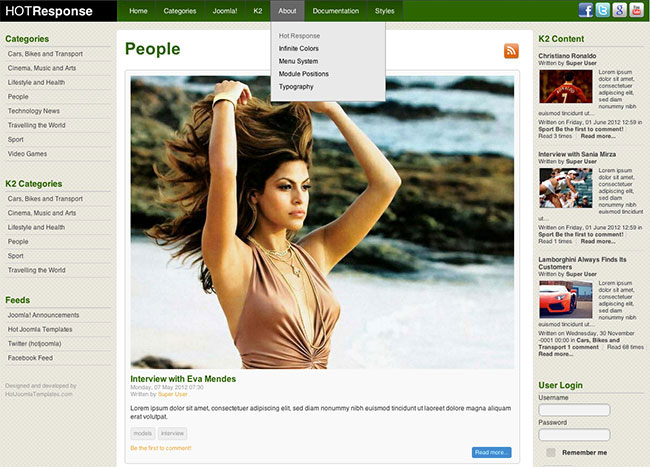
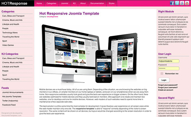
Template Key Features
- Responsive layout: Appropriate for all devices and screen resolutions.
- 5 pre-defined styles with different main colors. Each color is easily customizable in parameters. Infinite color combinations.
- HotStart (SQL dump) available. It copies the template with all extensions and demo data.
- Module positions on top, left, and right positions that change their places according to the screen size.
- Valid HTML, CSS and JavaScript code.
- Support for core Joomla articles, K2 component and core Joomla RSS Feed
- Drop-down top menu 100% compatible with mobile devices. It changes its layout on mobile devices for better user experience on smaller screens.
- Google Mobile-Friendly Test PASSED.
- Compatible with IE7+, Firefox, Chrome, Safari, Opera.
- Support for left-to-right and right-to-left languages.