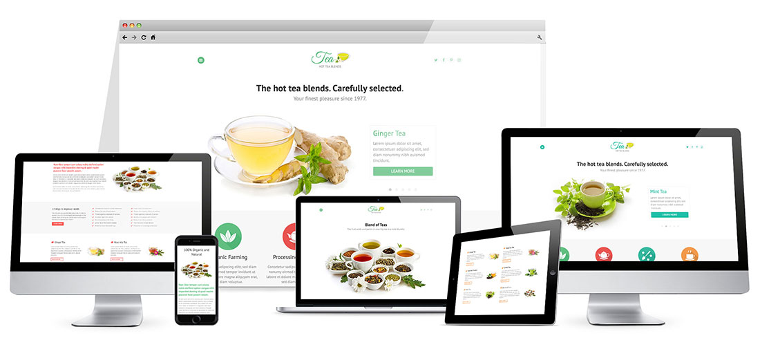
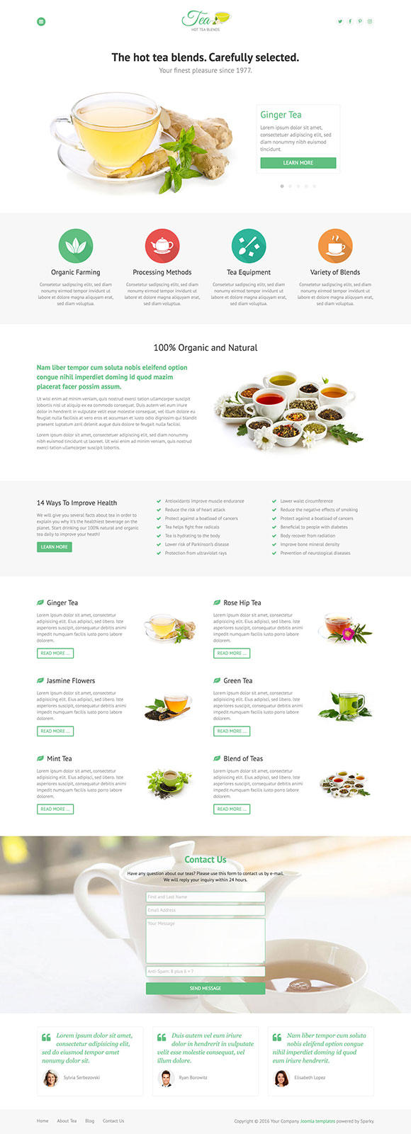
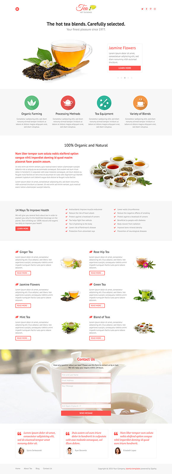
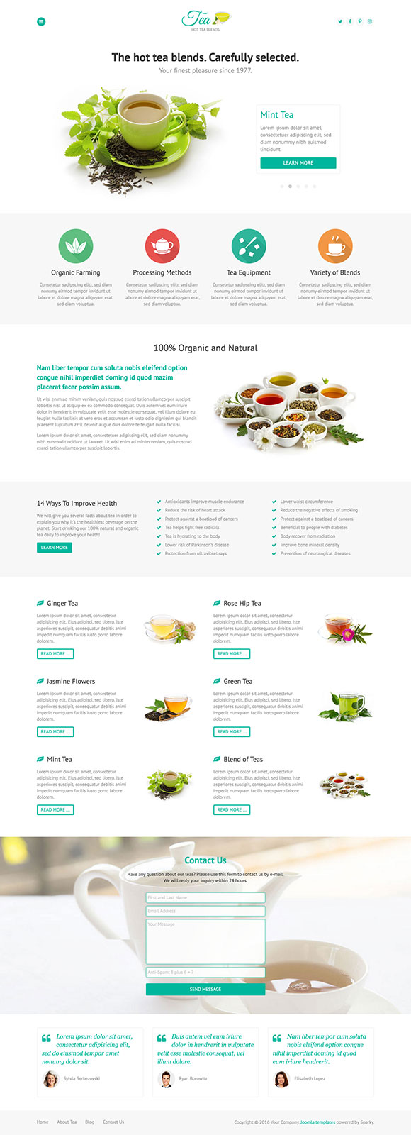
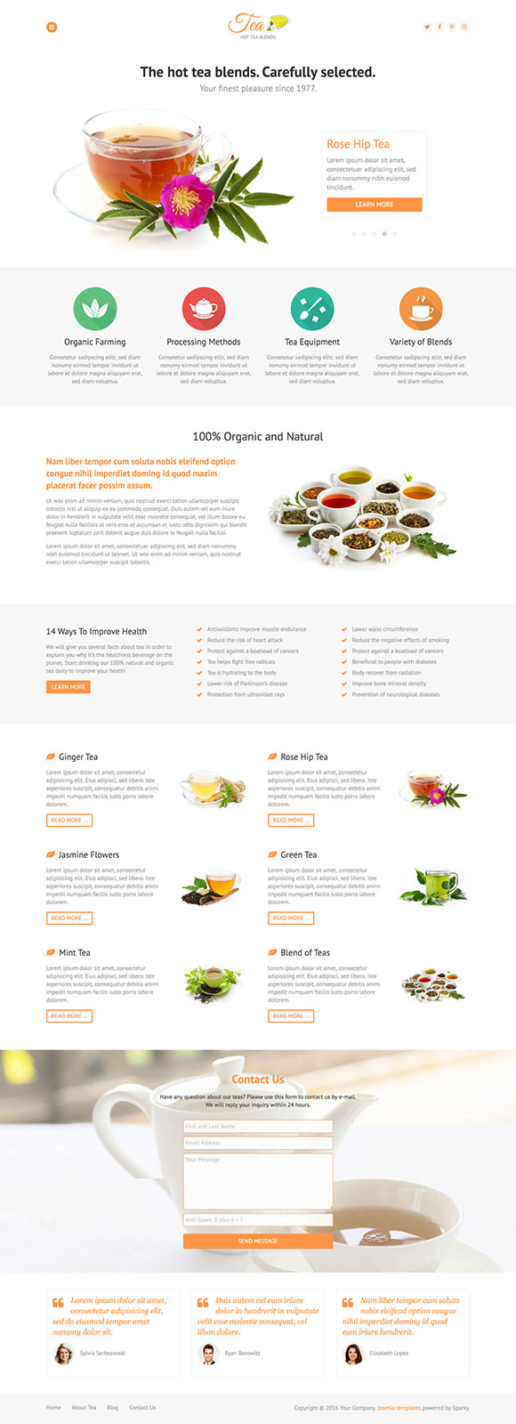
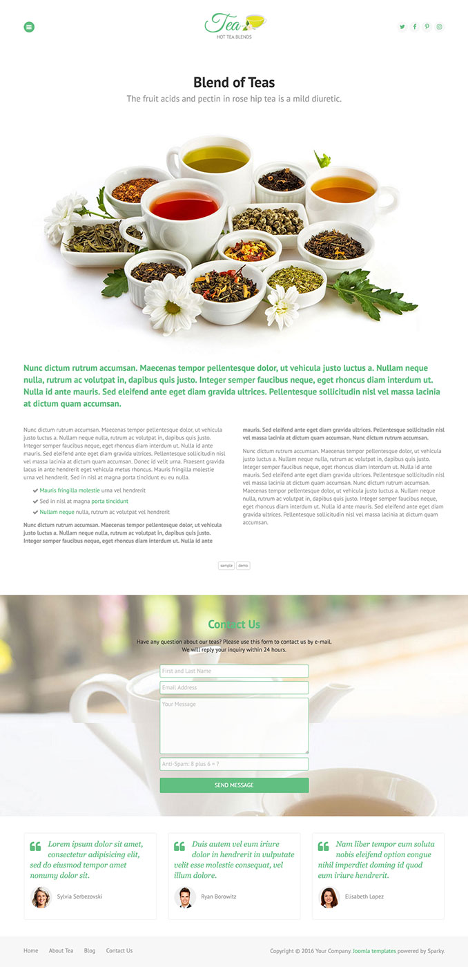
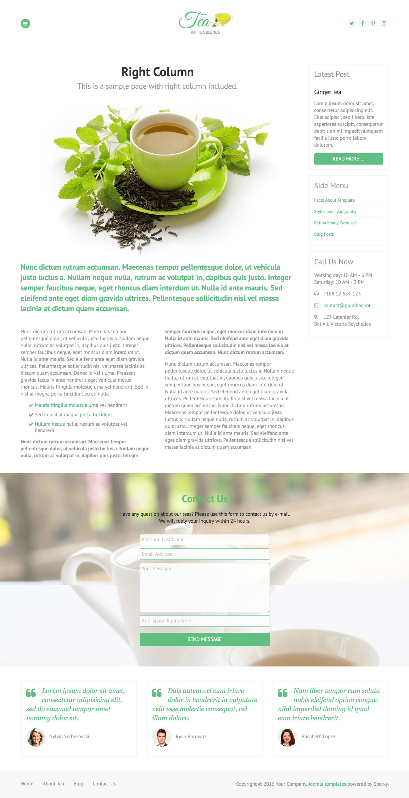
Hot Tea is an elegant and responsive Joomla template focused on tea as one of the most popular beverages on the planet. It's not crowded with graphics, and its light design with one accent color may be appropriate for many different kinds of websites, not only those related to the production of tea. By default, this template has one column. However, as we presented in our demo, it's possible to publish modules on the left and right columns if needed. This template comes with many new features that we added to our framework.
The first new feature in the Tea template is a new menu type - off-canvas menu. This is the first of our templates that doesn't have a classic drop-down menu by default. We are doing our best to follow the best practices in web design and to offer new features. Off-canvas menu doesn't complicate design unnecessarily. User experience with this menu system is the same on desktop and mobile devices.
Page transitions is another new feature in the Tea template. Animated CSS3 icon on the background will cover the entire screen during the loading of pages. Hot Tea template and its modules support retina screens fully. So, as you can see on our demo, the Tea template will display proper images according to the user's screen density using the new HTML5 feature - scrset.
To keep the design clean, the Tea template has only one column by default. However, if you need left or right columns, they are on some or all pages, they are available. In templates with one column, the textual paragraphs may become too wide. That's why we included CSS3 columns in this template and also in our framework. You can see that some pages have text in two columns. It's also possible to have text in up to six columns. The contact form is included as a module on the background with parallax scroll.
Tea Template Screen Shots
The Features Of Tea Template
Here comes the list of the Tea template's most significant features as well as some technical details:
- New menu type - Off-canvas and total control of all menus through the framework. You can set functionalities and styles of all your menus and drop them directly into the layout. Off-canvas top menu with drop-down sub-levels is included as a default menu.
- Responsive template, based on clean HTML5/CSS3 code, and powered by Sparky Framework for Joomla.
- CSS3 and jQuery-based animations welcome visitors to your site.
- 4 pre-defined color styles. All colors are easily customisable from the Sparky options (infinite color options).
- Customisation of the template's layout and adding/removing module positions is easy. It's powered by Sparky's drag-and-drop Layout Editor. Change the layout and elements' dimensions easily whenever you need.
- We included several responsive Joomla modules with this template. Hot Swipe Carousel (retina ready), Hot Slicebox, Hot Responsive Lightbox, Hot Maps and Rapid Contact module. All these modules are included with this template without additional fees (you save $19 per commercial module).
- Retina-ready images in articles, custom modules, and carousel. Full support for modern screens with double pixel density.
- HotStart (SQL dump) available with a single purchase or any membership plan. It copies the template with all extensions and demo pages easily.
- An unlimited number of module positions can be added easily within the Layout Editor of Sparky Framework, if needed.
- PSD source file and fonts are included.
- This template has been tested with Chrome, Edge, Firefox, IE9+, Opera, and Safari browsers on PC and Mac computers. It's also tested on iOS and Android mobile devices.
- Support for RTL (right-to-left) languages.