
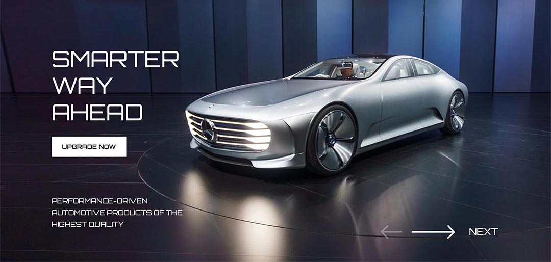
The number of users of smartphones, tablets, and other mobile devices with touch screens is growing daily. As a result, we may expect more and more people who are accessing our websites equipped with touch screens, rather than a mouse and a keyboard. Hot Swipe Carousel rotates slides that may contain any HTML content (images, text, etc.) and allows users to change slides by dragging them on the screen to the left or to the right.

Multiple Module Instances
It's possible to use multiple instances of this module on the same page.
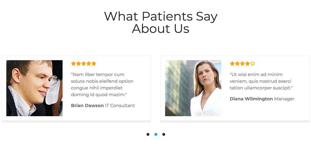
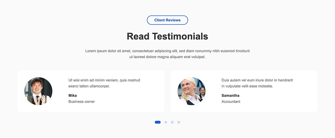
So, it can be used for the main carousel on the top and for the testimonials carousel on the bottom area, as you can see on many of our template demos.
Responsive Carousel
You can enable and disable navigational elements, such as left/right arrows and dots. As you probably assumed, this module is 100% responsive.
It will change its width according to the available screen space. Furthermore, it will change its layout on the smallest screens where the text block can't fit inside the image. The text block will be moved below the image on smaller screens (you can change the breakpoints in settings).

Unlimited Number of Slides
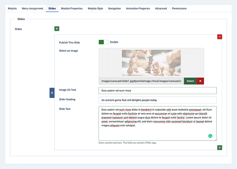
You can create an unlimited number of slides. Each slide can contain an optional heading and any HTML content and has its own set of options. There you can select the slide image, enter some heading and text (this is not mandatory). Also, don't forget to enable the slide; otherwise, it will not be used in the module output.
Multiple Slides On Screen
Beside full width slides, you can also have slides that occupy just a portion of the screen width. It's possible to combine 2, 3, or more slides per screen. This is suitable for making carousels of user testimonials or carousels of partner logos.

Transition Effects
There are two transition effects available in the Swipe Carousel Module: Horizontal scroll and Fade animation. You can select one of these transition types according to the content of the slides and size.
Carousel Parameters
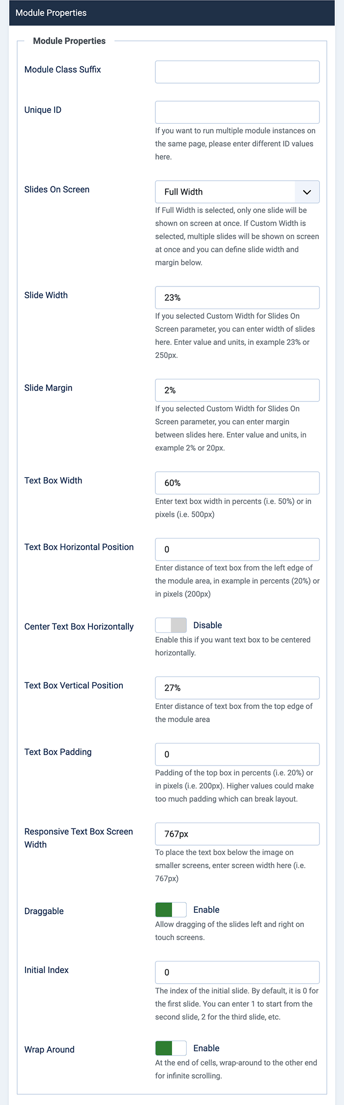
Module Properties
- Unique ID - If you need multiple instances of this module on the same page, each instance should have a different ID.
- Slides On Screen - Select whether to use full width for slides on screen or to use a custom width (defined below).
- Slide Width - If you selected Custom Width for Slides On Screen parameter, you can enter the width of slides here. Enter value and units, for example, 23% or 250px.
- Slide Margin - If you selected Custom Width for Slides On Screen parameter, you can enter the margin between slides here. Enter value and units, for example, 2% or 20px.
- Text Box Width - If your slides have text blocks, this will be the block's width in percents or pixels. By default, for screens smaller than 1024px, this parameter will be automatically set to 70%. Also, for screens smaller than 600px, this block will be moved below the image.
- Text Box Horizontal Position - Distance of the text box from the left edge of the module area, in example in percents (20%) or in pixels (200px).
- Center Text Box Horizontally - Enable this if you want the text block to be automatically centered on all screen sizes.
- Text Box Vertical Position - Position from the top side of the module boundaries in pixels. By default, for screens smaller than 1024px, this parameter will be automatically set to 10px.
- Text Box Padding - Padding of the top box in percents (i.e., 20%) or in pixels (i.e,. 200px). Higher values could make too much padding, which can break the layout.
- Responsive Text Box Screen Width - To place the text box below the image on smaller screens, enter screen width here (i.e., 767px).
- Draggable - Allow dragging of the slides left and right on touch screens.
- Initial Index - The index of the initial slide. By default, it is 0 for the first slide. You can enter 1 to start from the second slide, 2 for the third slide, etc.
- Wrap Around - At the end of cells, wrap-around to the other end for infinite scrolling.
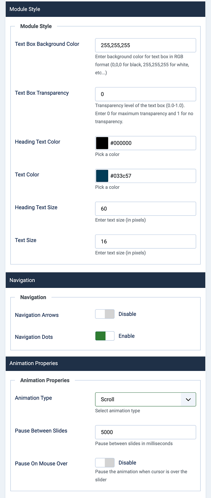
Module Style
- Text Box Background Color - Background color of the text block in RGB format.
- Text Box Transparency - Enter a value between 0 (full transparency) and 1 (no transparency) to set the transparency of the text block.
- Text Color - Select the text color inside the text block.
- Heading Text Size - Set size of the headings inside the text block.
- Text Size - Set size of the regular text inside the text block.
Navigation
- Navigation Arrows - Enable or disable left/right navigation buttons.
- Navigation Dots - Enable or disable clickable dots that show slides and the active slide.
Animation Properties
- Animation Type - You can select scroll or fade animation type.
- Pause Between Slides - Enter value in milliseconds. It will be used for the pause time between slide rotations. For example, enter 5000 for a pause of 5 seconds on each slide.
- Pause On Mouse Over - Pause the animation when the cursor is over the slider.
Settings For Each Slide
It's possible to add an unlimited number of slides. Each slide can contain different images and HTML that will be displayed in the content box.
- Publish This Slide - Slide will be published only if this parameter is enabled.
- Select an Image - This button opens a pop-up window where you can upload and/or select an image for this slide.
- Image Alt Text - Alt text for that describes your slide image.
- Slide Heading - Heading text of your slide. It will be displayed in the content box.
- Slide Text - Text or any HTML code for the slide. It will also be displayed in the content box.


Carousel Module Updates
Add and Re-order Slides Easily
Since version 4.2.0, this module uses a Joomla subform element and allows you to add an unlimited number of slides. Also, you can re-order them easily using the drag-and-drop technology.
Scroll and Fade Animation
Since version 4.1.0, we added the fade animation type to the Hot Swipe Carousel.
Support For Retina Screens
Since version 3.5.1, Hot Swipe Carousel supports retina screens (screens with double pixel density) in slide images and for images inside slide text. If you want to use this feature, you need to prepare two versions of your images (normal and double resolution). For example, if you have an image named as myimage.jpg, the module will check if image myimage-2x.jpg exists in the same folder. It will show this image instead of the normal resolution image, but only on retina (double pixel density) screens. It's pointless to show double-resolution images on screens with single pixel density.
If you add an image tag inside the text for the slide, the module will check if an image with double resolution exists in the folder where the regular image is placed.
Basically, you should select normal resolution images for slide images and use normal resolution images inside text, not double resolution images! Just make sure that you uploaded double-resolution images in the same folder, following the naming convention explained above. The module will take care to show proper images on different kinds of screens.