- Posts: 97
- Thank you received: 0
Mobile Phone View
-
ijohnparton
Active member - Topic Author
- Offline
- Member
-

Less
More
7 months 1 week ago #51958
by ijohnparton
Replied by ijohnparton on topic Mobile Phone View
Hi Milos
that has worked on the logo bar, but it has nor worked on the phone number. The phone number is on the same line has the menu. What i would like is to have the phone like it looks like on photo 2 can you helpme to make it look the same.
Thanks
that has worked on the logo bar, but it has nor worked on the phone number. The phone number is on the same line has the menu. What i would like is to have the phone like it looks like on photo 2 can you helpme to make it look the same.
Thanks
Please Log in to join the conversation.
7 months 1 week ago #51959
by milos
Replied by milos on topic Mobile Phone View
Hello,
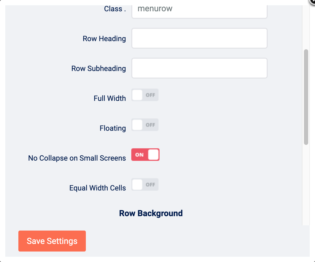
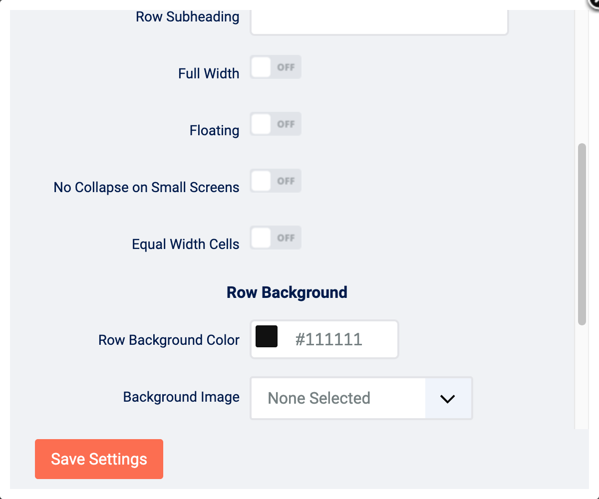
Go to System > Site Template Styles > Cats > Layout. Click "Row Settings" next to the row where the positions "top2" and "top3" are. Disable "No Collapse on Small Screens" parameter and save row settings and template settings.
Regards,
Milos
Go to System > Site Template Styles > Cats > Layout. Click "Row Settings" next to the row where the positions "top2" and "top3" are. Disable "No Collapse on Small Screens" parameter and save row settings and template settings.
Regards,
Milos
Please Log in to join the conversation.
-
ijohnparton
Active member - Topic Author
- Offline
- Member
-
Less
More
- Posts: 97
- Thank you received: 0
7 months 1 week ago #51960
by ijohnparton
Replied by ijohnparton on topic Mobile Phone View
Hi Milos
I have done it with it on and with it off and it dose not change.
2 photos below show what i have changed.
--=--
=
--=--
Thanks
I have done it with it on and with it off and it dose not change.
2 photos below show what i have changed.
--=--
=
--=--
Thanks
Please Log in to join the conversation.
7 months 1 week ago #51961
by milos
Replied by milos on topic Mobile Phone View
Hello,
Try adding this to custom.css file:
Add it to the bottom of the custom.css file, below the last }
Clear the browser cache on your mobile device to see the change.
Regards,
Milos
Try adding this to custom.css file:
Code:
@media (max-width: 767px) {
.menurow > .sparky_container > .sparky_cell {
float: none;
width: 100%;
}
}
Add it to the bottom of the custom.css file, below the last }
Clear the browser cache on your mobile device to see the change.
Regards,
Milos
Please Log in to join the conversation.
-
ijohnparton
Active member - Topic Author
- Offline
- Member
-
Less
More
- Posts: 97
- Thank you received: 0
7 months 1 week ago #51962
by ijohnparton
Replied by ijohnparton on topic Mobile Phone View
Hi Milos
It worked = Thanks very much for all your help")
It worked = Thanks very much for all your help
Please Log in to join the conversation.
-
ijohnparton
Active member - Topic Author
- Offline
- Member
-
Less
More
- Posts: 97
- Thank you received: 0
7 months 2 days ago #51971
by ijohnparton
Replied by ijohnparton on topic Mobile Phone View
Hi Milos
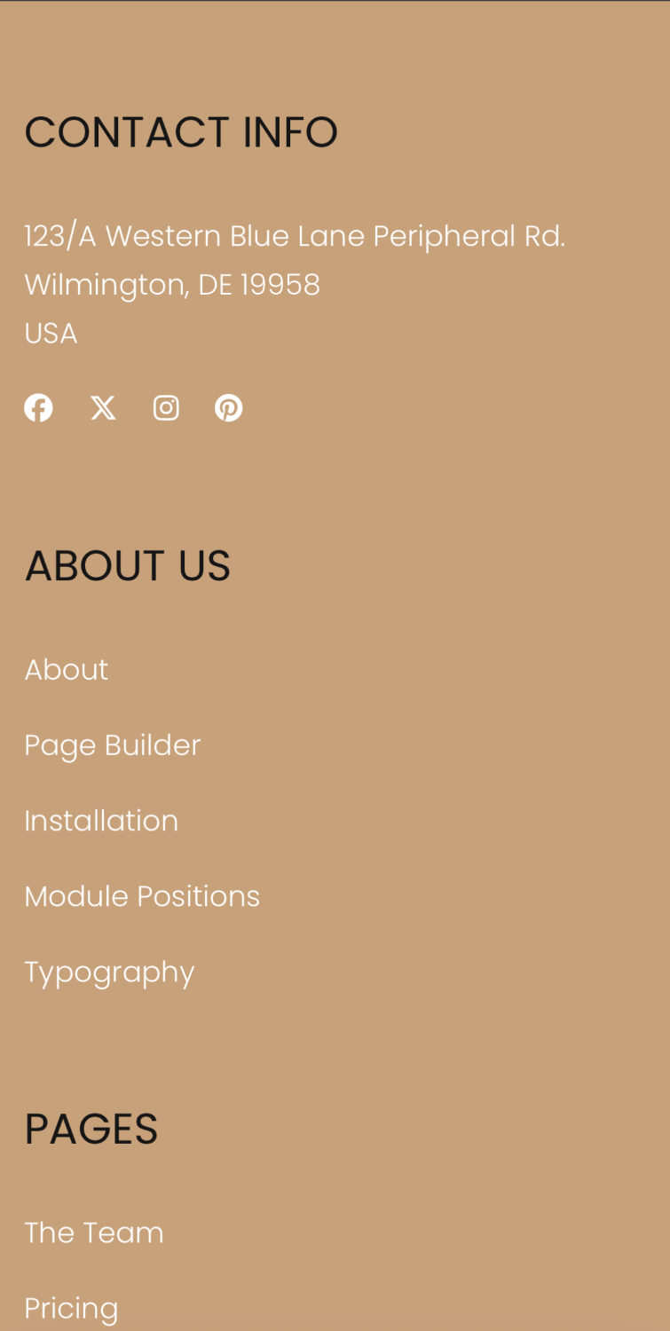
Can you help me with a problem with the footer view this is what i can see on my phone - photo below.
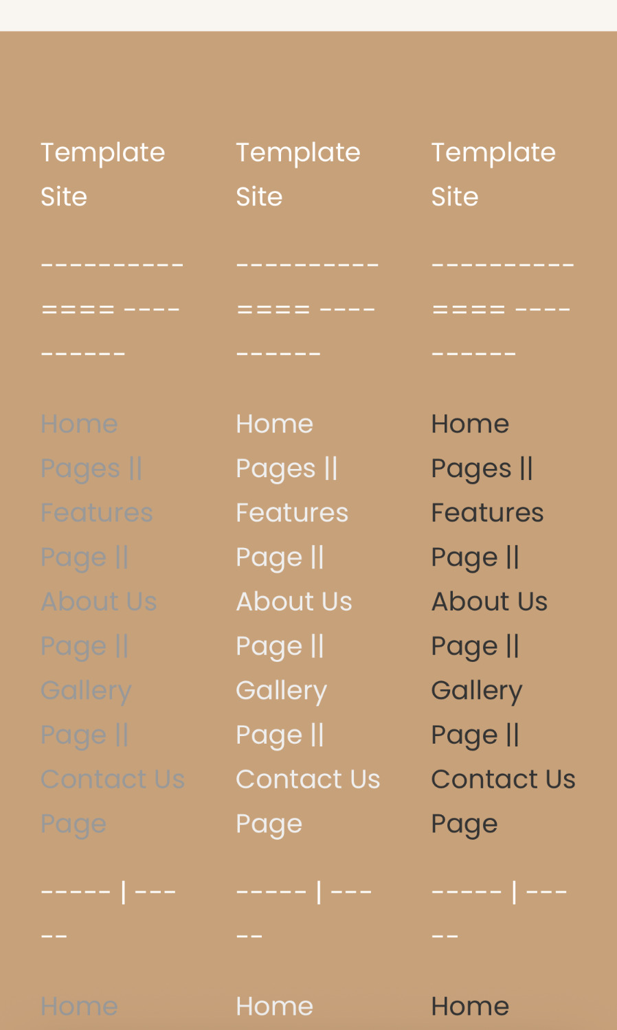
I need them to be like the one on your template site for cat - photo below.
Thanks
Can you help me with a problem with the footer view this is what i can see on my phone - photo below.
I need them to be like the one on your template site for cat - photo below.
Thanks
Please Log in to join the conversation.
Time to create page: 0.085 seconds