- Posts: 8
- Thank you received: 0
Responsive template image and article
-
bowman9991
Inactive member - Topic Author
- Offline
- New Member
-

Less
More
13 years 3 months ago #25512
by bowman9991
Responsive template image and article was created by bowman9991
Hi,
I'm setting up the Responsive template on my development server and was wondering if there was an easy way to make a change to the way images are resized? All the images on my site are 90px wide and approx 130px high.
What I would like to happen is for the images to remain their original size as a default, but the article box changes size/width instead. I am building a new version of ScienceFictionWorld.com, but visually it's not working for me when such small images become larger on different devices and with different resolutions.
If I wanted to add a larger image or a YouTube video for example, with a different size, I would use the HTML code provided (the 5 snippets) to signify the size of the article box in that case. This way article images remain their exact size unless one of the code snippets is used (eg..dynlayout_wide3).
So in summary, article boxes adjust in size at different resolutions and images remain their original size, unless a code snippet is used.
Is there a place in the code where I can change the way images are resized? I know I can add width: 90px !important; and height: 130px !important to the IMG tag in the template css,but this effects all images on the entire site and then I can't add YouTube videos or other image sizes when I need to.
Hope this makes sense. I'd be prepared to pay for extra development work if that is possible too.
Any help appreciated.
Many thanks,
John
Please Log in to join the conversation.
-
ivan.milic
Support Staff - Offline
- Moderator
-

Less
More
- Posts: 14116
- Thank you received: 1639
13 years 3 months ago #25516
by ivan.milic
Replied by ivan.milic on topic Responsive template image and article
You can force some box to be wider by setting class attribute on any of content elements to:
.. class="dynlayout_wide1" ..
.. class="dynlayout_wide2" ..
.. class="dynlayout_wide3" ..
.. class="dynlayout_wide4" ..
.. class="dynlayout_wide5" ..
.. class="dynlayout_wide1" ..
.. class="dynlayout_wide2" ..
.. class="dynlayout_wide3" ..
.. class="dynlayout_wide4" ..
.. class="dynlayout_wide5" ..
Please Log in to join the conversation.
-
bowman9991
Inactive member - Topic Author
- Offline
- New Member
-
Less
More
- Posts: 8
- Thank you received: 0
13 years 3 months ago #25529
by bowman9991
Replied by bowman9991 on topic Responsive template image and article
Thanks. I understand that, but I'd like to keep original size of the images by default.
Where do the classes below live in the code?
.. class="dynlayout_wide1" ..
.. class="dynlayout_wide2" ..
.. class="dynlayout_wide3" ..
.. class="dynlayout_wide4" ..
.. class="dynlayout_wide5" ..
Perhaps I can add an extra class to do what I want with image parameters?
Let me know.
Thanks,
John
Where do the classes below live in the code?
.. class="dynlayout_wide1" ..
.. class="dynlayout_wide2" ..
.. class="dynlayout_wide3" ..
.. class="dynlayout_wide4" ..
.. class="dynlayout_wide5" ..
Perhaps I can add an extra class to do what I want with image parameters?
Let me know.
Thanks,
John
Please Log in to join the conversation.
-
ivan.milic
Support Staff - Offline
- Moderator
-
Less
More
- Posts: 14116
- Thank you received: 1639
13 years 3 months ago #25534
by ivan.milic
Replied by ivan.milic on topic Responsive template image and article
You can apply style attribute to images with width and height defined and with !important flag:
... style="width:300px!important;height:200px!important;" ...
but i think that will make images get out of box sometimes so not recommended...
... style="width:300px!important;height:200px!important;" ...
but i think that will make images get out of box sometimes so not recommended...
Please Log in to join the conversation.
-
bowman9991
Inactive member - Topic Author
- Offline
- New Member
-
Less
More
- Posts: 8
- Thank you received: 0
13 years 3 months ago - 13 years 3 months ago #25566
by bowman9991

Thanks Ivan,
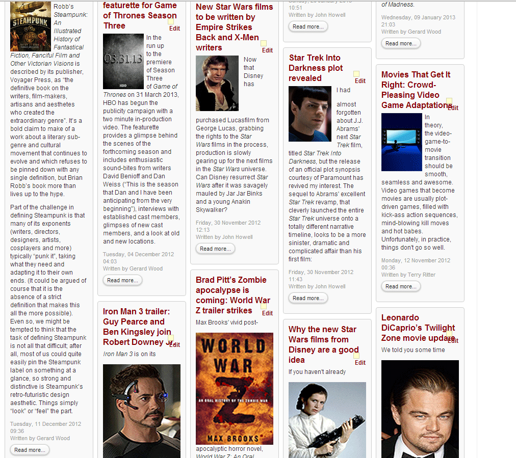
I've set articles to class="dynlayout_wide1" and this has solved the problem for the first lot of articles that are loaded. However, when the next set of articles are loaded, the images become large again, even if the class is applied to these articles. I've attached a picture to illustrate.
In my menu blog category settings, I have it set to 10 intro articles, 1 column and 0 for everything else.
I can't increase the number of intro articles set, because that means they would all load at once. For example, if I set intro articles to 100, they will come out the right size, but every time I reach the end of the page another 100 articles will be displayed...
Really would like to use the template. Any help appreciated.
Thanks,
John
Replied by bowman9991 on topic Responsive template image and article
Thanks Ivan,
I've set articles to class="dynlayout_wide1" and this has solved the problem for the first lot of articles that are loaded. However, when the next set of articles are loaded, the images become large again, even if the class is applied to these articles. I've attached a picture to illustrate.
In my menu blog category settings, I have it set to 10 intro articles, 1 column and 0 for everything else.
I can't increase the number of intro articles set, because that means they would all load at once. For example, if I set intro articles to 100, they will come out the right size, but every time I reach the end of the page another 100 articles will be displayed...
Really would like to use the template. Any help appreciated.
Thanks,
John
Last edit: 13 years 3 months ago by bowman9991. Reason: Image too big
Please Log in to join the conversation.
-
ivan.milic
Support Staff - Offline
- Moderator
-
Less
More
- Posts: 14116
- Thank you received: 1639
13 years 3 months ago #25575
by ivan.milic
Replied by ivan.milic on topic Responsive template image and article
Submit link for check
Please Log in to join the conversation.
Time to create page: 0.104 seconds