
- Posts: 107
- Thank you received: 0
responsiveness (iPAD)
12 years 5 months ago #35701
by plive
responsiveness (iPAD) was created by plive
Hi,
what is the suitable valu pour iPAD ?
Actually, Change Menu on Screen Width : 1000
thank you
what is the suitable valu pour iPAD ?
Actually, Change Menu on Screen Width : 1000
thank you
Please Log in to join the conversation.
12 years 5 months ago #35703
by milos
Replied by milos on topic responsiveness (iPAD)
Hi,
Bokeh template uses full width (100%), so changing width value in pixels doesn't have any effect. This template will look good on iPads without changing any width values in template parameters.
Regards
Milos
Bokeh template uses full width (100%), so changing width value in pixels doesn't have any effect. This template will look good on iPads without changing any width values in template parameters.
Regards
Milos
The following user(s) said Thank You: plive
Please Log in to join the conversation.
12 years 5 months ago - 12 years 5 months ago #35719
by plive
Replied by plive on topic responsiveness (iPAD)
Hi Milos,
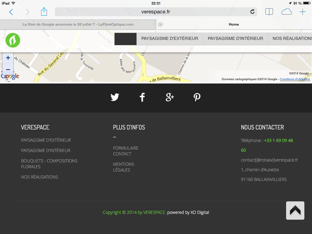
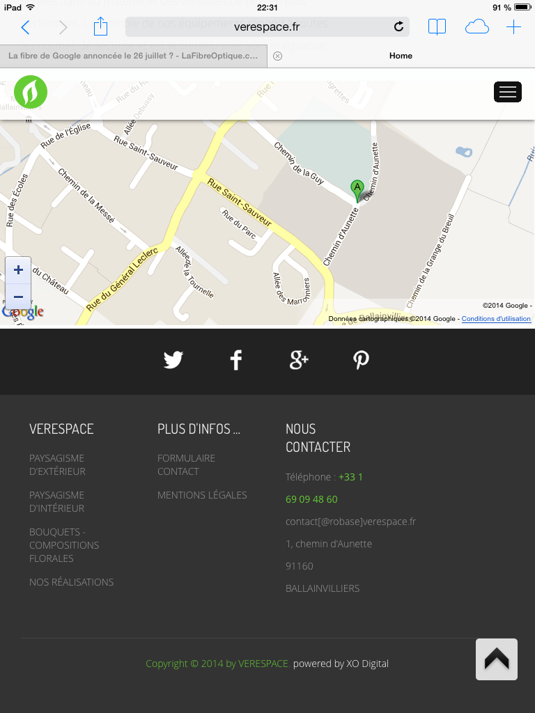
Please check it on iPAD, you'll get other thing strange that i don't understand.
See attached files (from iPAD, vertical and horitontal view)
View problem :
on the bottom, the phone number 60 is not on the same line
the 3 dots of PLUS d'INFOS go to the next line
The other strangee thing is the 4logo.png is changed for others menu's items, only the homepage keep my logo (same name 4logo.png)The logo.png file is a copy of 4logo.png.
I cleared my cache, but have same problem safari, opera. Not under IE 10 and firefox
Last edit: 12 years 5 months ago by plive.
Please Log in to join the conversation.
-
ivan.milic
Support Staff - Offline
- Moderator
-

Less
More
- Posts: 14116
- Thank you received: 1639
12 years 5 months ago #35727
by ivan.milic
Replied by ivan.milic on topic responsiveness (iPAD)
in template_css.css:
.rowfooter .cell_pad {
padding: 20px 15%;
}
you can change padding: 20px 15%; to padding: 20px 13%;
I see 4logo.png is used for all pages?
.rowfooter .cell_pad {
padding: 20px 15%;
}
you can change padding: 20px 15%; to padding: 20px 13%;
I see 4logo.png is used for all pages?
Please Log in to join the conversation.
12 years 5 months ago - 12 years 5 months ago #35737
by plive
Replied by plive on topic responsiveness (iPAD)
Hi,
ok, i changed padding: 20px 15%; to padding: 20px 11%;
instead of 13% (doesn't work)
The second problem is about 4logo.png
for all pages of course. But 4logo.png with i have to use and uploaded is the one you see on home page.
It seems chaged to logo4_2.png ?! due of sparky framework.
I checked style4.css, please check lines 33 and 37.
Must i change thoses png files ?
ps/i cleared my cache, but have this 4logo.png problem under chrome,safari and opera
image link is verespace.fr/templates/hot_bokeh/images/4logo.png but NOT MY LOGO is browsed
Last edit: 12 years 5 months ago by plive.
Please Log in to join the conversation.
12 years 5 months ago #35738
by plive
4logo.png solved
i replaced logo_small4.png, logo4_2.png, like 4logo.png
thank you
Replied by plive on topic responsiveness (iPAD)
plive wrote: Hi,
ok, i changed padding: 20px 15%; to padding: 20px 11%;
instead of 13% (doesn't work)
The second problem is about 4logo.png
for all pages of course. But 4logo.png with i have to use and uploaded is the one you see on home page.
It seems chaged to logo4_2.png ?! due of sparky framework.
I checked style4.css, please check lines 33 and 37.
Must i change thoses png files ?
ps/i cleared my cache, but have this 4logo.png problem under chrome,safari and opera
image link is verespace.fr/templates/hot_bokeh/images/4logo.png but NOT MY LOGO is browsed
4logo.png solved
i replaced logo_small4.png, logo4_2.png, like 4logo.png
thank you
Please Log in to join the conversation.
Time to create page: 0.205 seconds