- Posts: 27
- Thank you received: 0
Top menu on mobile devices: not shows all items
10 years 11 months ago #45358
by ted_hotj
Top menu on mobile devices: not shows all items was created by ted_hotj
Hi,
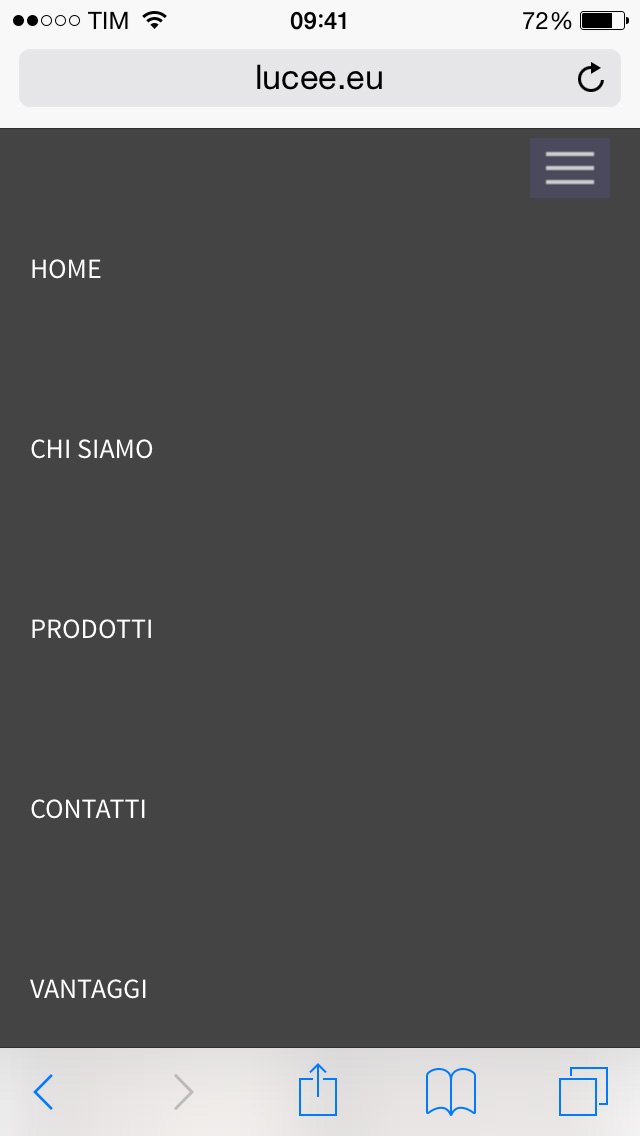
I'm using Clinic template in this website www.lucee.eu and I have 7 menu voices that I see fine on desktop device.
When i browse the site with a mobile device, i can't see all menu voices (please watch the attachment).
Can I reduce line height of collapsing mobile menu so I can have all my entries?
Thank you.
DAM
Please Log in to join the conversation.
-
ivan.milic
Support Staff - Offline
- Moderator
-

Less
More
- Posts: 14116
- Thank you received: 1639
10 years 11 months ago #45360
by ivan.milic
Replied by ivan.milic on topic Top menu on mobile devices: not shows all items
Hello, put this code in your template_css.css (on bottom) which is located under your template_folder\css
@media (max-width: 979px) {
.mnu_mainmenu > li {
margin: 0px;
}
}
@media (max-width: 979px) {
.mnu_mainmenu > li {
margin: 0px;
}
}
The following user(s) said Thank You: ted_hotj
Please Log in to join the conversation.
Time to create page: 0.153 seconds