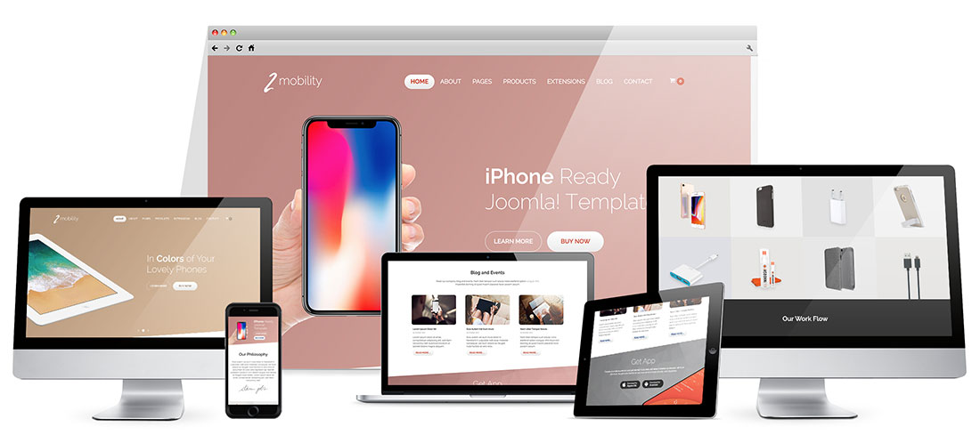
This is a completely new responsive Joomla! iPhone template that has the same name as our old template, released about 8 years ago.
Things are changing in this industry almost on a monthly basis. People are browsing the internet using mobile devices more than ever! In the early ages of the mobile devices industry, websites usually had a separate version optimized for small mobile devices only. Today, responsive design is a must!
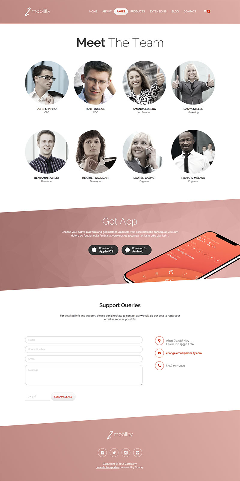
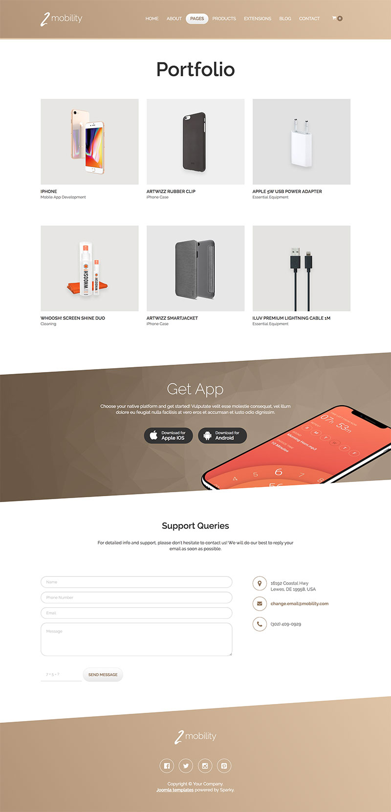
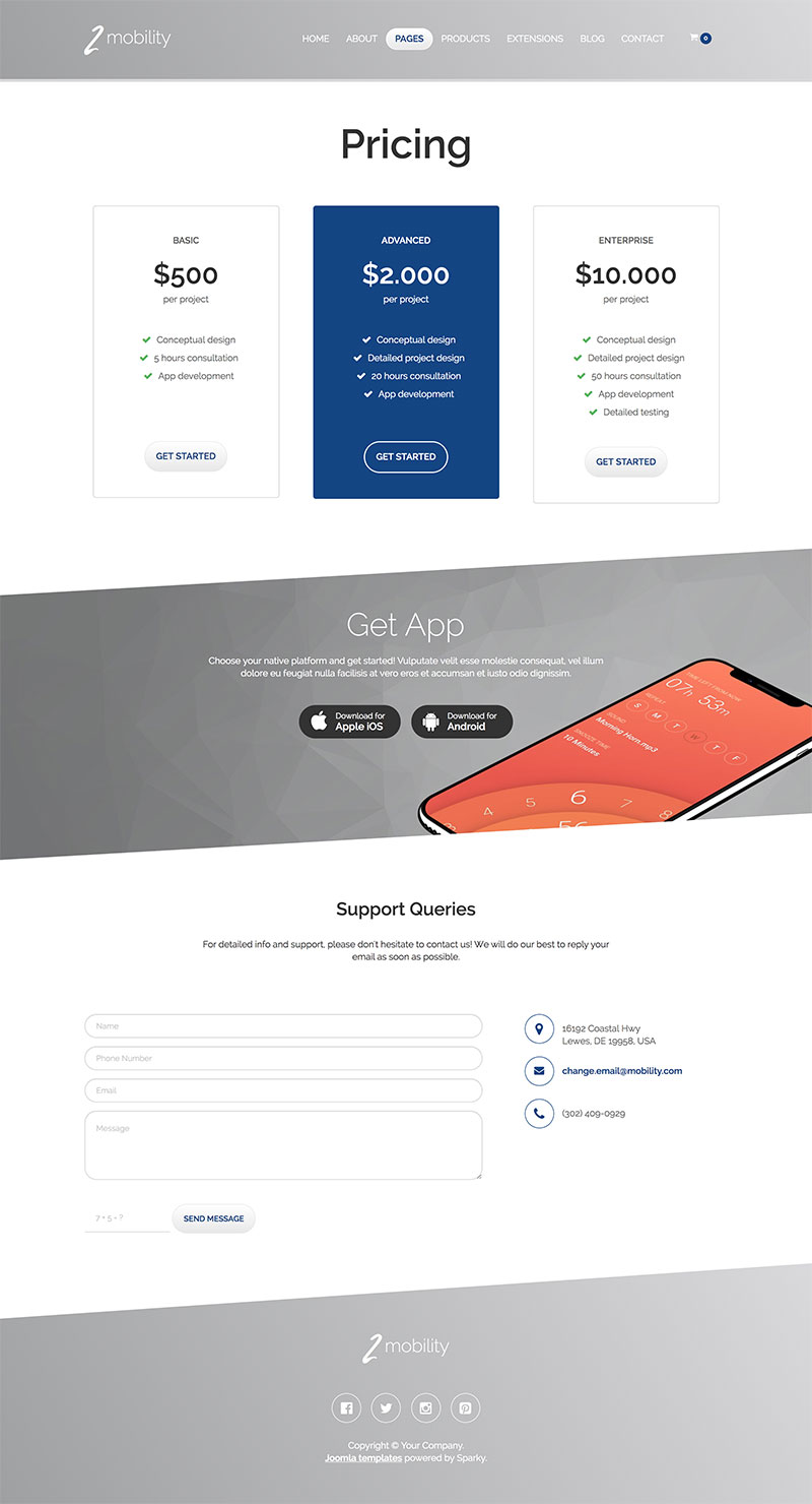
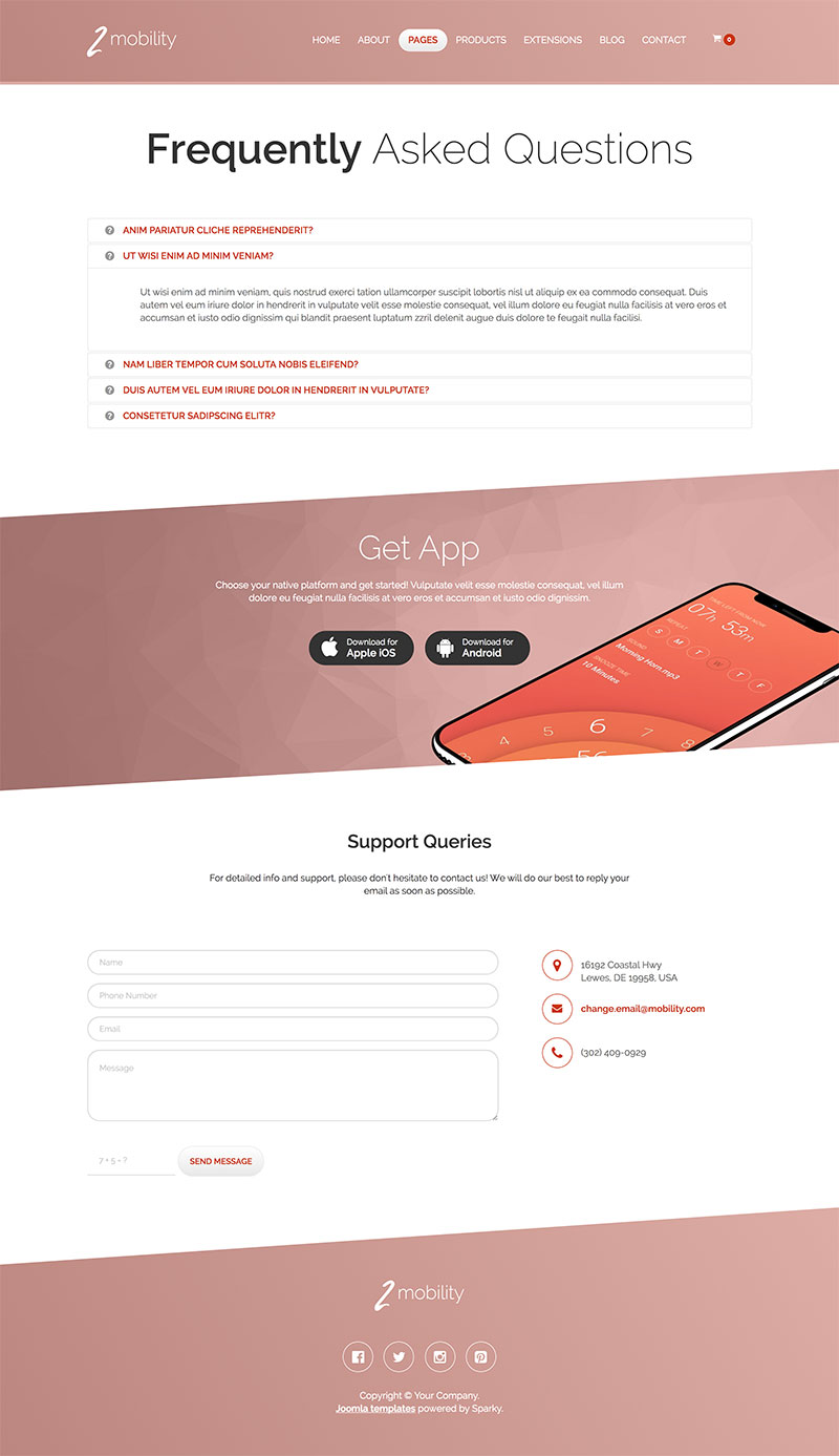
Following the best practices in web design, we created this Joomla! iPhone template. Mobile devices developed by Apple™ are in focus. Therefore, we recommend this template if your website is related to mobile devices. You can use this template to sell mobile devices and equipment if you combine it with any e-commerce component. However, if you just write about the mobile industry, this template contains a nicely designed blog section. Besides the Blog page, there are other pages that you may find useful, such as Team, Portfolio, Pricing, FAQ page, etc.
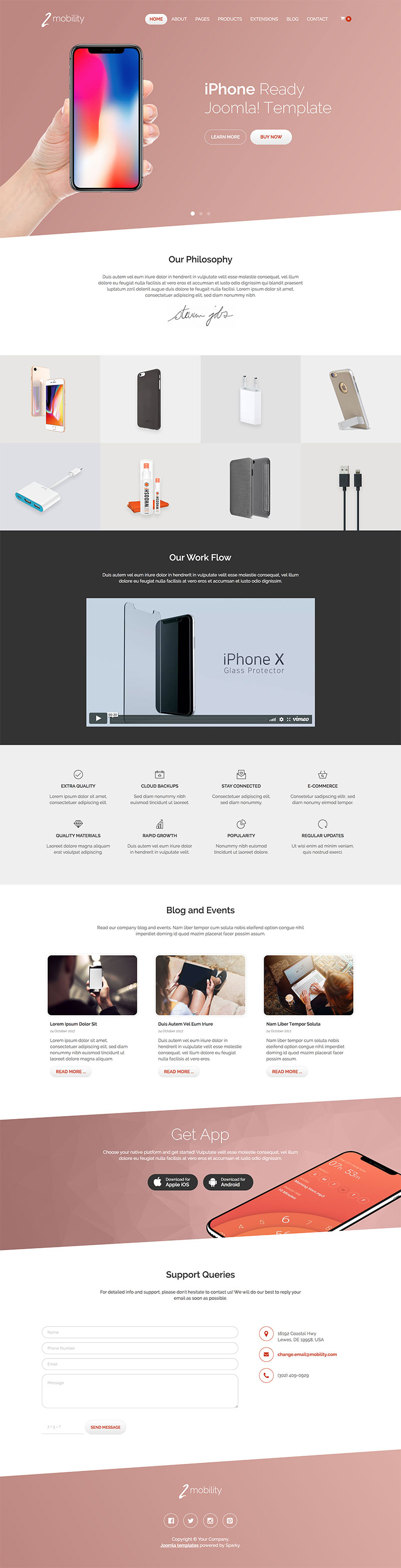
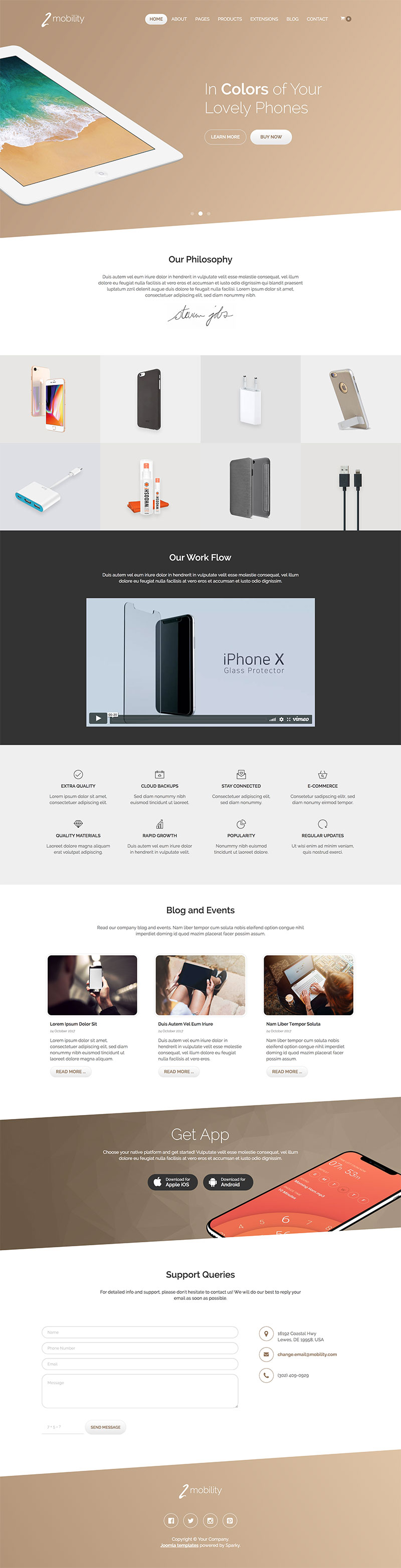
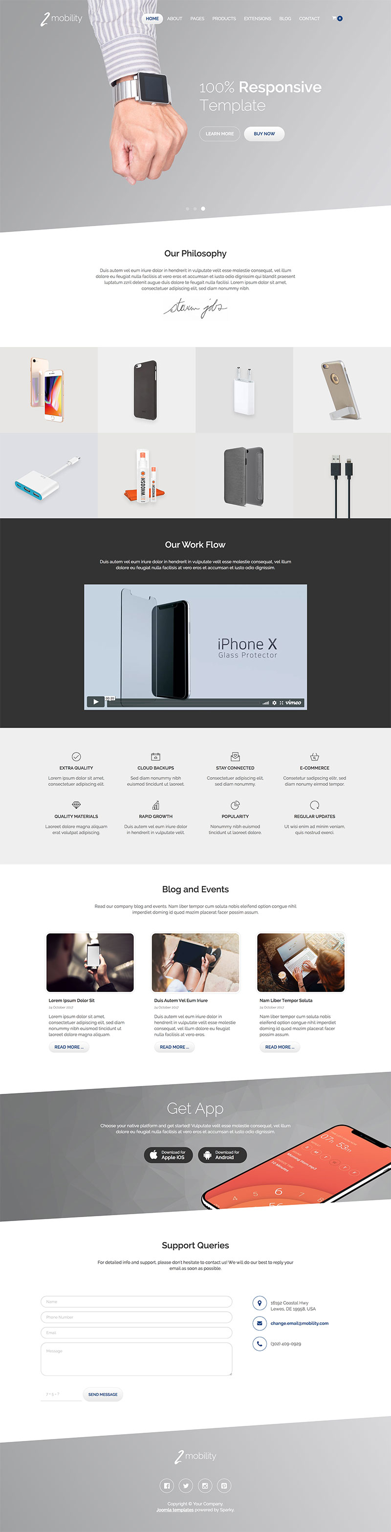
The colors of this template are in accordance with the colors of the latest Apple mobile devices. You can switch the color scheme to pink, gold, or silver.
Responsive and touch-friendly carousel module optimized for Retina screens is included with Joomla! iPhone template. It looks good on both small mobile screens and desktop monitors.
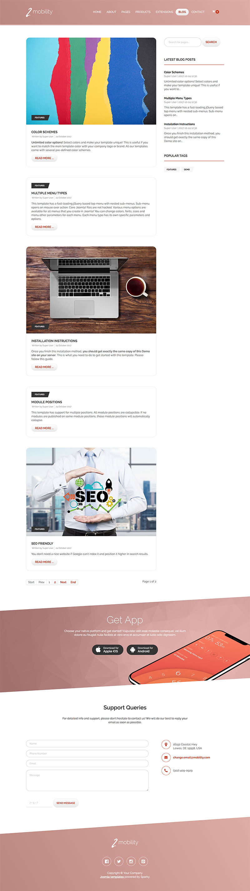
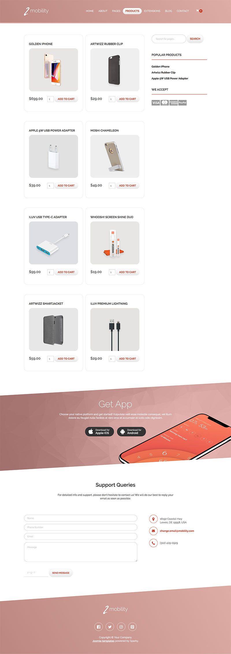
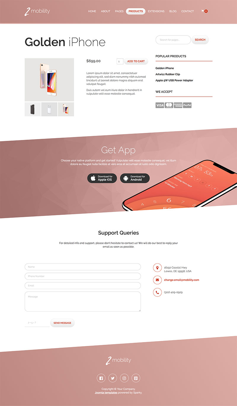
Joomla iPhone Template Screen Shots
Features of the Hot Mobility Template
This is the list of the Mobility template's features with some technical details:
- Responsive template, based on clean HTML5/CSS3 code.
- Customisation of the template's layout and adding/removing module positions is easy. It's powered by Sparky's drag-and-drop Layout Editor. Change layout and element dimensions easily whenever you need.
- Retina-ready images in articles, custom modules, and carousel. Full support for modern screens with double pixel density.
- We included several responsive Joomla modules with this template. Hot Swipe Carousel (retina ready and powered by CSS animations), Hot Slicebox, Hot Responsive Lightbox, Hot Maps and Rapid Contact. All these modules are included with this template without any additional fees (you save $19 per commercial module).
- HotStart (SQL dump) available with both a single purchase and any membership plan. It copies the template with all extensions and demo pages easily.
- An unlimited number of module positions can be added easily within the Layout Editor of Sparky Framework if needed.
- PSD source file and fonts are included.
- Total control of all menus through the framework. You can set the functionalities and style of all your menus and drop them directly into the layout. This template uses a Drop-down menu, which allows multiple levels of menu items to be included in the drop-down panes.
- This template has been tested with Chrome, Edge, Firefox, IE10+, Opera, and Safari browsers on PC and Mac computers. It's also tested on iOS and Android mobile devices.
- Support for RTL (right-to-left) languages.