- Posts: 32
- Thank you received: 0
Mobile support for Wellness template
-
yonishobby
Inactive member - Topic Author
- Offline
- Member
-

Less
More
10 years 8 months ago #45903
by yonishobby
Replied by yonishobby on topic Mobile support for Wellness template
My mistake in the last reply, probably caching issue. Now it works.
Many thanks for your support.
Many thanks for your support.
Please Log in to join the conversation.
-
nikola.mihajlovic
Support Staff - Offline
- Moderator
-

Less
More
- Posts: 91
- Thank you received: 10
10 years 8 months ago #45904
by nikola.mihajlovic
Replied by nikola.mihajlovic on topic Mobile support for Wellness template
Yes it was probably some cache delay.
If you have more questions feel free to ask.
Best regards,
Nikola Mihajlovic
If you have more questions feel free to ask.
Best regards,
Nikola Mihajlovic
Please Log in to join the conversation.
-
yonishobby
Inactive member - Topic Author
- Offline
- Member
-
Less
More
- Posts: 32
- Thank you received: 0
10 years 8 months ago - 10 years 8 months ago #45913
by yonishobby
Replied by yonishobby on topic Mobile support for Wellness template
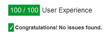
First, thanks again, the site is now 100/100 Mobile Friendly according to Google:
I have 2 more questions:
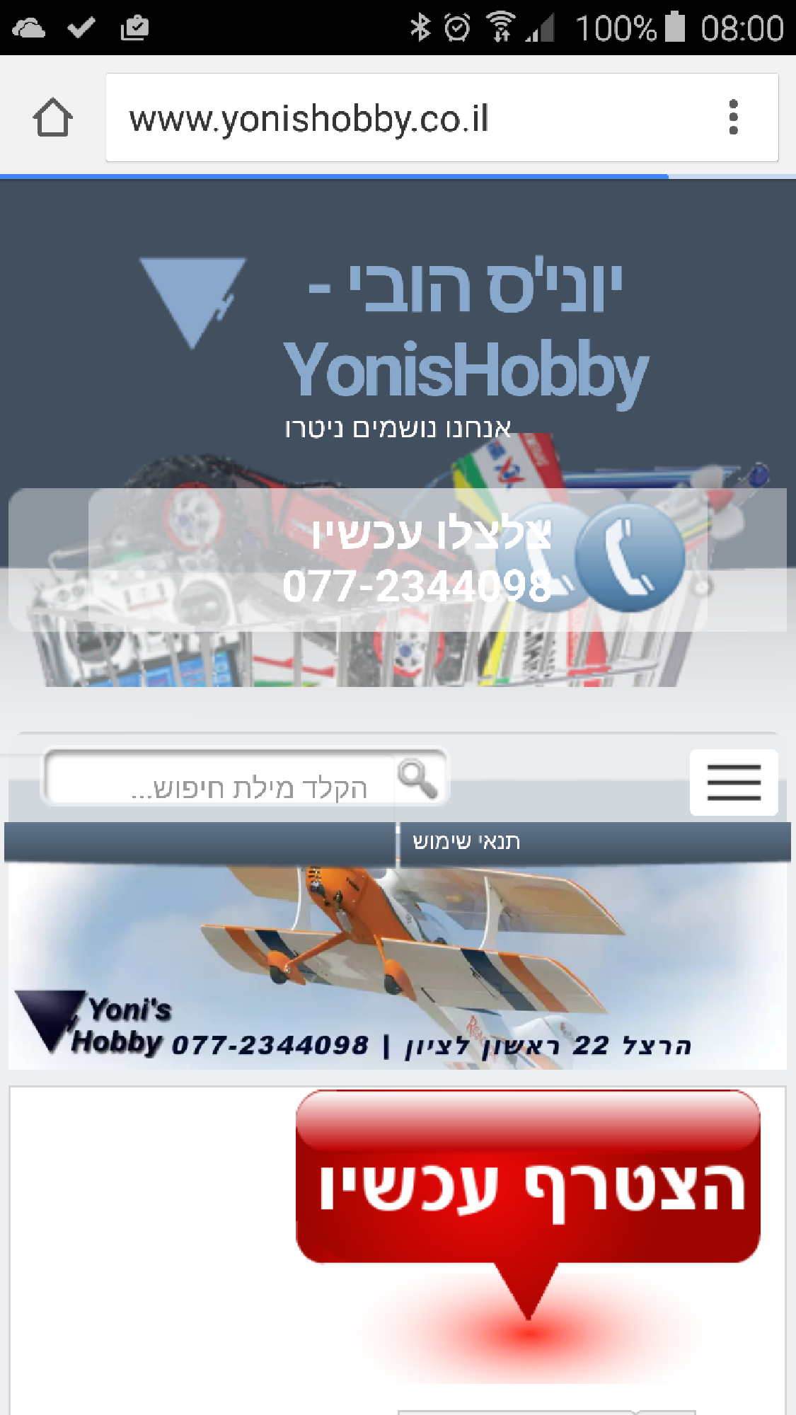
1. A cosmetic issue with the "Call center" module. On mobiles and when shrinking the browser size, looks like another instance of the graphics appears and shadows the pone number:
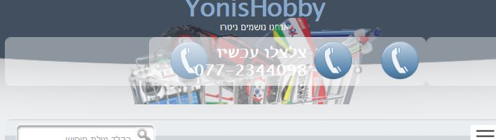
In some browser sizes even 3 appearances:
Any idea how to solve it?
And the second question is regarding the location of each module on the mobile. Can I sort the modules differently?
I prefer to have the main store page before the user registration module. Don't wont to have my visitors the feeling I'm pushing them to register.
Thanks.
I have 2 more questions:
1. A cosmetic issue with the "Call center" module. On mobiles and when shrinking the browser size, looks like another instance of the graphics appears and shadows the pone number:
In some browser sizes even 3 appearances:
Any idea how to solve it?
And the second question is regarding the location of each module on the mobile. Can I sort the modules differently?
I prefer to have the main store page before the user registration module. Don't wont to have my visitors the feeling I'm pushing them to register.
Thanks.
Last edit: 10 years 8 months ago by yonishobby.
Please Log in to join the conversation.
-
nikola.mihajlovic
Support Staff - Offline
- Moderator
-
Less
More
- Posts: 91
- Thank you received: 10
10 years 8 months ago #45914
by nikola.mihajlovic
Replied by nikola.mihajlovic on topic Mobile support for Wellness template
Hello,
You or some script setted this:
style="background-image:url(/images/xcontact_bg.png.pagespeed.ic.pyKU55joVa.png);"
above call center div. So find it and edit it. And for mobile view, you can make new rows in sparky and add some class to it, two new rows will have new positions and will be invisible in desktop mode but will contain module reversed, and when going to mobile you should hide old rows and display only new ones. That can be done with .css and I will help you if you want to do that.
Regards
Please Log in to join the conversation.
-
yonishobby
Inactive member - Topic Author
- Offline
- Member
-
Less
More
- Posts: 32
- Thank you received: 0
10 years 8 months ago #45915
by yonishobby
Replied by yonishobby on topic Mobile support for Wellness template
This line was added or altered by the Google Pagespeed module I added to my Apache server. The idea is to deliver optimized content created from the original site system.
How do I distinguish between Desktop and Mobile browsers?
How do I distinguish between Desktop and Mobile browsers?
Please Log in to join the conversation.
-
nikola.mihajlovic
Support Staff - Offline
- Moderator
-
Less
More
- Posts: 91
- Thank you received: 10
10 years 8 months ago #45916
by nikola.mihajlovic
Replied by nikola.mihajlovic on topic Mobile support for Wellness template
Hello,
you can "recognize" it by screen width. So in .css files you can use @media tags. Example:
this will show class1 item in desktop mode and hide class2 item but when is resolution smaller than 700px it will hide class1 and show class2.
Regards
you can "recognize" it by screen width. So in .css files you can use @media tags. Example:
Code:
.class1{
display: block;
}
.class2{
display: none;
}
@media (max-width: 700px) {
.class1 {
display: none;
}
.class2 {
display: block;
}
}
this will show class1 item in desktop mode and hide class2 item but when is resolution smaller than 700px it will hide class1 and show class2.
Regards
Please Log in to join the conversation.
Time to create page: 0.121 seconds