- Posts: 23
- Thank you received: 0
bad starting page on smartphone
12 years 2 months ago #36805
by caland
bad starting page on smartphone was created by caland
on the Smartphone my 3 picutres and text from the starting page are overlapped:
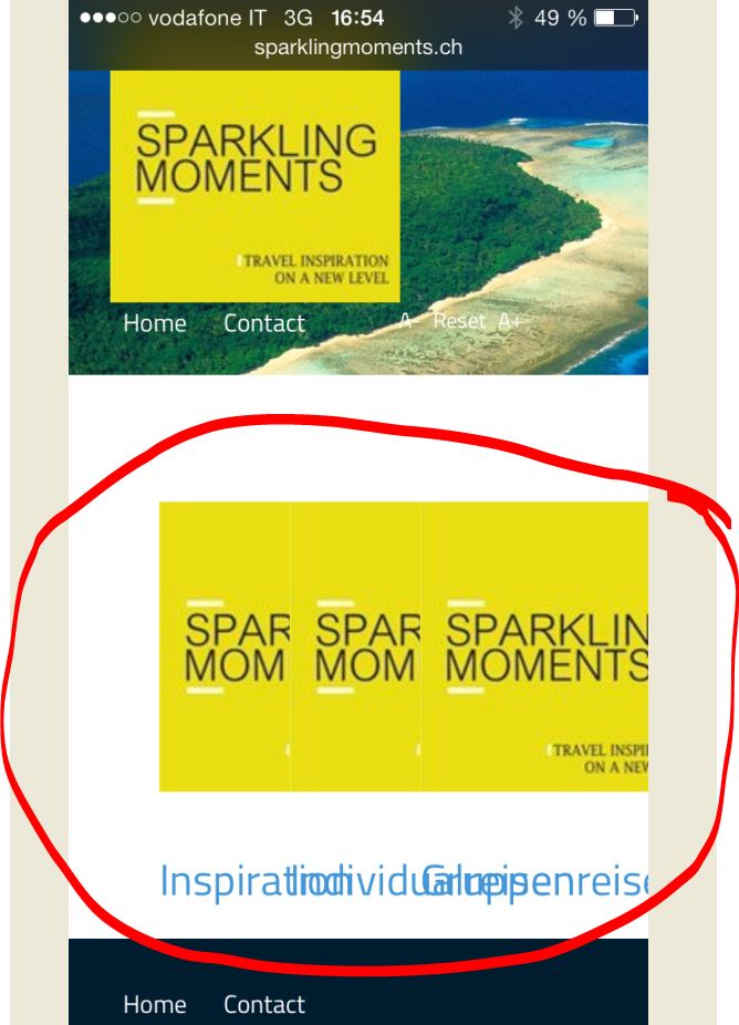
the problem coms from my Change on the layout.css. I added the following code to place my 3 sub-categorie picture and text horizontal (side by side) and not vertical.
For the browser on the PC and tablets this change works fine. But how can I change back the vertical alignment only for smartphones?
link
the problem coms from my Change on the layout.css. I added the following code to place my 3 sub-categorie picture and text horizontal (side by side) and not vertical.
Code:
.cat-children div {
float: left;
text-align: center;
width: 33%;
}
For the browser on the PC and tablets this change works fine. But how can I change back the vertical alignment only for smartphones?
link
Please Log in to join the conversation.
-
ivan.milic
Support Staff - Offline
- Moderator
-

Less
More
- Posts: 14116
- Thank you received: 1639
12 years 2 months ago #36809
by ivan.milic
Replied by ivan.milic on topic bad starting page on smartphone
Add this to bottom of template_css.css:
@media screen and (max-width: 620px){
.cat-children div {
width: 100%;
}
}
@media screen and (max-width: 620px){
.cat-children div {
width: 100%;
}
}
Please Log in to join the conversation.
12 years 2 months ago #36811
by caland
Replied by caland on topic bad starting page on smartphone
added but nothing change on Smartphone
Code:
/*------------------------------------------------------------------------
# "Hot Explorer" - Joomla Template Framework
# Copyright (C) 2013 HotThemes All Rights Reserved.
# License: http://www.gnu.org/licenses/gpl-2.0.html GNU/GPLv2 only
# Author: HotJoomlaTemplates.com
# Website: http://www.hotjoomlatemplates.com
-------------------------------------------------------------------------*/
/* overwrite sparky's settings */
body {
margin:0;
padding:0;
}
h1 {
padding:30px 0;
margin:0;
line-height:normal;
text-transform: uppercase;
}
.componentheading {
font-size: 40px;
font-weight: normal;
color:#ccc;
}
h2, h2 a {
padding:30px 0 15px;
margin:0;
line-height:32px;
}
.mp_user1 h2, .mp_user4 h2, .mp_bottom2 h2 {
text-transform: uppercase;
}
h3 {
margin:30px 0 15px;
padding:0;
}
h4 {
margin:0;
padding:0;
}
iframe {
border: none;
}
/* overwrite joomla.css */
div.finder label, div.finder br {
display:none;
}
/* forms */
fieldset {
border:0;
margin:0;
padding:0;
}
legend {
font-weight:bold;
margin: 0;
padding: 0;
}
.input {
margin:0;
padding:0;
}
.inputbox {
background: #fff;
border: 1px solid #999;
padding: 3px;
}
.button, button {
display: block;
background: #4296d7 !important;
color:#fff;
font-size: 11px !important;
text-align: center;
line-height: 26px;
border: none !important;
-webkit-border-radius: 3px;
-moz-border-radius: 3px;
border-radius: 3px;
padding: 0 10px !important;
}
.button:hover, button:hover {
background: #1f74b6 !important;
}
form {
margin:0;
padding:0;
}
/* lists */
ul, ol {
margin: 15px 45px;
padding: 0;
}
li {
margin: 0;
padding: 0 0 10px 0;
}
div.item-page ol li, div.item-page ul li {
margin: 0 0 10px 0;
padding: 0;
}
ul.arrow li {
list-style-image: url(../images/bullet_arrow_right.png);
}
ul.arrowleft li {
list-style-image: url(../images/bullet_arrow_left.png);
}
ul.calendar li {
list-style-image: url(../images/bullet_calendar.png);
}
ul.checklist li {
list-style-image: url(../images/bullet_tick.png);
}
ul.delete li {
list-style-image: url(../images/bullet_delete.png);
}
ul.email li {
list-style-image: url(../images/bullet_email.png);
}
ul.file li {
list-style-image: url(../images/bullet_file.png);
}
ul.folder li {
list-style-image: url(../images/bullet_folder.png);
}
ul.heart li {
list-style-image: url(../images/bullet_heart.png);
}
ul.information li {
list-style-image: url(../images/bullet_information.png);
}
ul.lock li {
list-style-image: url(../images/bullet_lock.png);
}
ul.pencil li {
list-style-image: url(../images/bullet_pencil.png);
}
ul.person li {
list-style-image: url(../images/bullet_person.png);
}
ul.rss li {
list-style-image: url(../images/bullet_rss.png);
}
ul.shop li {
list-style-image: url(../images/bullet_shop.png);
}
ul.song li {
list-style-image: url(../images/bullet_song.png);
}
ul.star li {
list-style-image: url(../images/bullet_star.png);
}
ul.star2 li {
list-style-image: url(../images/bullet_star2.png);
}
ul.trash li {
list-style-image: url(../images/bullet_trash.png);
}
ul.tweak li {
list-style-image: url(../images/bullet_tweak.png);
}
ul.unlock li {
list-style-image: url(../images/bullet_unlock.png);
}
ul.warn li {
list-style-image: url(../images/bullet_warning.png);
}
/* typography */
.warning {
padding:15px 15px 15px 60px;
color:#000;
border-top:4px solid #c10000;
border-bottom:4px solid #c10000;
background:#FFDE25 url(../images/warning.png) no-repeat center left;
}
.info {
padding:15px 15px 15px 60px;
color:#006699;
border-top:4px solid #006699;
border-bottom:4px solid #006699;
background:#bde1ff url(../images/info.png) no-repeat center left;
}
.error {
padding:15px 15px 15px 60px;
color:#900;
border-top:4px solid #900;
border-bottom:4px solid #900;
background:#f8b5b5 url(../images/error.png) no-repeat center left;
}
.typewriter {
background: url(../images/typewriter_bg.png);
padding:20px 15px 20px 30px;
color:#000;
font-family:"Courier New", Courier, monospace;
line-height:20px;
text-align:left;
}
blockquote {
margin:0;
padding:15px 15px 15px 75px;
font-size:125%;
font-style:italic;
font-family: serif;
line-height:normal;
background: url(../images/quotes.png) top left no-repeat;
line-height: 25px;
}
.dropcap:first-letter {
font-size: 300%;
font-weight:bold;
float:left;
margin:0 10px 5px 0;
}
span.p_number {
font-size: 400%;
font-weight:bold;
float:left;
margin:0 10px 10px 0;
position: relative;
line-height: 40px;
}
.inset_left {
display:block;
float:left;
width: 150px;
font-style: italic;
margin: 15px 15px 15px 0;
}
.inset_right {
display:block;
float:right;
width: 150px;
font-style: italic;
margin: 15px 0 15px 15px;
}
.inset_title {
font-weight:bold;
display:block;
}
img.img_left {
float:left;
margin:0 30px 30px 0;
}
img.img_right {
float:right;
margin:0 0 30px 30px;
}
/* k2 */
.sparky_home #k2Container {
padding: 0;
}
.sparky_home #k2Container div.catItemView {
padding: 16px;
}
#k2Container, .item-page, #k2Container.itemView {
padding: 0 30px 10px 30px;
}
div.itemView {
margin: 0;
border: none;
}
div#k2Container.latestView h2, div#k2Container.latestView h2 a {
padding: 25px 0 0 0;
margin: 0;
}
div.latestItemsCategory h2 a {
color: #ccc !important;
font-weight: normal;
}
div.itemToolbar {
background: none;
border:none;
}
span.itemImage img, span.latestItemImage img, span.userItemImage img, span.tagItemImage img {
border:none;
padding: 0;
max-width: 100%;
}
span.catItemImage img {
border:none;
padding: 0 0 15px 0;
}
div.catItemHeader h3.catItemTitle, div.userItemHeader h3.userItemTitle {
font-family: inherit;
}
.sparky_inner div.catItemHeader h3.catItemTitle a, .sparky_inner div.userItemHeader h3.userItemTitle a, .sparky_inner div.itemRelated h3 {
color:#000;
font-size: 32px;
}
div.latestItemCategory a, div.latestItemTagsBlock ul.latestItemTags li a, div.catItemHeader span.catItemAuthor a, div.catItemCategory a, div.catItemTagsBlock a, div.userItemCategory a, div.userItemTagsBlock a, div.tagItemCategory a {
font-size: 14px;
}
div.itemCategory, div.catItemCategory, div.catItemTagsBlock, div.userItemCategory, div.userItemTagsBlock, div.tagItemView {
border:none;
padding: 0;
}
.sparky_inner div.catItemView {
border:none;
padding: 0 15px 30px 15px;
}
div.itemImageBlock {
padding: 0;
margin: 0 0 15px 30px;
width: 373px;
float: right;
}
span.itemImage {
margin:0;
}
div.itemIntroText {
color: inherit;
font-size: inherit;
font-weight: inherit;
line-height: inherit;
padding: 0;
line-height: 22px;
}
div.itemFullText {
line-height: 22px;
}
div.itemToolbar ul li, div.itemToolbar ul li a {
font-size: 14px;
}
div.itemContentFooter, div.tagItemCategory, div.itemTagsBlock {
padding: 0;
margin: 0;
border: none;
}
div.itemNavigation {
padding: 10px 0;
margin: 0;
border:none;
background: none;
}
div.itemNavigation a.itemPrevious, div.itemNavigation a.itemNext {
padding: 0;
display: block;
}
div.itemNavigation a.itemPrevious {
float: left;
}
div.itemNavigation a.itemNext {
float: right;
}
div.itemAuthorBlock {
background: none;
border:none;
padding:0 30px;
}
div.itemAuthorLatest {
padding: 0 30px 15px 30px;
}
.itemAuthorLatest h3 {
}
div.itemBackToTop {
text-align: center;
padding-top: 10px;
}
.even, .odd {
background: none;
padding: 0;
border: none;
}
div.itemSocialSharing {
padding-left: 300px;
}
div.itemRatingBlock span {
font-size: 14px;
line-height: 25px;
}
.itemRatingList, .itemRatingList a:hover, .itemRatingList .itemCurrentRating {
background-image:url(../images/custom/transparent_star.png) !important;
}
div.itemComments {
background: none;
border: none;
padding: 0;
}
div.itemComments ul.itemCommentsList li {
padding: 0;
margin: 0;
border: none;
}
div.itemComments ul.itemCommentsList li img {
float: left;
margin: 0 15px 15px 0;
padding: 0;
background: #fff;
border: none;
}
div.itemComments ul.itemCommentsList {
font-size: 12px;
line-height: 16px;
}
div.itemCommentsForm p.itemCommentsFormNotes {
padding-top: 10px;
}
div.itemLinks {
padding: 0;
margin: 0;
}
div.latestItemCategory {
border: none;
padding: 0;
}
div.latestItemsCategory, div.itemListCategory, div.catItemImageBlock, div.userBlock {
background: none;
border: none;
margin: 0 10px 0 0;
padding: 0;
}
div.userBlock {
background: #333;
padding: 15px;
margin: 0;
color: #999;
}
div.userBlock h2 {
color:#fff;
}
div.latestItemsCategory {
border-bottom: 1px solid #ccc;
}
div.latestItemTagsBlock {
border: none;
padding: 0;
}
.latestItemBody p.intro_headline, .catItemBody p.intro_headline, .userItemIntroText p.intro_headline, .tagItemIntroText p.intro_headline {
display: none;
}
div.k2FeedIcon {
float: right;
}
span.catItemImage {
padding: 0;
text-align: left;
margin:0;
}
div.catItemIntroText {
padding: 0 30px 0 0;
}
div.catItemCommentsLink, div.userItemCommentsLink {
border:none;
padding: 0 0 0 30px;
margin:0;
line-height: 30px;
float: right;
}
div.userItemView {
padding: 30px 0;
}
.userBlock h2 {
padding: 0;
margin: 0;
}
a.k2Anchor {
display: inline-block;
width: 60px;
height: 60px;
background: url(../images/custom/top.png) no-repeat;
text-indent: -9999px;
}
a.k2Anchor:hover {
background: url(../images/custom/top_hover.png) no-repeat;
}
ul.pagenav {
clear: both;
margin: 30px 0 0 0;
}
a.itemPrevious, li.previous a {
display: inline-block;
width: 124px;
height: 60px;
background: url(../images/custom/prev.png) no-repeat;
text-indent: -9999px;
}
a.itemPrevious:hover, li.previous a:hover {
background: url(../images/custom/prev_hover.png) no-repeat;
}
a.itemNext, li.next a {
display: inline-block;
width: 124px;
height: 60px;
background: url(../images/custom/next.png) no-repeat;
text-indent: -9999px;
}
a.itemNext:hover, li.next a:hover {
background: url(../images/custom/next_hover.png) no-repeat;
}
a.k2ReadMore, p.readmore {
display: block;
background: #4296d7;
color:#fff;
font-size: 11px;
width: 90px;
text-align: center;
line-height: 26px;
-webkit-border-radius: 3px;
-moz-border-radius: 3px;
border-radius: 3px;
}
a.k2ReadMore:hover, p.readmore:hover {
background: #1f74b6;
}
p.readmore a {
color:#fff;
}
div.userBlock img {
float: right;
margin: 0 0 0 30px;
padding: 0;
}
/* k2 module */
.k2ItemsBlock ul {
margin: 0;
padding: 0;
list-style: none;
}
.k2ItemsBlock li {
margin: 0;
padding: 0 0 10px 0;
}
.big_italic {
text-align: center;
line-height: normal;
padding-top: 25px;
}
.big_italic span {
font-size:200%;
font-weight: bold;
font-style:italic;
font-family: serif;
}
/* hot full carousel */
.hero-carousel-nav li.next, .hero-carousel-nav li.prev {
text-indent: -9999px;
}
.hero-carousel-nav li.prev a {
background: url(../images/custom/left_arrow.png) no-repeat !important;
}
.hero-carousel-nav li.prev a:hover {
background: url(../images/custom/left_arrow.png) no-repeat !important;
background-color: none;
}
.hero-carousel-nav li.next a {
background: url(../images/custom/right_arrow.png) no-repeat;
}
.hero-carousel-nav li.prev {
left: 10px;
}
.mp_copyright {
width: 100%;
}
@media screen and (max-width: 620px){
.cat-children div {
width: 100%;
}
}
Please Log in to join the conversation.
12 years 2 months ago #36813
by caland
Replied by caland on topic bad starting page on smartphone
I informed already the moderator about that I choosen the wrong forum. I'm using Commercial Joomla Templates "Explorer"!
Please Log in to join the conversation.
12 years 2 months ago #36814
by caland
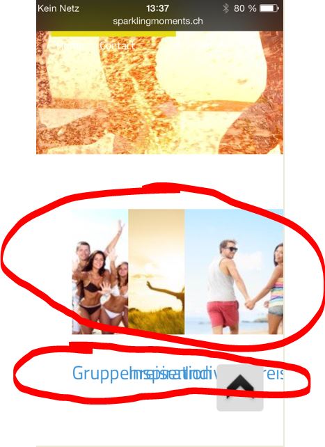
Replied by caland on topic bad starting page on smartphone
with your changes suggested on template_css.css:
Please Log in to join the conversation.
-
ivan.milic
Support Staff - Offline
- Moderator
-
Less
More
- Posts: 14116
- Thank you received: 1639
12 years 2 months ago - 12 years 2 months ago #36816
by ivan.milic
Replied by ivan.milic on topic bad starting page on smartphone
Try:
@media screen and (max-width: 620px){
.cat-children > div {
width: 100%;
clear:both;
}
}
@media screen and (max-width: 620px){
.cat-children > div IMG{
max-width:100%;
}
}
@media screen and (max-width: 620px){
.cat-children > div {
width: 100%;
clear:both;
}
}
@media screen and (max-width: 620px){
.cat-children > div IMG{
max-width:100%;
}
}
Last edit: 12 years 2 months ago by ivan.milic.
Please Log in to join the conversation.
Time to create page: 0.098 seconds