- Posts: 14116
- Thank you received: 1639
bad starting page on smartphone
-
ivan.milic
Support Staff -

- Offline
- Moderator
-

Less
More
12 years 1 month ago #36882
by ivan.milic
Replied by ivan.milic on topic bad starting page on smartphone
Move css you added to template_css.css to bottom of layout.css, if that does not help
...
@media screen and (max-width: 620px){
.cat-children > div {
width: 100%;
clear:both;
}
...
change width: 100%; to width: 100%!important;
...
@media screen and (max-width: 620px){
.cat-children > div {
width: 100%;
clear:both;
}
...
change width: 100%; to width: 100%!important;
Please Log in to join the conversation.
12 years 1 month ago - 12 years 1 month ago #36895
by caland
Replied by caland on topic bad starting page on smartphone
One other step to come to the result that I expect. On the smartphone the pictures are now fine. On the PC and tablets under
inspiration
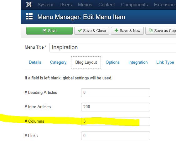
now I have only 1 column. Before I had 3 columns on the PC and tablet.
Last edit: 12 years 1 month ago by caland.
Please Log in to join the conversation.
-
ivan.milic
Support Staff -

- Offline
- Moderator
-

Less
More
- Posts: 14116
- Thank you received: 1639
12 years 1 month ago - 12 years 1 month ago #36901
by ivan.milic
Replied by ivan.milic on topic bad starting page on smartphone
Here are files just replace them
Last edit: 12 years 1 month ago by ivan.milic.
Please Log in to join the conversation.
12 years 1 month ago - 12 years 1 month ago #36905
by caland
Replied by caland on topic bad starting page on smartphone
Greate! Can I have the same border distance left and right. The left border is smaller than the right one
Last edit: 12 years 1 month ago by caland.
Please Log in to join the conversation.
-
ivan.milic
Support Staff -

- Offline
- Moderator
-

Less
More
- Posts: 14116
- Thank you received: 1639
12 years 1 month ago #36911
by ivan.milic
Replied by ivan.milic on topic bad starting page on smartphone
Replace layout.css with one in attachment.
The following user(s) said Thank You: caland
Please Log in to join the conversation.
12 years 1 month ago - 12 years 1 month ago #36919
by caland
Replied by caland on topic bad starting page on smartphone
Hi Ivan
Your support is excellent!
I don't no if you find also a solution for the tablet. Only if I held my tablet in the upright position I see the pictures "inspiration" overlapped:
Your support is excellent!
I don't no if you find also a solution for the tablet. Only if I held my tablet in the upright position I see the pictures "inspiration" overlapped:
Last edit: 12 years 1 month ago by caland.
Please Log in to join the conversation.
Time to create page: 0.084 seconds

