- Posts: 97
- Thank you received: 0
Help with the look
-
ijohnparton
Active member - Topic Author
- Offline
- Member
-

Less
More
1 year 1 month ago - 1 year 1 month ago #51823
by ijohnparton
Help with the look was created by ijohnparton
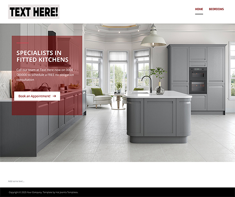
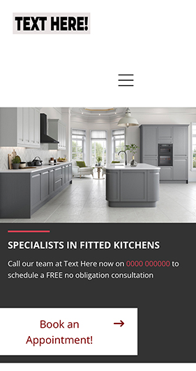
Hi AllHow do i get the mobile version on a website looking the same has the desktop version. I have attached phots of what is happening also a link to the site.
So on the desktop version where is says Specialists in Fitted Kitchens the background is red but on the mobile is black. i would like it to be red, The button is wrong has well ther is not padding and the not in line.
Also something has hapened to the top bar the logo and the menu are wroung.
Link: dev-website.uk/kittemp/
Thanks
Last edit: 1 year 1 month ago by ijohnparton.
Please Log in to join the conversation.
1 year 1 month ago #51825
by milos
Replied by milos on topic Help with the look
Hello,
The background of the carousel text on mobile screens can be changed if you edit the file /media/templates/site/veterinarian/css/custom.css and change the background color here:
You can edit the template settings, and in the Layout, change the Row Options for the first row so it does not collapse on small screens. More details www.hotjoomlatemplates.com/sparky-docume.../layout/row-settings
Regards,
Milos
The background of the carousel text on mobile screens can be changed if you edit the file /media/templates/site/veterinarian/css/custom.css and change the background color here:
Code:
.hot_swipe_carousel_slides .contents {
position: relative !important;
background: #333 !important;
width: 100% !important;
left: 0 !important;
color: #fff !important;
min-height: 200px;
}
You can edit the template settings, and in the Layout, change the Row Options for the first row so it does not collapse on small screens. More details www.hotjoomlatemplates.com/sparky-docume.../layout/row-settings
Regards,
Milos
Please Log in to join the conversation.
-
ijohnparton
Active member - Topic Author
- Offline
- Member
-
Less
More
- Posts: 97
- Thank you received: 0
1 year 1 month ago #51830
by ijohnparton
Replied by ijohnparton on topic Help with the look
Hi Milos
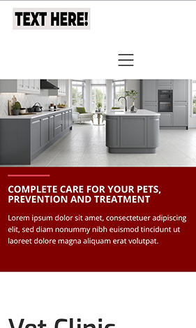
Thanks for your help with the banner colour. I still have a problem with the meny bar on a mibile. I did the changes you told me to do nut its is still the same. I have attached some photos below and the website url so you can have a look. Your userame and password and URL in private.
Thaks
J
URL Address:https://dev-website.uk/tempkit/
Photos:
--
Please Log in to join the conversation.
1 year 1 month ago #51831
by milos
Replied by milos on topic Help with the look
Hello,
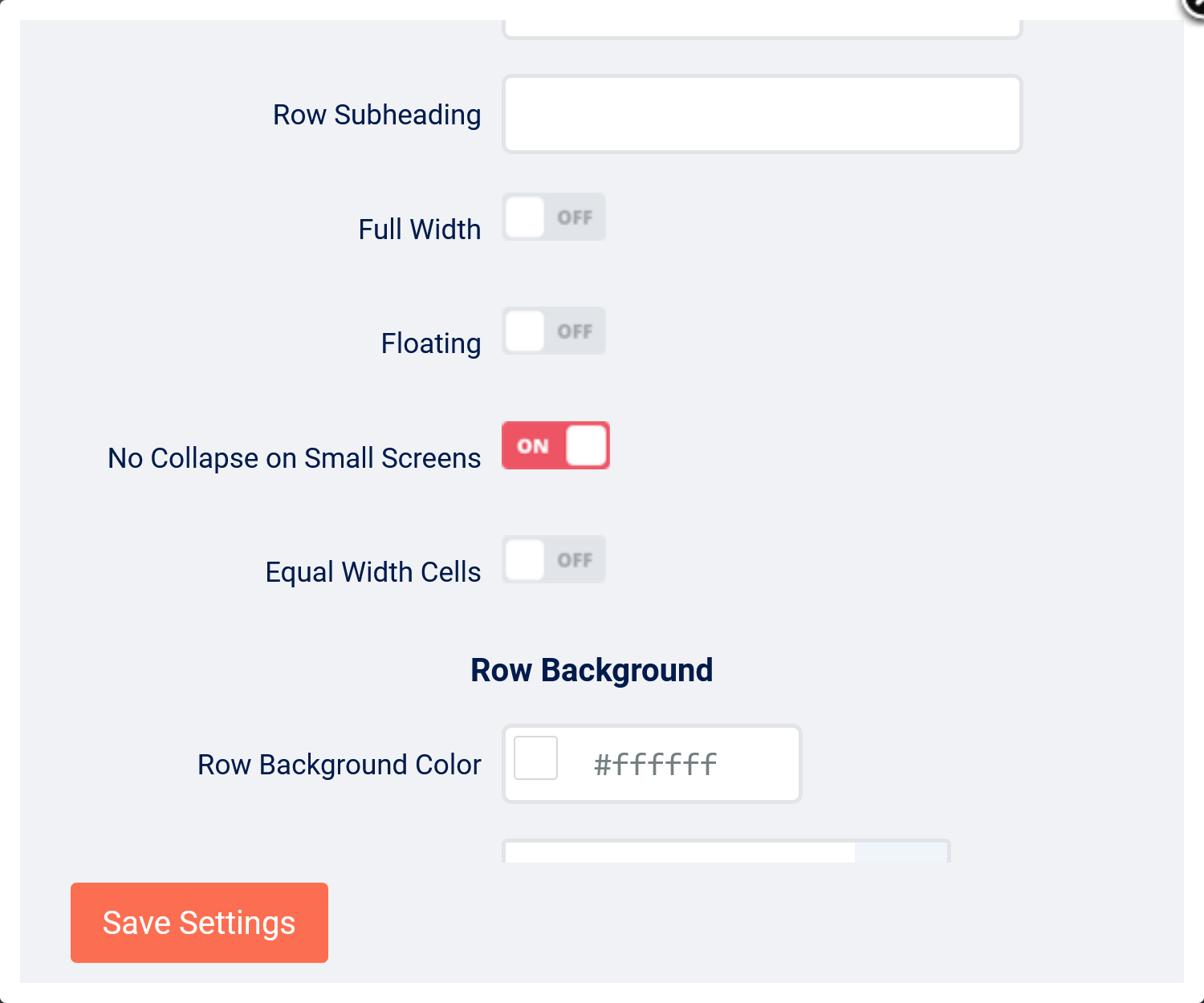
You should enable "No Collapse on Small Screens" and I see from your screenshot that you didn't.
Regards,
Milos
You should enable "No Collapse on Small Screens" and I see from your screenshot that you didn't.
Regards,
Milos
Please Log in to join the conversation.
-
ijohnparton
Active member - Topic Author
- Offline
- Member
-
Less
More
- Posts: 97
- Thank you received: 0
1 year 1 month ago #51832
by ijohnparton
 Hi Milos
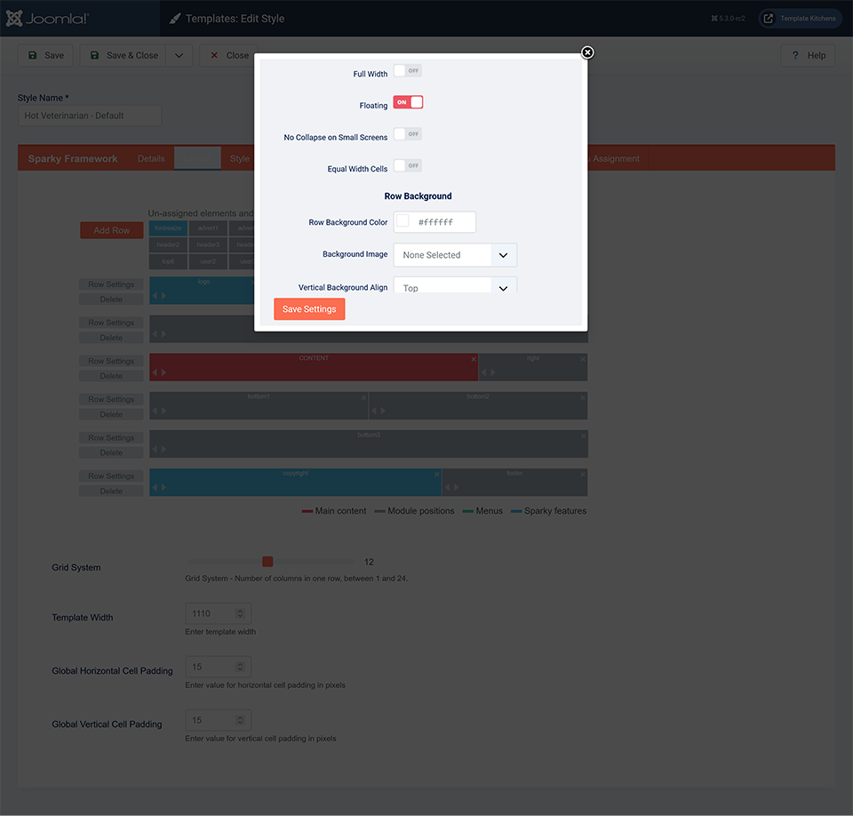
I havve changed that setting butt its still the same. Blow is a photo for the setting.
Thanks
Replied by ijohnparton on topic Help with the look
I havve changed that setting butt its still the same. Blow is a photo for the setting.
Thanks
Please Log in to join the conversation.
1 year 1 month ago #51834
by milos
Replied by milos on topic Help with the look
Hello,
In the file /media/templates/site/veterinarian/css/custom.css change this code:
to this:
Clear the browser cache on your mobile device to see the change.
Regards,
Milos
In the file /media/templates/site/veterinarian/css/custom.css change this code:
Code:
.logorow .mp_logo {
width: 50% !important;
}
to this:
Code:
.logorow .mp_logo, .logorow .mp_mainmenu {
width: 50% !important;
}
Clear the browser cache on your mobile device to see the change.
Regards,
Milos
Please Log in to join the conversation.
Time to create page: 0.122 seconds