Each row from your layout has a Row Settings button on the left hand side. If you click this button, a modal window will be opened with bunch of parameters that allow you to configure this row.
Keep in mind that when you click Save Settings button in the row modal window, your template settings are not saved yet! After that, click Save or Save & Close button to save your settings.
Row Properties
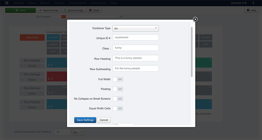
The first section contains parameters that allow you to determine a type of the row, distinguish this row from other rows, and some behavior options.
We marked some parameters here as advanced because only advanced users with knowledge about HTML and CSS will find them useful.
Container Type (advanced)
HTML5 brings many new elements. They allows better structuring of the source code of your site. In example, all elements that create your site before HTML5 were usually just <div>'s. Now, we can use the <header> element for the header, one or more <section> elements for different sections of our web page and <footer> element for the footer area.
By default, all your rows has Container Type set to <div>. But, you can change it if you understand HTML5 and if you think it will gain some benefits for your web site.
Note that changing the container type of any row will not have any effect on the appearance of this row on your site. This setting is visible only “under the hood” if you check the source code of your site.
Unique ID and Class (advanced)
These two parameters allow you to distinguish a row from other rows by adding an unique identifier or class to it. When your row has a class attached to it, you can style it in your custom CSS stylesheet. On the other hand, with a unique identifier set, it’s easy for you to find this row in DOM (Document Object Model) and add some behavior to it in your custom JavaScript code.
Row Heading and Sub Heading
If you have a row with several elements and want to attach a heading (and sub heading) which uses full site width and is placed above the row elements (but still part of the row), you can enter the heading (and sub heading) in these two parameters.
Without these options, to achieve this, you would need to create one more row above the current row, put a module in this row, and then enter the heading (and subheading) in a custom module. So, these parameters save you some time and make your layout and source code simpler.
Note that you can’t use these options on multilingual websites because the same heading (and subheading) will be used in all languages.
Full Width
The width of each row is, by default, determined by the site width. However, you can override the site width parameter for certain rows and make them use all available width in the window. This option is useful on rows with a single element (for example when you want only a carousel module to use full width).
However, this option works for rows with multiple elements as well. If it’s enabled in a row with multiple elements, instead of sharing the space available in the site width, the elements would share the space available in the entire window. The proportion of the elements will be respected though. For example, you are using a 4 grid system and have two elements in the row. The first element occupies 1/4 and the second element occupies 3/4 of the row space. If the full-width option is enabled for this row, the row width will be set to 100%, the width of the first element will be 25% and the width of the second element will be 75%.
Note that if your site width is set to 100%, usage of this option doesn’t have any effect because your entire site is using the full window width. Therefore, all your rows are already using full window width as well.
Floating
Although this option can be enabled for any row, it’s interesting for the rows from the upper area of your layout. It’s especially useful on the long web pages. When this option is enabled, the row will be floating on the screen when visitor scrolls your site down.
Usually, this option makes sense for the row where your top menu was placed. On the long pages, when a visitor reaches the bottom area of the page, s/he doesn’t need to scroll up to reach the menu because the row with the menu is already floating on the top of the screen. It allows the visitor to navigate to the other page easier.
No Collapse on Small Screens
One of the main principles of responsive web design is to collapse the elements when there’s no space to display them in a single row on the smaller screens. This is how Sparky Framework behaves if the responsive mode is enabled.
What if you have just two small elements in a row and if they both can fit in a single row even on the smallest screens. A good example of this is a row with the logo and top menu (the menu is converted to a hamburger button on the smaller screens). You can enable this option for such row and it will prevent collapsing of the elements in responsive mode for this row only.
Note this option has effect only on rows that contain more than one element.
Equal Width Cells
This option forces all elements in a row to have equal widths. Regardless of the element widths, you defined in the layout, this option will make all elements in the row to use an equal width. It’s useful if you have a row with multiple elements, but some of the elements are published on certain pages only.
For example, if you have 3 elements in a row and enable this option, they will use 1/3 of the site width each. But, what if one of the elements is a module that’s not published on a certain page(s)? On these pages, we will have 2 elements in this row, but one of them will use 2/3 of the site width because it will occupy the space of the missing element. So, the remaining two elements will not be equal. This situation is acceptable on some occasions, but not always. If you want to prevent this and make all row elements always have equal width, enable this option.
Row Background
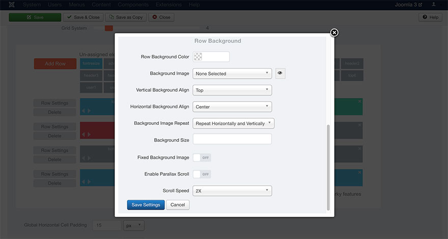
This set of options allows you to set background of the row and fine tune it. The row background will be applied to the full window width. Background size is not limited with the site width parameter.
Row Background Color
The simplest parameter allows you to select a background color for your row from the color picker.
Background Image
This is a selector witch lists all available images from the “images” folder of your template. To add your images to the list, you will need to use FTP client and upload them to:
Once you select an image, it will be used as a background image for the row.
Vertical and Horizontal Background Align
If background image size is less than the row size, you can use these options to set alignment of the background image. You can align the background image to the top, bottom, and center vertically. Similarly, you can align the background image to the left, center, and right-hand side horizontally.
Note that when background repeating is enabled, this option determines how the first occurrence of the background image will be aligned. Note this option has no effect if no background image is selected.
Background Image Repeat
If background image size is less than the row size, you can set the repetition of the background image. The image can be repeated both horizontally and vertically (tile), only horizontally or only vertically. You can also disable the repetition of the background image.
Note this option has no effect if no background image is selected.
Background Size
If background image size is less than row size, but you don’t want to enable any repetition, the row will be covered by the background image just partially. To avoid this and make your row fully covered with the background image regardless of the image size, you can use this parameter.
You should enter the static size of your background image or use one of the keywords to resize the background image automatically. If you enter two dimensions, they will be used as the width and height of the background image, regardless of the image size. In example, you can enter “200px 100px” (two values with units, separated with space). In this case, size of the background image will be scaled to 200px horizontally and 100px vertically.
You can also enter the keyword “cover” to make the background image fully covers the area of the row. If this keyword is entered, it will scale the background image to be as large as possible so the row area is completely covered.
Another keyword allowed is “contain”. If this keyword is entered, the background image will be scaled to the largest size such that both its width and its height can fit inside the row area.
Note this option has no effect if no background image is selected. If you enter a wrong value for this parameter, it will be disregarded.
Fixed Background Image
If this option is enabled, the background image of the row will not scroll with the rest of the site. It will have fixed position on screen all the time.
Note this option has no effect if no background image is selected.
Enable Parallax Scroll
If this option is enabled, background image of the row will scroll slower than the rest elements of the site. It will make a parallax effect, or an illusion that your site contains multiple levels when we scroll it up or down.
This option works best when the background-size parameter is set to “cover”. You should always check if your background image has enough height to perform the effect properly on all screen sizes.
Note this option has no effect if no background image is selected.
Scroll Speed
When parallax scroll is enabled, background image will scroll slower than the rest of the site. This parameter determines how much slower it should scroll.
Note this option has no effect if no background image is selected and if parallax scroll option is not enabled.
Sample
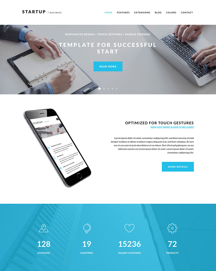
Can you recognize different settings of the rows? The first and the third rows have default settings. The second row uses full site width. The fourth row has different background. This is a sample from the Startup template. This template is available for all premium members.