- Posts: 160
- Thank you received: 1
Responsive layout
12 years 11 months ago #30135
by hkeyzer
Responsive layout was created by hkeyzer
When viewing site on a mobile device, the layout changes as expected. But on the front page and category pages, the product headers are behind the product images.
It would be better if the header was over the image how do we achieve this?
Can be viewed at www.fatbacks.co.nz
Thanks
Henk
It would be better if the header was over the image how do we achieve this?
Can be viewed at www.fatbacks.co.nz
Thanks
Henk
Please Log in to join the conversation.
-
ivan.milic
Support Staff - Offline
- Moderator
-

Less
More
- Posts: 14116
- Thank you received: 1639
12 years 11 months ago #30147
by ivan.milic
Replied by ivan.milic on topic Responsive layout
You mean title over image when expanded?
Please Log in to join the conversation.
12 years 11 months ago #30300
by hkeyzer
Replied by hkeyzer on topic Responsive layout
Hi,
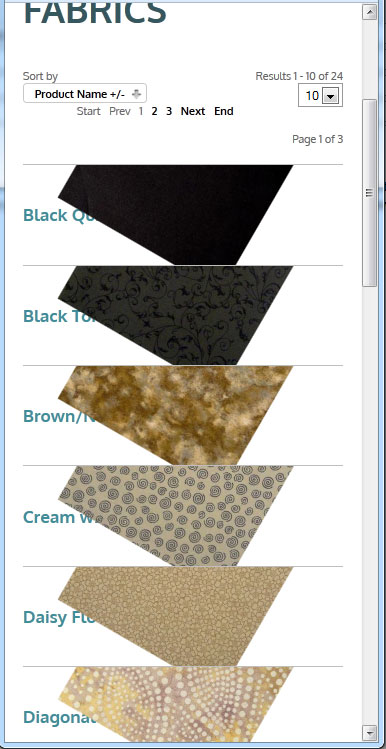
Yes - note in attached image (iphone emulated) the title (product name) is under the image.
Can this be changed to be above the image?
Thanks
Henk
Yes - note in attached image (iphone emulated) the title (product name) is under the image.
Can this be changed to be above the image?
Thanks
Henk
Please Log in to join the conversation.
-
ivan.milic
Support Staff - Offline
- Moderator
-
Less
More
- Posts: 14116
- Thank you received: 1639
12 years 11 months ago #30310
by ivan.milic
Replied by ivan.milic on topic Responsive layout
Send link so I could check fo solution live
Please Log in to join the conversation.
12 years 11 months ago #30348
by hkeyzer
Replied by hkeyzer on topic Responsive layout
Please Log in to join the conversation.
-
ivan.milic
Support Staff - Offline
- Moderator
-
Less
More
- Posts: 14116
- Thank you received: 1639
12 years 11 months ago #30354
by ivan.milic
Replied by ivan.milic on topic Responsive layout
Nothing can be done except this (add to bottom of template_css.css) :
@media all and (max-width: 476px) {
.product_intro h3 a{
position:absolute;
}
}
taht will enable text to be visible but it will move picture up leaving only tiny image corner to be visible
@media all and (max-width: 476px) {
.product_intro h3 a{
position:absolute;
}
}
taht will enable text to be visible but it will move picture up leaving only tiny image corner to be visible
Please Log in to join the conversation.
Time to create page: 0.207 seconds