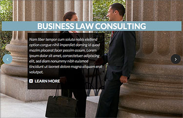
Hot Full Carousel has "full" in its name for two reasons. The first, regardless if you have 3 or 20 slides, it rotates in the same direction all the time, just like a real carousel. The second reason is its responsive features. This is responsive carousel with responsive behavior (if used with a responsive template). This module can have a fixed width, but can also occupy the full width of the screen. This behavior is maintained on large monitor screens, tablets, and smartphones. Of course, to make it happen, you must publish the module in the module position that spans the entire width of the screen. Check your template about this.
Responsive and Non-responsive Modes
The Non-responsive (Normal mode) of this module works just like our demo. It shows a big row of slides and moves them to the left. Some parts of the previous and next slides are visible. Besides the normal mode, this module has Full Screen Mode. When this mode is enabled, only one slide will be shown on the screen, and it will be spanned to occupy the full available space. An example of such behaviour is demonstrated in Sparks template demo.

The module can be used as an images-only rotator or as a rotator of the images with text. If you need to rotate only images, you don't enter anything for text and heading in the slide boxes. You can also combine some slides with and some without text. You can have up to 20 slides in this carousel, and the content for each slide (image and optionally heading and text) is entered in the tabs that represent slides. You can publish and unpublish slides; therefore, you can keep some temporary unneeded slides inactive and activate them later easily.
Slides and Text Boxes
Text boxes that can be used to describe slides and add some headings are optional but fully configurable. Text box width as well as its position and padding, can be set in percentages (useful for responsive sites). So, if you'd like to have a text box that has a half-width of the slide and is centered on the slide, you can enter 50(%) for the Text Box Width and 25(%) for the Text Box Horizontal Position. If you add padding of, for example, 1(%), the Text Box Horizontal Position should be reduced by this value (24), to keep the text box centered. But this is just an example... You can also position the text box more to the left or the right edge. There's also an option that can make the text box perfectly centered for all screen sizes. If this option is enabled, the Text Box Horizontal Position option will be ignored.
Slides rotate automatically, and you can control the time between two slides (by default it's 5 seconds). However, the slides can also rotate by clicking on the navigation buttons. The navigation buttons can always be present, present on mouse-over only, or disabled. The position of the navigation buttons, as well as their size, is fully configurable. The text displayed on both buttons is also parametrized.
To be up-to-date with modern web design standards, such as CSS3, our text boxes and navigation buttons can have a transparent background color and rounded borders. Those two parameters can also be configured. Text color and text size on both text boxes and navigation buttons are parametrized.
Slides created by this responsive carousel for Joomla can be linked. Clicking anywhere on the slide can lead to another page of your site or to any other address. For better ranking of your site, those links can also have a "title" parameter. It's worth mentioning that every image of the slides can have "alt" text of your choice.
Different Images for Mobiles
You can add name prefixes for slide images that will be used on mobile devices only. This option works only in responsive mode. Any word entered for "Name Prefix For Mobile Optimized Images" parameter will be added to the beginning of the names of your images. It's useful if you want to have different images displayed on mobile devices (optimized for mobile screens). For example, your image for a slide is image.jpg and you enter small_ for this parameter. In this case, on desktops image.jpg will be used for the slide, but on mobiles small_image.jpg will be used for the same slide. You can leave this parameter empty if you want the same images to be used on all devices.
If you entered the previous parameter, then mobile-optimized images will be used as long as the screen width is less than the value defined in the next parameter: "Maximum Resolution For Mobile Optimized Images" (in pixels).
The Other Options
All parameters of this module are described when you mouse over the parameter's name. The colors can be selected easily using the color picker. Background colors of the text box and buttons must be entered in RGB format. You can find out the RGB value of any color with this online HEX to RGB converter.
Responsive carousel module Hot Full Carousel has been tested with all browsers, including IE7+, Chrome, Firefox, Opera, and Safari. It's also tested on mobile platforms, such as iOS and Android.
Samples
In this sample taken from the Hot Justice template, the background image of the slide looks great on big desktop screens.
The name of the image from this slide is justice_slide2.jpg.


However, when the same image is used on mobile screens (less than 768px wide), the slide won't look good because the people will be cut off. Therefore, we will enter small_ for parameter "Name Prefix For Mobile Optimized Images" and create a new image optimized for mobiles. The image name in our case will be small_justice_slide2.jpg.