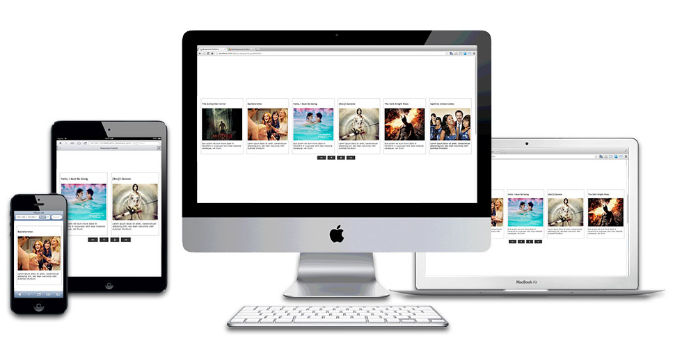
 We are witnesses of the flood of responsive websites. Those sites are made to be useful on all kinds of devices, from desktop computers to mobile phones. It's not enough to have only a responsive template. If you are about to use modules on the responsive website, those modules should be responsive as well. Hot Film Tape is responsive Joomla module because it supports the responsive websites. This module automatically resizes itself to fit the available screen space as much as possible.
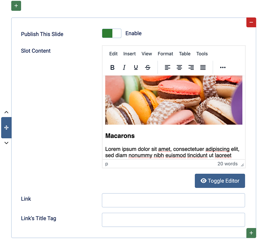
So, what does Hot Film Tape do, and what's its purpose for your site? Let's explain that in several sentences. This is an endless carousel that scrolls slides from right to left. You can have an unlimited number of slides, enable and disable them, and reorder them easily. Each slot can contain any HTML content that you enter using a WYSIWYG editor (such as JCE or TinyMCE) or using a plain text editor (if you are familiar with HTML). Therefore, each slot can contain anything you can think of. You can put text, images, YouTube movies, or anything else inside the slides. You can even make a combination, for example, the first slot with text, the second with images, the third with a movie, and the fourth with text and images. The content of the Hot Film Tape is completely up to you.
In this example, the module's container has a width set to 100%, so it occupies the full screen. If you are using this module with another template, ensure the container where you put the module has similar settings. But it's not necessary because this module can occupy only a part of your site's space. Another feature makes this module very flexible.
 Please spend some time experimenting with Hot Film Tape. You can also have multiple instances of the module on screen, just make sure that you entered different unique IDs in the parameters.
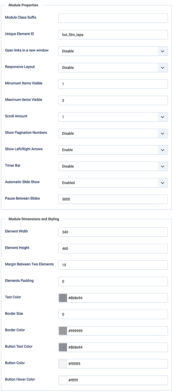
Hot Film Tape Module Properties
- Unique Element ID - If you need multiple instances of this module on the same page, each instance should have a different ID.
- Responsive Layout - If this mode is enabled, the width of slides won't be fixed, but variable depending on the available space on the screen.
- Minimum/Maximum Items Visible - How many slides to show on screen at once. Set minimum and maximum numbers. If the screen width is smaller, the module will show fewer slides, but not fewer than the minimum set here. Also, if the screen width is larger, the module will show more slides, but not more than the maximum set here.
- Scroll Amount - How many slides to scroll at once.
- Show Pagination Numbers - Select whether to show the pagination number buttons or not.
- Show Left/Right Arrows - Select whether to show the navigation buttons or not.
- Timer Bar - This option, when enabled, shows a timer line that counts the time between two slides.
- Automatic Slide Show - Select whether to change slides automatically or only manually.
Hot Film Tape Module Dimensions and Styling Options
- Element Width/Height - Set width and height of slides in pixels here. In the responsive mode, the width is variable.
- Margin Between Two Elements - Enter value in pixels.
- Elements Padding - Set padding inside each slide in pixels.
- Text Color - Using the color picker, you can select the color of text throughout the module.
- Border Size/Color - Options related to border of the slides. Set the size to 0 to disable the border.
- Button Options - These three options are related to the button's color and text color.