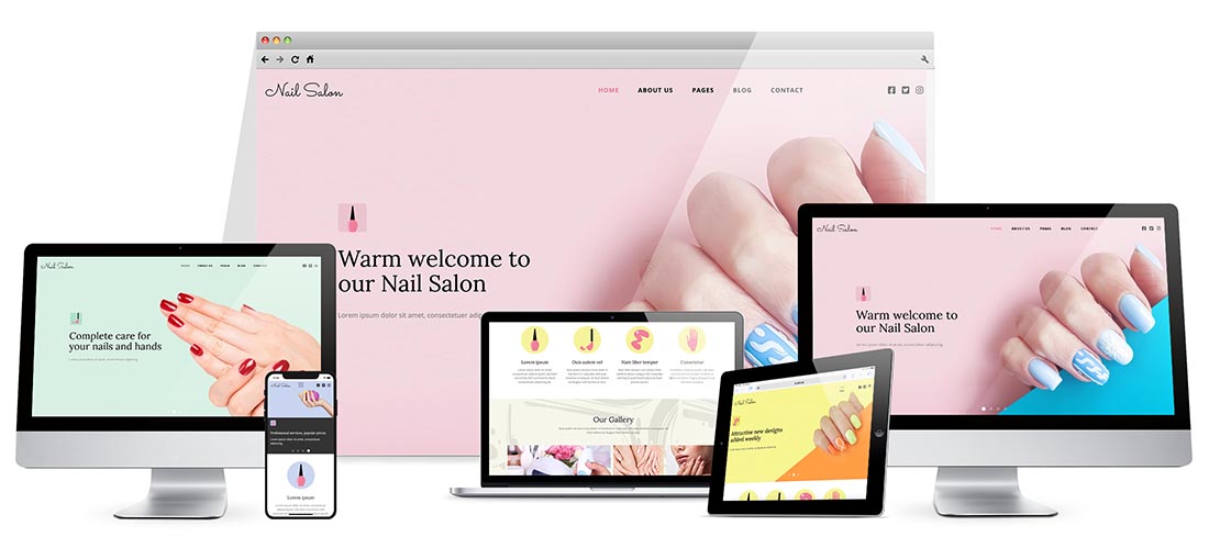

The Hot Nail Salon Template is a responsive Joomla! template appropriate for the development of websites for nail salons for ladies and for houses of beauty. It's based on a colorful design and contains a nice selection of images appropriate to nail salons. The home page contains a big carousel, descriptions of main services, as well as an image gallery, news, and testimonials.
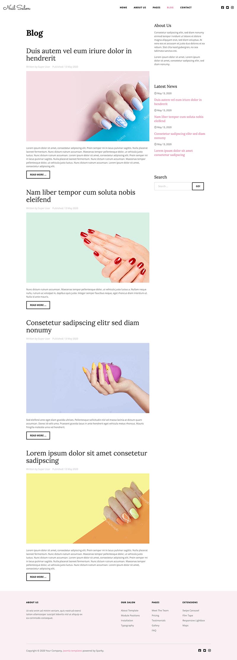
Besides the long home page, this template has a wide selection of other pages you might need for this kind of website. You can present the members of the salon's team on the dedicated team page. Also, a nice pricing table is included on a separate page. Although the testimonials are included in a carousel on the home page, there's also a dedicated page for the full list of client's testimonials. There's also a gallery page, a FAQ page, and so on. The blog section in this template can be used to represent the news from the nail salon to prospective customers.
We understand the importance of the presentation of your website on mobile devices. Therefore, the Nail Salon template is fully responsive and mobile-friendly. The output of this template on mobile devices is impeccable.
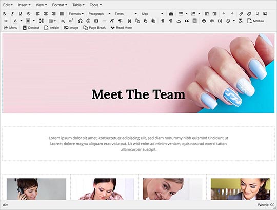
Edit the Content Visually
All content that you see on the demo of the Nail Salon template comes from Joomla! articles or modules. Therefore, it can be edited visually using the core Joomla! editor. The content is editable from the backend or the front-end. Therefore, you can rest assured that your website will be compatible with future major versions of Joomla!
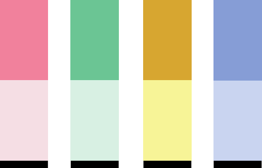
4 Color Schemes
The Nail Salon template is available in 4 different color variants. They are all based on different background colors of the containers and elements. It's easy to create your own color schemes through the template framework.
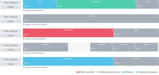
Nail Salon Template Framework
The backend of the Nail Salon Joomla! template is based on our Sparky Framework. Using a drag and drop technology you can create or edit website layout and other template elements (module positions, menus, logo, special features, etc.). This is also the place where you can change the font colors and text styles using a collection of 800+ Google fonts integrated into the framework.
Drop-down Menu
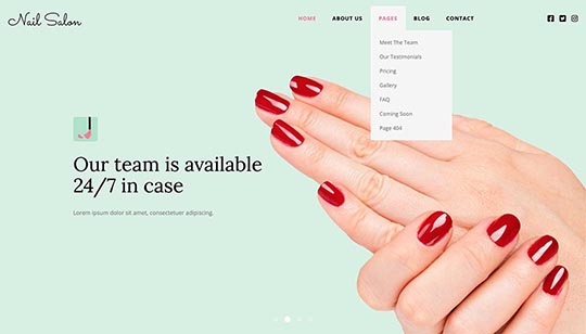
The Hot Nail Salon template has a top menu with submenu items on multiple levels. The sub-menu panes open on mouse-over action. The menu is fully responsive and it's converted to a responsive menu that's easy to handle on tablets and smartphones. You can change colors, fonts, sizes, and other menu parameters in the template settings.
Nail Salon Template Screen Shots
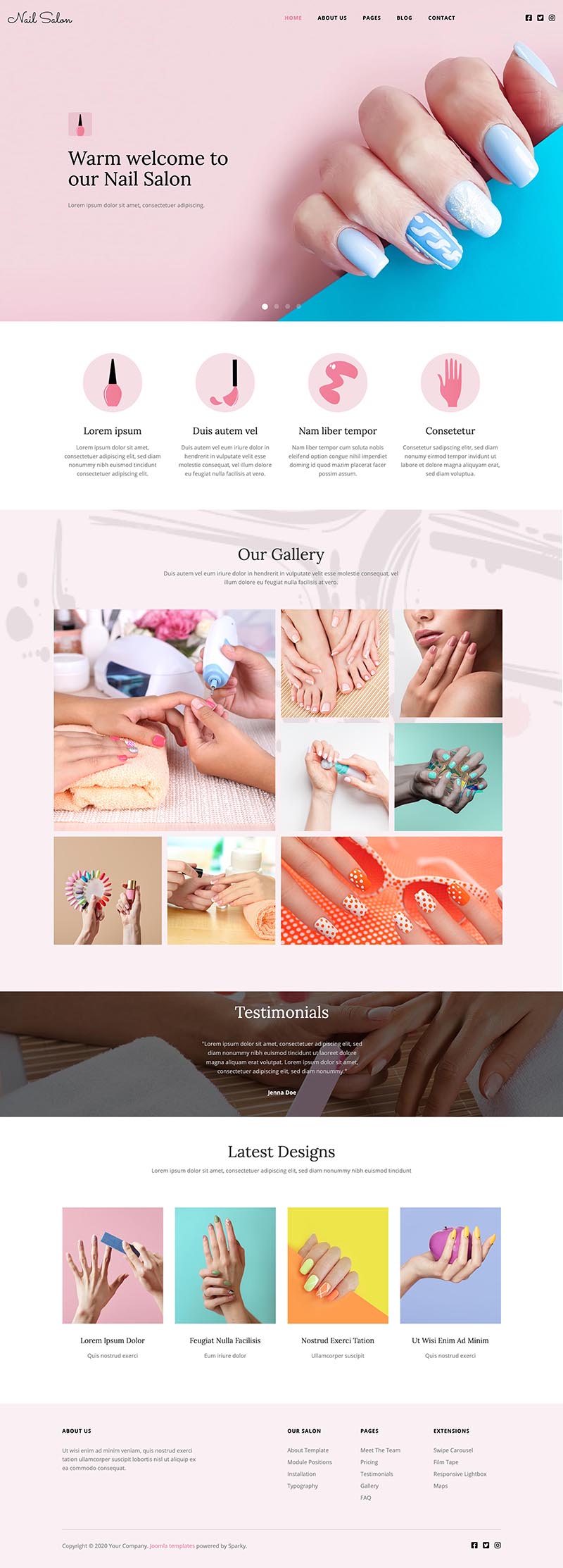
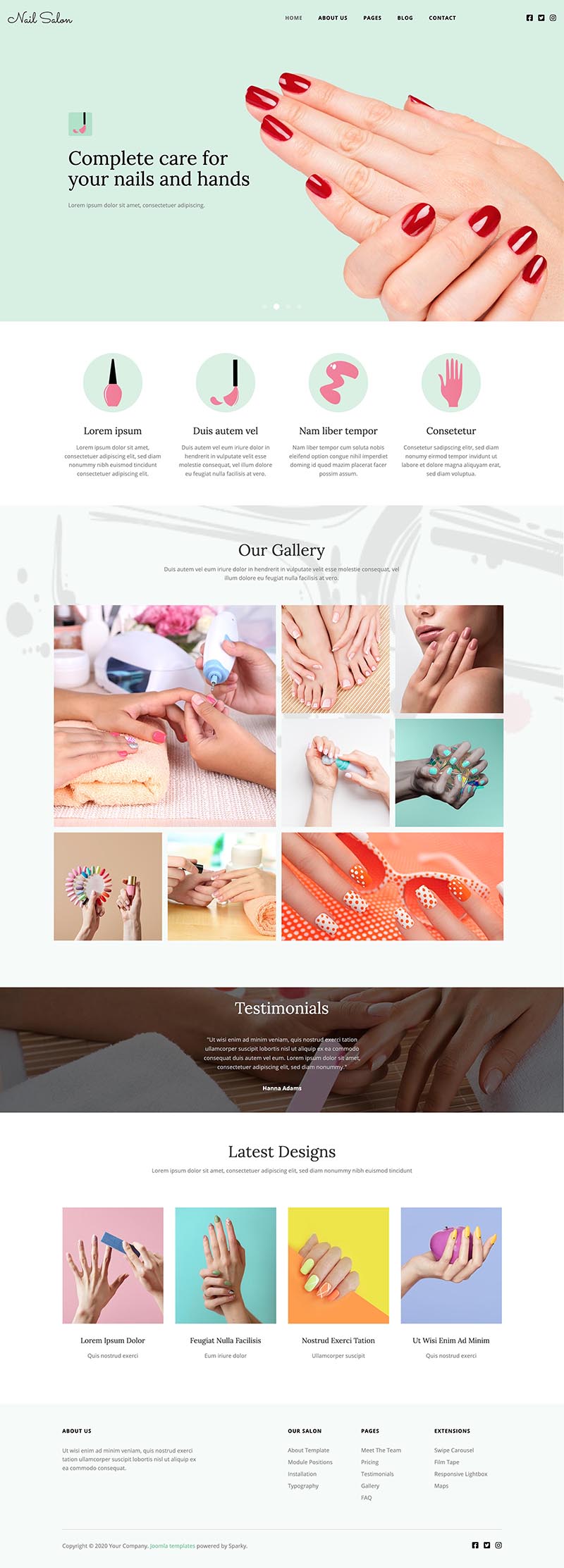
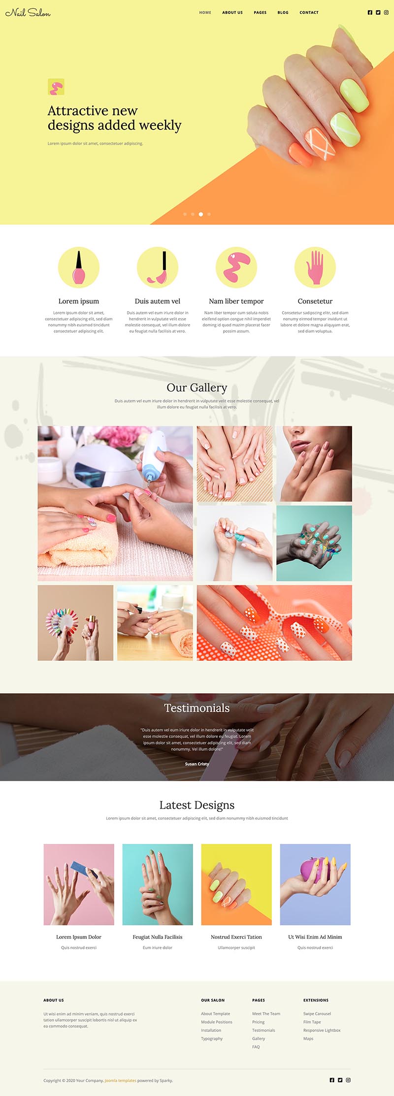
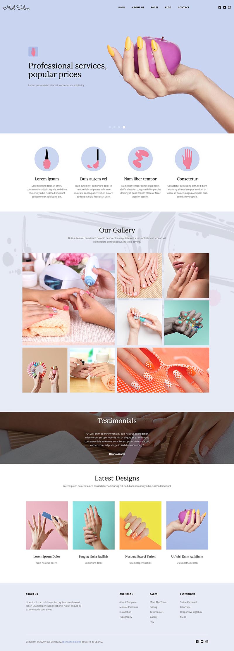
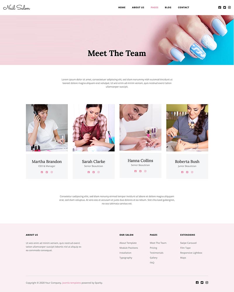
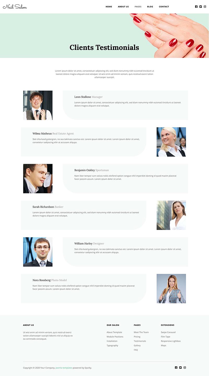
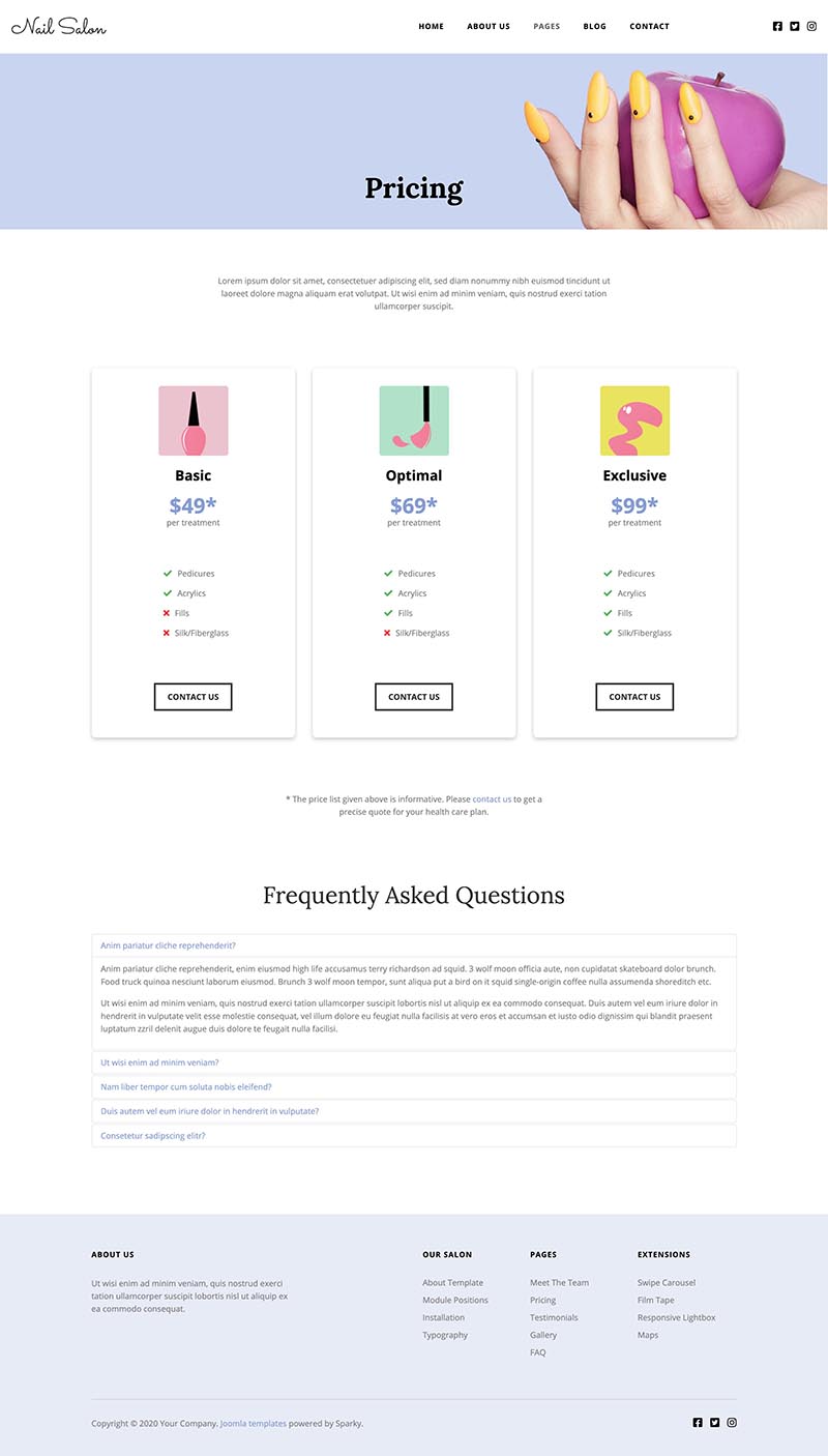
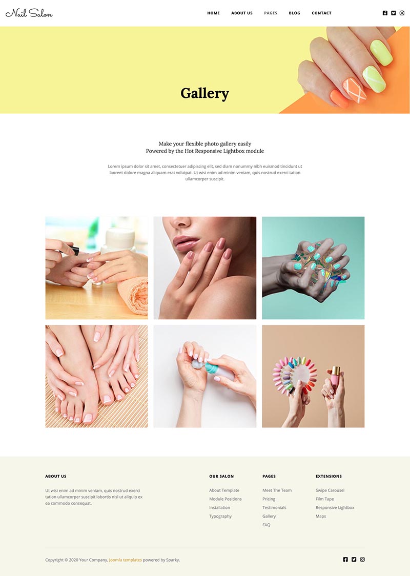
Nail Salon Template Features
- Responsive template, based on clean CSS/CSS3 code, and powered by the Sparky Joomla template framework.
- 4 pre-defined styles with different colors. All colors are easily customizable in Sparky options (infinite color options).
- Customization of the template's layout and adding/removing module positions is easy. It's powered by Sparky's drag and drop Layout Editor. Change layout and element dimensions easily whenever you need.
- Hot Swipe Carousel, Hot Film Tape, Hot Maps, Hot Slicebox, and Hot Responsive Lightbox are included with the template. All commercial modules included in this template are free for you if you buy the template (you save $15 per module). All extensions are pre-installed and configured.
- All demo content can be edited visually, using only the core Joomla! editor. Therefore, compatibility with all future Joomla! versions is guaranteed!
- HotStart (quick start installation) is available with both single purchase and membership plans. It copies the template with all extensions and demo pages easily.
- 13 module positions are used in our demo. An unlimited number of module positions can be added easily within the Layout Editor of the Sparky Framework if needed.
- A selection of 800+ locally hosted Google Fonts is available through the template options panel. The latest version of the Font Awesome icons collection is included.
- PSD source file and fonts are available.
- The top menu system with the presentation of the menu items in multiple levels in the drop-down panes.
- Tested with Chrome, Firefox, Edge, Safari, Opera, and IE10+ browsers. Tested on iOS and Android mobile devices.
- Support for RTL (right-to-left) languages.