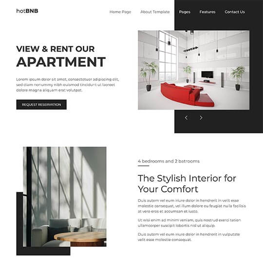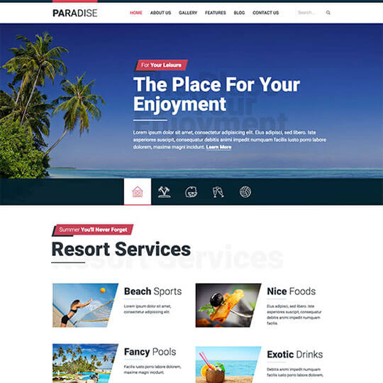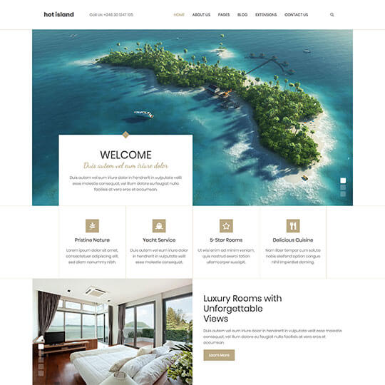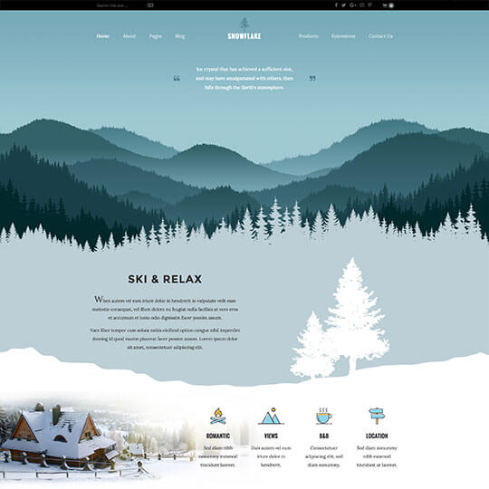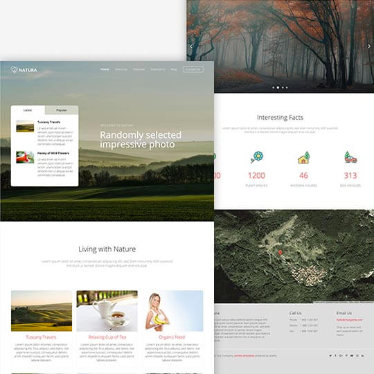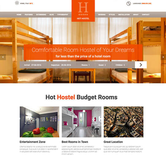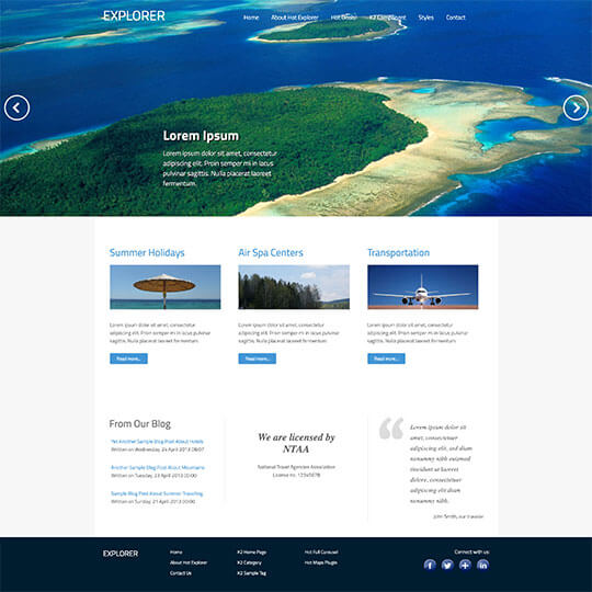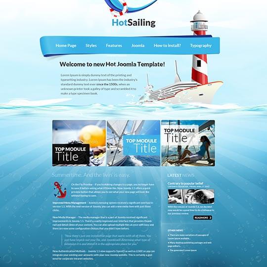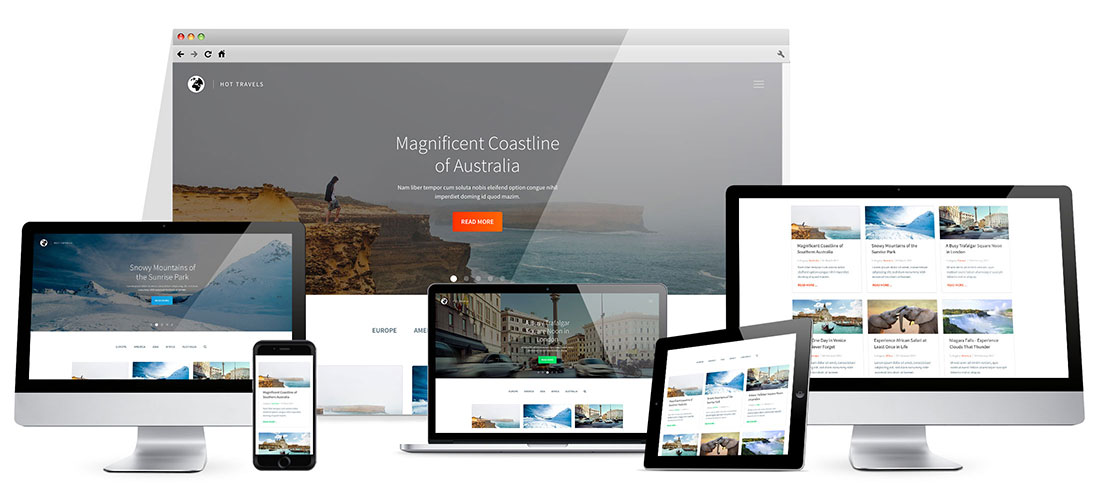

Hot Travels is the perfect travel template for people who are traveling often and want to create a blog about the travels. It's a responsive and mobile-friendly template based on a clean design, easy to read and navigate.
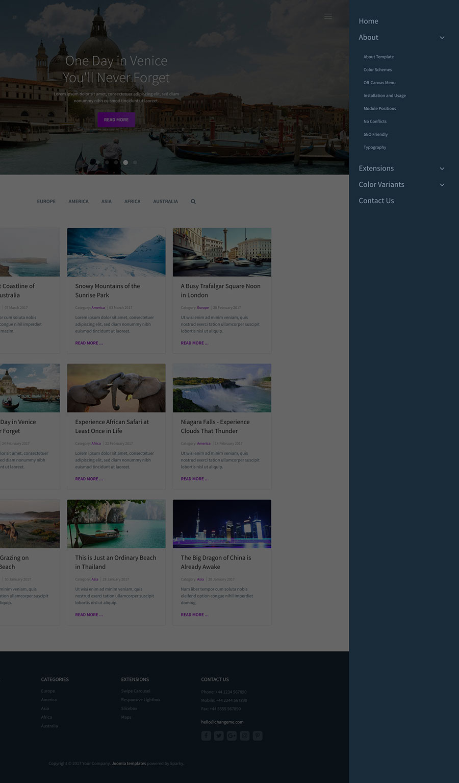
To let blog visitors search the posts more easily, we added a new feature to the travel template: Off-canvas search. Clicking the magnifier icon in the navigation menu will open a new screen with a big search form.
The big animated full-screen carousel on the home page allows blog authors to feature the most interesting or the most latest articles. It's recommended to use some darkened images in the carousel to improve the text readability. The blog posts are opened one by one as the visitor scrolls down the site. This is followed by a simple fade CSS3-powered animation.
In our demo of the travel template, the blog posts are categorized by continents, and the categories are listed in the world's Joomla menu. However, depending on the needs of your blog, you can easily change the categories and categorize your blog posts per different criteria.
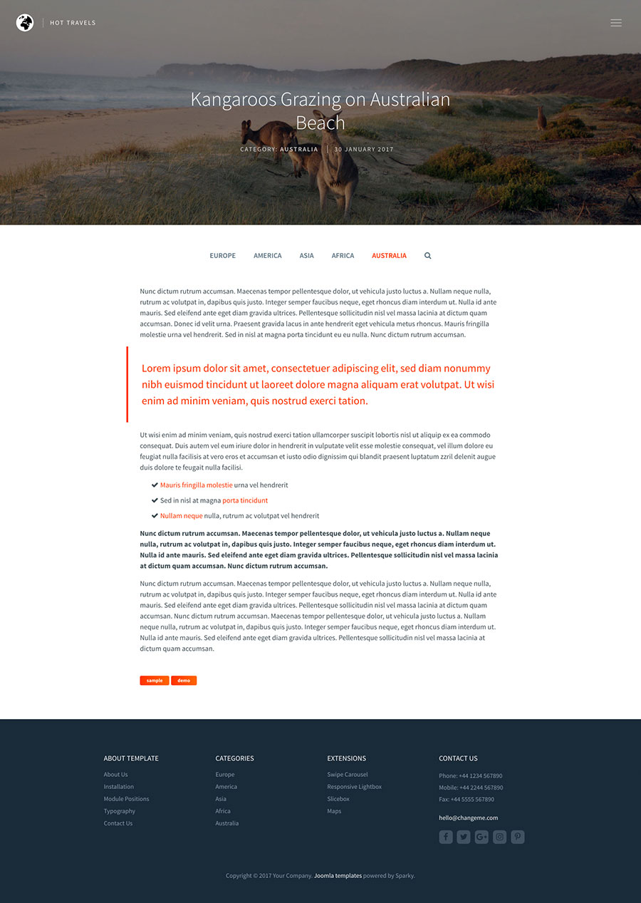
It's recommended to use the Images & Links tab for each blog post when you are editing it. This Joomla feature allows you to include a small intro image and a big featured image for each blog post. The travel template will then process these images properly with full support for retina screens. The featured image of each blog post will be used as a background for the post title and details and will be animated with a subtle parallax effect.
Travel Template Screen Shots
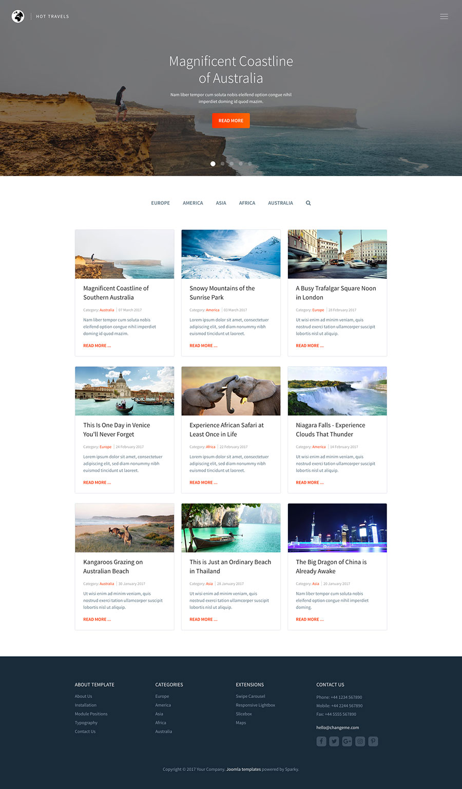
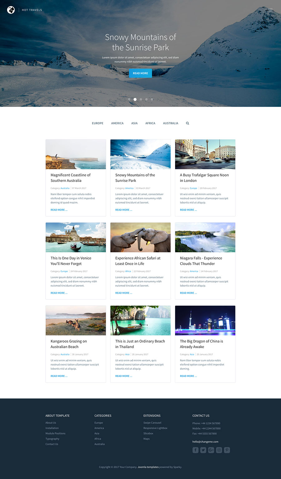
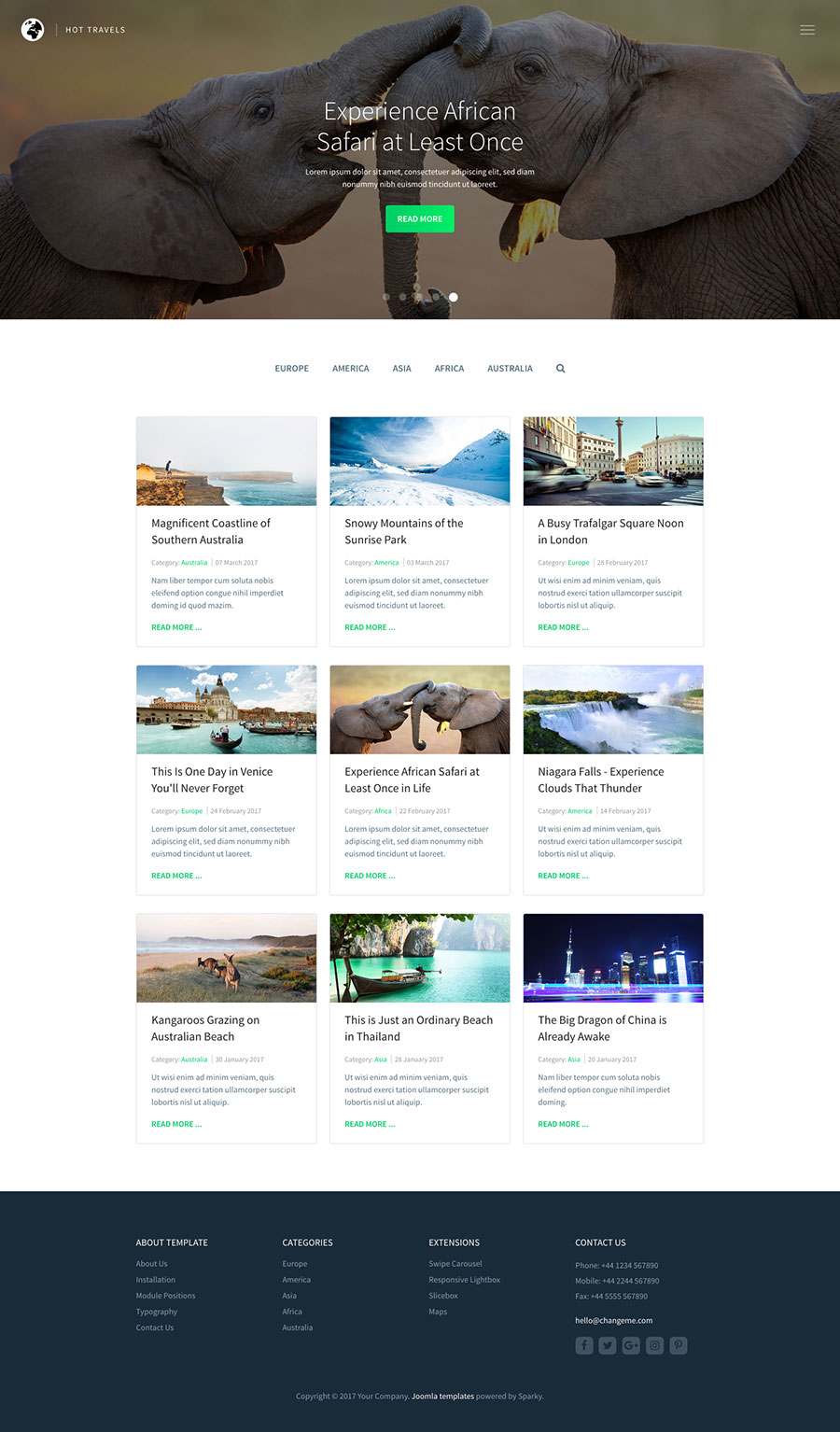
Features of the Hot Travels Template
This is the list of the Hot Travels template's most significant features, followed by some technical details:
- Responsive template, based on clean HTML5/CSS3 code, and powered by Sparky Framework for Joomla.
- CSS3 based animations improve the overall user experience of your site.
- 5 pre-defined color styles. All colors are easily customisable from the Sparky options (infinite color options).
- Customisation of the travel template's layout and adding/removing module positions is easy. It's powered by Sparky's drag and drop Layout Editor. Change layout and element dimensions easily whenever you need.
- Featured images of your articles (where available) will be moved to the top, displayed in the full width of the screen, and revealed through the parallax scroll effect.
- Total control of all menus through the framework. You can set the functionality and style of all your menus and drop them directly into the layout. The Hot Travels template uses an off-canvas menu, which allows multiple levels of menu items to be included in the side pane.
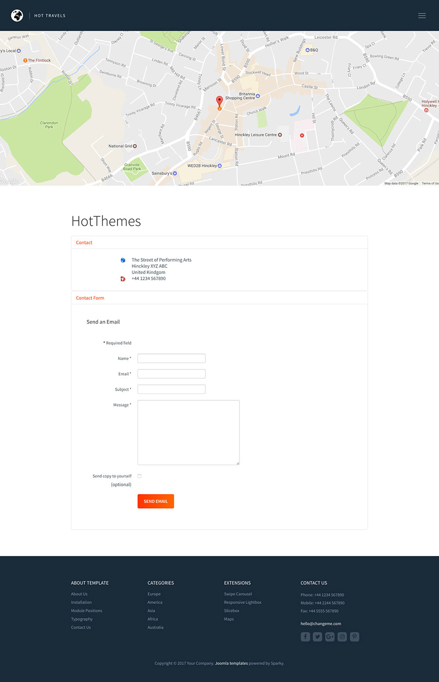
- Responsive Joomla modules included with this template: Hot Swipe Carousel (retina ready), Hot Slicebox, Hot Responsive Lightbox and Hot Maps module. All these modules are included with this template without additional fees (you save $19 per commercial module).
- Retina ready images in articles, custom modules, and carousel. Full support for modern screens with double pixel density.
- HotStart (SQL dump) available with both single purchase and any membership plan. It copies the template with all extensions and demo pages easily.
- Unlimited number of module positions can be added easily within the Layout Editor of Sparky Framework, if needed.
- PSD source file and fonts are included.
- This template has been tested with Chrome, Edge, Firefox, IE10+, Opera, and Safari browsers on PC and Mac computers. It's also tested on iOS and Android mobile devices.
- Support for RTL (right-to-left) languages.