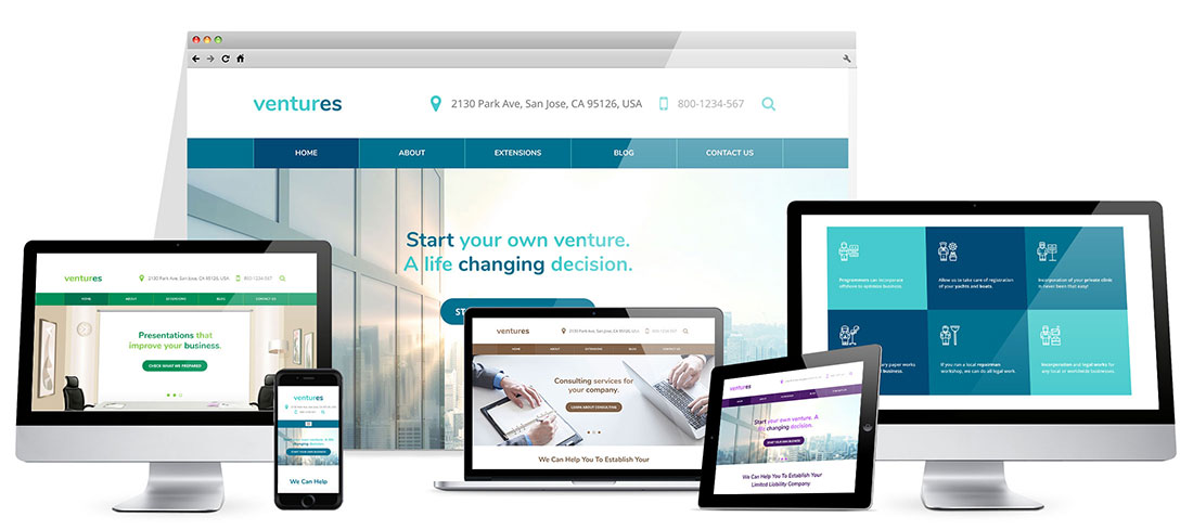
Hot Ventures is a responsive business template based on a clean design that looks good on all screen resolutions. Thanks to our powerful framework, we can use variable units for all template elements. That's necessary in the development of a responsive Joomla template that's optimized for all screens, from the biggest to the smallest.
This template can be used as a starting point for development of any kind of business and corporate websites.
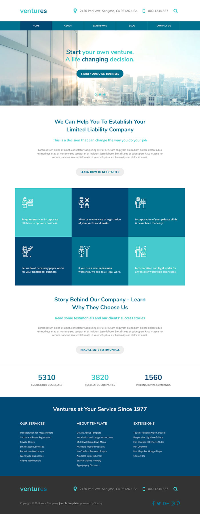
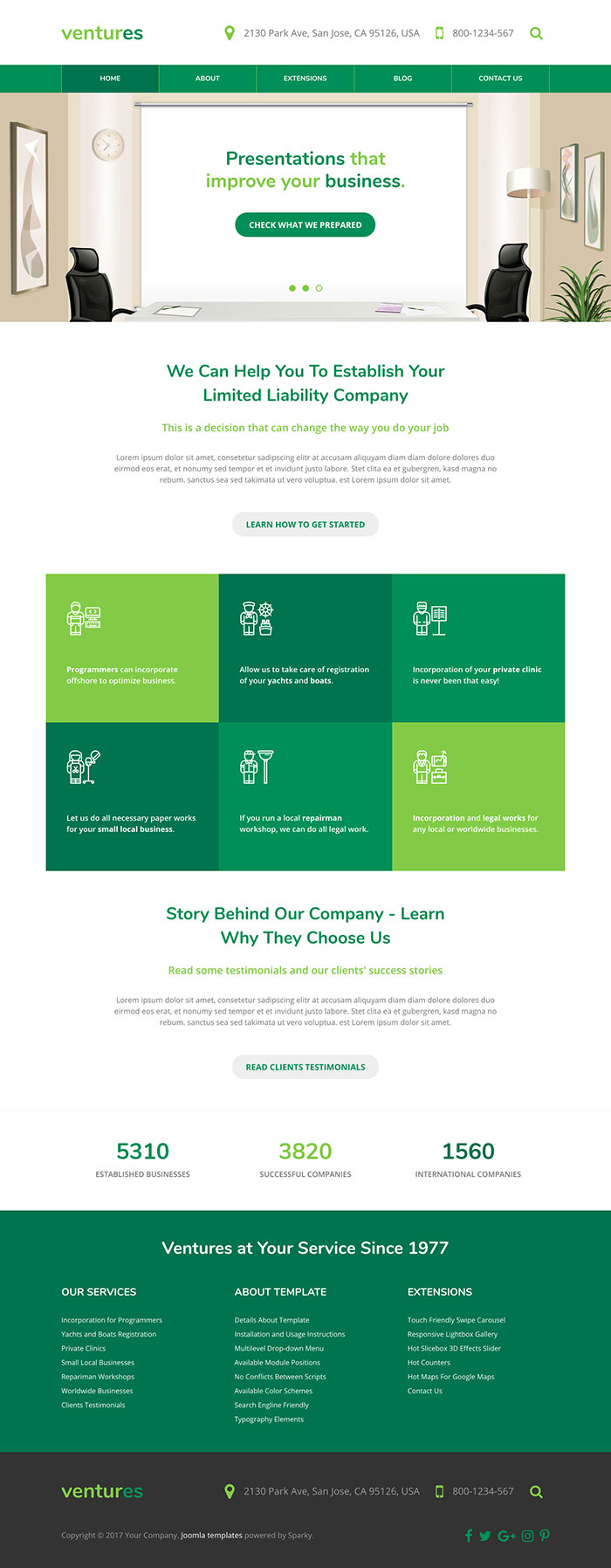
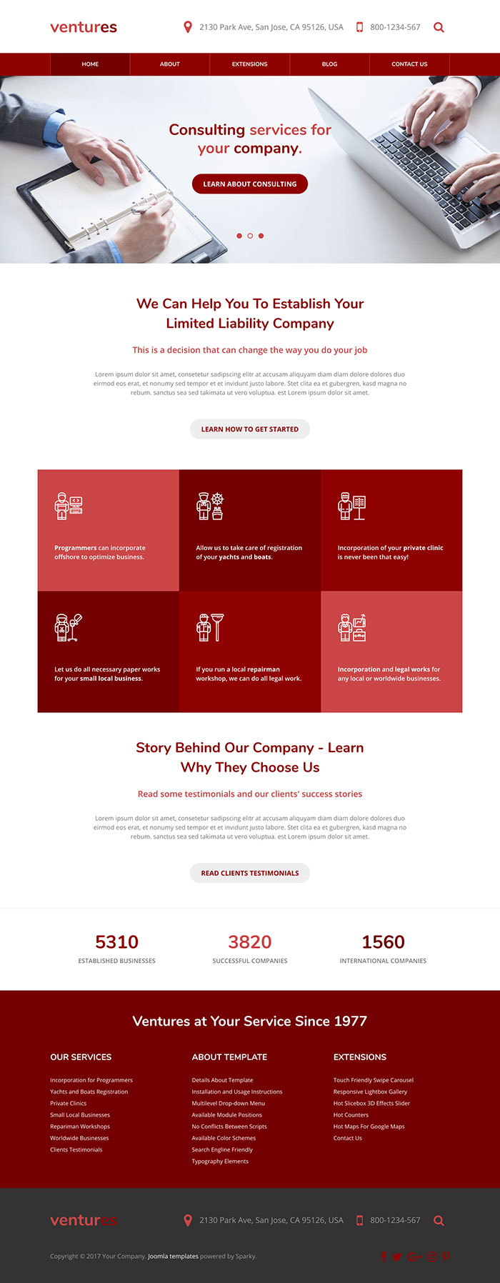
All necessary elements that a visitor expects on a responsive business website are available. The company's contact information is next to the logo.
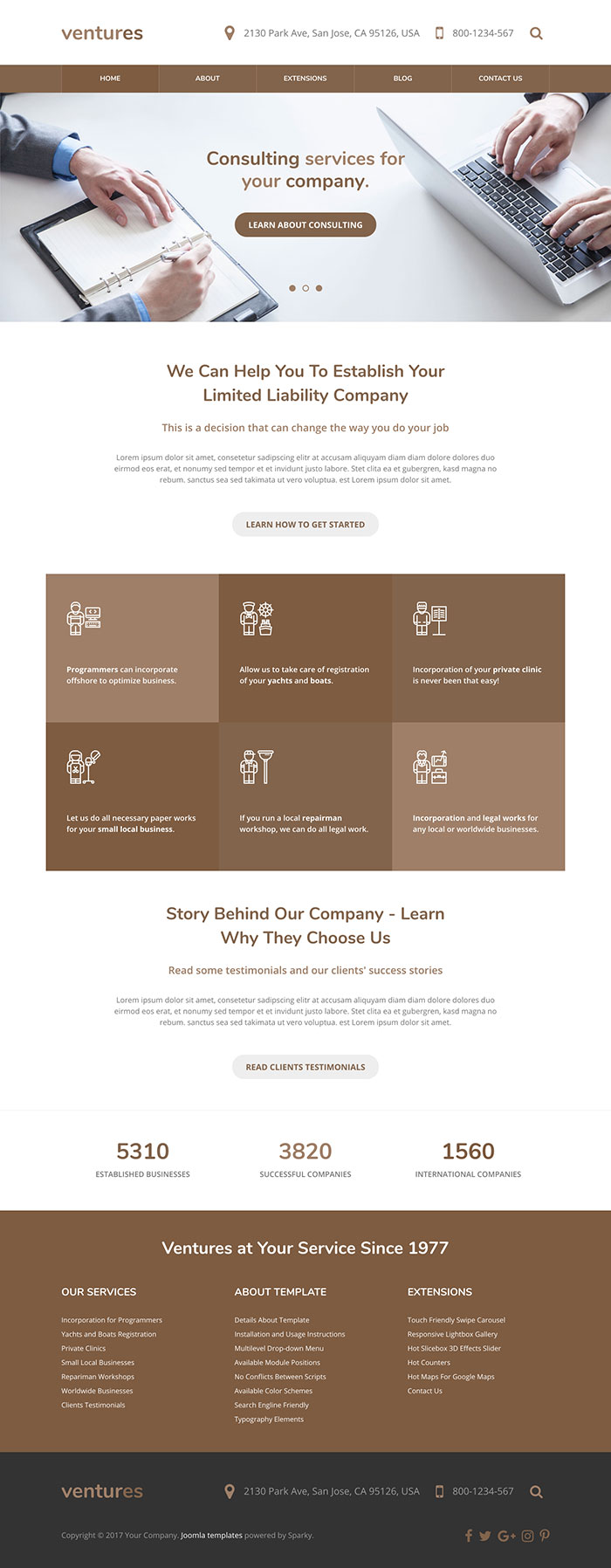
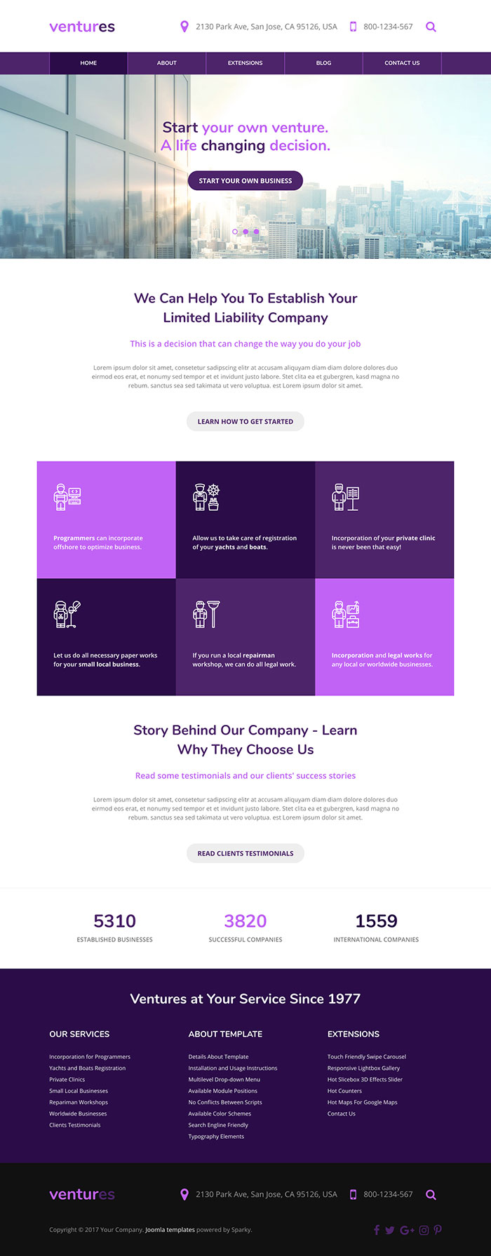
Several slides that we included in the demo of this template are actually intros to the company's main services. The big call to action buttons are used in the slider and other places of the site. Their purpose is to draw the visitor's attention and challenge them to visit one more page of your site. The middle area of the home page is reserved for 6 (or more) boxes that explain how the company's services can be helpful for various types of businesses.
The bottom area of the template is reserved for counters. They can be used to represent facts about your company as numbers. Also, there's a big footer area with various links to the site's pages.
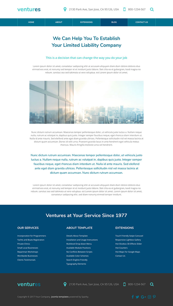
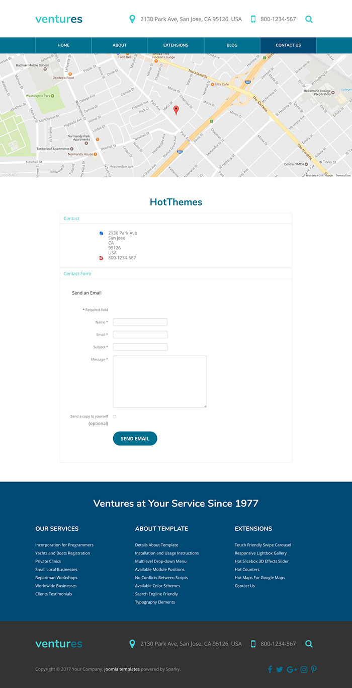
Hot Ventures is responsive business template that comes in 5 color variants. What's interesting here is that each variant contains only one color in 3 tones. There are blue, green, red, brown, and purple color schemes. You can also make yours by making slight changes in the provided CSS files.
Ventures Template Screen Shots
Features of the Hot Ventures Template
This is the list of the Hot Ventures template's most significant features, followed by some technical details:
- Responsive template, based on clean HTML5/CSS3 code, and powered by Sparky Framework for Joomla.
- CSS3-based animations welcome visitors to your site.
- 5 pre-defined color styles. All colors are easily customisable from the Sparky options (infinite color options).
- Customisation of the template's layout and adding/removing module positions is easy. It's powered by Sparky's drag-and-drop Layout Editor. Change the layout and elements' dimensions easily whenever you need.
- We included several responsive Joomla modules with this template. Hot Swipe Carousel (retina ready), Hot Slicebox, Hot Responsive Lightbox, Hot Counters and Hot Maps module. All these modules are included with this template without any additional fees (you'll save $15 per commercial module).
- Retina-ready images in articles, custom modules, and carousel. Full support for modern screens with double pixel density.
- HotStart (SQL dump) is available with either a single purchase or any membership plan. It copies the template with all extensions and demo pages easily.
- An unlimited number of module positions can be added easily within the Layout Editor of Sparky Framework, if needed.
- PSD source file and fonts are included.
- Total control of all menus through the framework. You can set functionalities and style of all your menus and drop them directly into the layout. This template uses a Drop-down menu, which allows multiple levels of menu items to be included in the drop-down panes.
- This template has been tested with Chrome, Edge, Firefox, IE10+, Opera, and Safari browsers on PC and Mac computers. It's also tested on iOS and Android mobile devices.
- Support for RTL (right-to-left) languages.