You have probably already heard about the responsive web design or about the responsive web sites and the responsive templates. Many people don't make any difference between the regular and the responsive web design. This is a new approach in web design, not because it uses some new or super modern techniques, but because it's needed today much more than it was needed in the past. On this page, we will explain why responsive websites are so popular these days.
In the beginning, people used desktop/laptop computers only to access the World Wide Web. So, "to visit a web page" meant that one should sit ahead of the monitor, open a favorite browser (such as Netscape Navigator or Internet Explorer) and then access the website. Only the "wired" Internet connections (dial-up, DSL, cable...) were available. Therefore, we were limited to surfing the web only from our houses or our offices. Furthermore, mobile devices these years were very simple and had limited monochromatic displays. Surfing the web on them was just science fiction!
 Several years later, it became possible to transmit data over the mobile networks, not just the voice. Since the mobile phones from that age had very simple, sometimes text-only screens, the specific kind of websites were born: WAP (wireless application protocol) websites. That's miniaturized versions of the "normal" websites, optimized for extremely simple screens of the old mobile phones. The WAP websites did not become popular. They were too simple and offered a poor user experience. However, it was just the beginning...
Wireless networks (Wi-Fi) became popular later. They allowed us to take our laptops and surf the web from the nearby park, or from any other place where a Wi-Fi network was available. The Internet is not only in our homes and our offices anymore. It's everywhere where Wi-Fi is available, but still only on our desktop/laptop computers. You'll agree, it's not too comfortable to carry the laptop bag everywhere, so there's still a lot of space for enhancements of the mobile Internet.
The oldest smartphones were mostly based on Palm, Windows Mobile, and Blackberry operating systems. Many people (geeks?) started to use them in everyday life. However, the user experience on the oldest smartphones was far from perfect. Also, there were not a lot of users who access websites using smartphones. Logically, webmasters didn't optimize their websites for such users, because their percentage was usually below 1%.
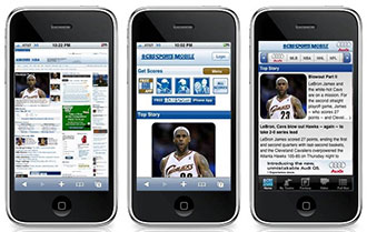
 The first Apple's iPhone dramatically increased user experience on the smartphones, especially surfing the web on them. This device became instantly very popular, loved, and owned by millions of users. Google's version of the mobile operating system, named Android, became available after that. Since many companies (such as Samsung, HTC, Sony...) make smartphones based on Android, not only one (as Apple in iPhone's case), it's the most popular mobile operating system today. We should also mention the tablets here, the bigger version of the smartphones. The tablets were available in the markets decades ago, but not widely accepted. However, one more Apple product, the iPad, has changed everything! Millions of people are using tablets today, mostly to surf the web or check email. Apple's iOS is still the most popular operating system for the tablets, although there are many other cheaper tablets available from other companies, usually based on Google's Android.
From the surfer's point of view, the present is much better than the past. But, let's look at things from the web designer's point of view. Our website statistics say, the percent of visitors who visit the websites using desktop/laptop computers are still the largest one! However, now we have a lot more of those who are visiting the websites using smartphones or tablets. Their share is not under 1% anymore, like in the old (good?) times. It's now 10%, 20%, maybe even 40%! And it's still increasing! So let's face the situation, maybe 1/3 of all people who are visiting your website using mobile devices (smartphones and tablets). It's clear now, your website must look perfect not only on the monitor but also on mobile devices. It's not enough anymore to create a website that looks good on the big screens only. But, let's think about, how to make a design that looks nice on a monitor that has a resolution of 1920x1080 pixels, and, at the same time, looks nice on a tablet that has 1024x768 pixels? And finally on the smartphone that has a resolution of 480x800 pixels.
You would probably think "No, it's absolutely not possible". And you would be absolutely correct! You must create 2 or even 3 different designs for your website. Depending on the visitor's environment, an appropriate version of your website should be presented on the screen. And there's more work needed to be done now than in the old (good?) times! Well, c'est la vie, you will create 2 or 3 (or even more) layouts in Photoshop, but now what? The first idea is probably to create 2, 3, or more separate websites and serve them according to the visitor's screen resolution. Well, it's possible, maybe even the easiest approach, but keep in mind, if you change a page, you would need to change it several times. If you add/remove a page, you would need to add/remove it several times, once for every version of your website. It's not an ideal solution but could be used on some occasions.
 Probably the best solution for the problem caused by the progress of the mobile technology, is the responsive web design. In this approach, we will take several different designs optimized for several different screen sizes, and develop one website of them. The website should be programmed to "respond" properly depending on the user's screen size! There are many techniques on how to make it happen. Usually, it's JavaScript and PHP code which "serve" an appropriate CSS stylesheet, depending on the user's screen size. For example, if the visitor uses a desktop/laptop computer, he/she has a lot of screen space, so our website will load CSS that makes a layout with three columns. However, if the visitor uses a tablet, our website can "call" the CSS stylesheet which makes the layout of two columns. In this case, the left and the right columns can be positioned one above the other. Finally, if the visitor uses a smartphone, our website loads the CSS stylesheet which makes a layout that has only one column and puts the left and the right column above or below the main content.
The problem has been solved! Now, you have a responsive website that is optimized for all devices, from tiny smartphones to high-definition plasma or LCD screens. And, since you've created only one website, you don't have to make the same changes several times. Responsive web design requires more effort than the usual web design, but keep in mind, the responsive websites will serve each of your visitors properly, no matter how they are accessing your website. More happy website visitors will bring a better online presence and more customers.
In conclusion, we will give you some samples of responsive templates. Responsive Joomla template named as "Hot Responsive" uses some advanced jQuery plugins to offer the possibility of adding a lot of content on site which is easily accessible on both large and small screens. The second example is Joomla wedding template named as "Hot Wedding" (presented in the illustration). You can visit the template's demo on both desktop computer and smartphone (or tablet) to check how it adapts in different environments.