Your hero image looks fine on desktop screens, but it's too short on mobile screens and doesn't occupy enough of the mobile screen. How to fix this?
The problem and two possible solutions
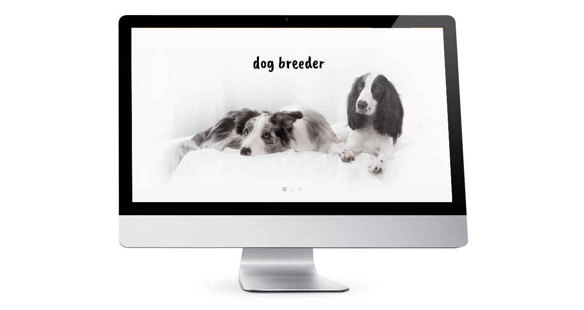
Let's analyze first why this problem happens. This is an example of a hero image or a carousel slide image on desktops. As you can see, it looks just fine.
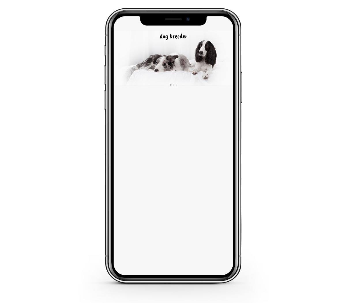
Now, let's see exactly the same image on mobile screens. Its height is too short.
Option 1
How about making it occupy more of the mobile screen? There's certainly some CSS code that can make it happen. But, if we add such code, what result will we get? See the following image where we simply enlarged the image height keeping the image width unchanged. This will be our option 1.
Ok, the image height is ok now, but what happened to the dogs?
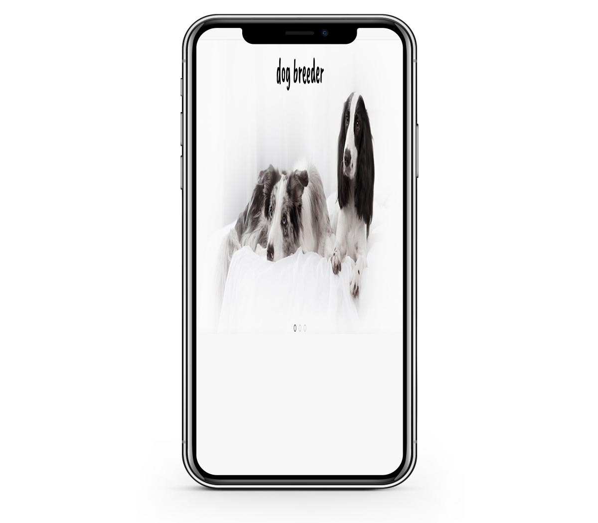
Well, but increasing the image height and keeping the image width unchanged, we changed the image's aspect ratio. Now, the image looks squeezed and it's certainly not something that we need. The result is not satisfying, so let's try something else.
Option 2
How about increasing both image width and height? The aspect ratio will be unchanged in this case, right? So, let's see the result. This will be our option 2.

Ok, the dogs are not squeezed now as the image aspect ratio is not changed. But, something else happened. As you can see, the image is cropped and one of the two dogs is cut off from the screen. Again, the results are not satisfying.
Perhaps there's no easy solution! What we can do?
Simple solutions that we tried in options 1 and 2 that increase image height only or crop the image obviously don't work.
You run into this problem probably because you are using our carousel modules. We have two carousel modules and they are working differently. In some cases, you should use the Swipe Carousel, in other cases, the Full Carousel is better. It depends on your slides' images.
Hot Swipe Carousel
The Hot Swipe Carousel module maintains the aspect ratio of the carousel image. So, the same image is used on all screens. To make the image height bigger on mobile screens, you will have to make it bigger on desktop screens as well. For example, if you are using images of resolution 1920 x 700 pixels, try using images of resolution 1920 x 1000 pixels.
This module also has an option to put the carousel slide text below the image on mobile screens. The slides will look higher on mobile screens if you are using this option, but the slide images will be the same. More info about this module is here.
Hot Full Carousel
The Hot Full Carousel keeps the image height on all screens. Therefore, image cropping will occur as we explained in option 2 above.
However, this module has an option to use different images for mobile screens. So, for example, if your slide image for desktops is 1920 x 700 px, you can use a different image of resolution 400 x 700 for mobile screens. However, this approach will require your photo editing skills as you will need to make two images and make them both look good. More info about this module is here.