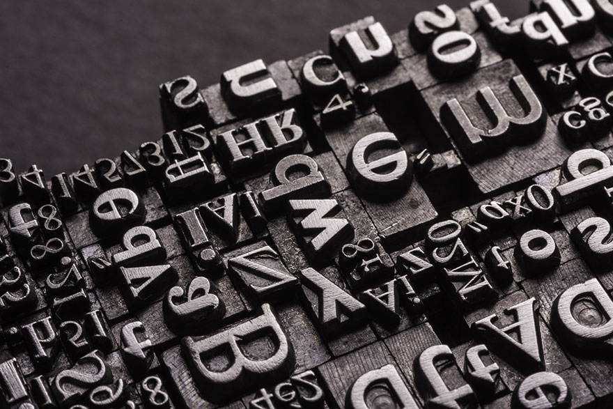
Fonts are a powerful element of any presentation. Yes, you might have background HD pictures or cute icons to jazz up your layouts but it’s the fonts that carry your message. Thus, whether you are creating a resume or an invitation card or a restaurant menu or a website or a marketing pitch- fonts play a crucial role in defining your presentation and the main message. The post below offers some invaluable tips on using fonts the right way in typography.
Increase know-how on font family
You have to be aware of the major font groups and their layouts when you are about to choose the right font for your presentation. There are 5 main groups here:
1. Geometric Sans
A fusion of Geometric, Realistic & Grotesk, Geometric Sans-Serifs fonts are identified by strict geometric outlook - depicting a minimalist yet smart appeal with strokes of the same width. These fonts are objective, clear, impersonal, and modern. Some examples would be: Helvetica, Avant Garde, Gotham etc.
2. Humanist Sans
In sharp contrast to the previous one, Humanist Sans, as the name implies, carries a human and empathetic outlook, added to being modern and clear. These fonts somewhat represent the casual nature of a hand-written piece which is not marked by the starkness of corporate sincerity. Some examples include: Myriad, Verdana, Frutiger etc.
3. Old Style
Commonly dubbed as "Venetian", the Old Style fonts are actually the oldest typefaces and carry forward century-long developments in calligraphic forms. These are characterized by curved letters tilted to the left and slight contrast between thin and thick. Some examples include Palatino, Garamond, Bembo etc.
4. Transitional & Modern
These fonts were created as designers were looking for something beyond the unassuming Old Style, something that would be more geometric, virtuosic, and sharp. They are most noted for being stylish, strong, and dynamic. Examples include: Times New Roman, Didot, Baskerville etc.
5. Slab Serifs
Slab Serifs are identified with simple forms carrying slight contrast between thin and thick, powered by rectangular solid boxy feeling at the end. Very authoritarian in looks, these fonts are capable to add a distinctive twist to anything. Examples include: Rockwell, Clarendon, Archer etc.
Know your purpose
This is the first thing to consider when it comes to choosing fonts for your presentation. If you are looking for something for resumes, you have to choose something formal and strong such as Times New Roman. On the other hand, if you are preparing your poster in Victorian or Wild West style, you have the Old Style fonts to go for. A sales page promoting a beauty product would take to Humanist Sans while a flyer marketing men's colognes will look best in Avant Garde or Baskerville.
It should be stressed here that there are some fonts that tend to go with almost everything as they can easily adapt to surroundings. Some of the examples include: Gotham, Myriad, Perpetua, Electra, Mercury, Interstate etc.
Group contrasting fonts for more appeal
A similar line of fonts cannot create the desired impact as much as is created by font pairs placed in contrast. The maxim here is to choose fonts with sharp contrasts to trigger more interest. For example, you can take to an edgy fusion of a decorative font with Geometric Sans. If you are creating websites from templates, make sure the chosen website templates allow you to include contrasting font pairs for a stronger visual appeal. These are especially great for the banners on your website or the sales pages.
Use various font sizes
All lines and words used in your text are not equally important. For example, the heading is always more crucial than the 3rd line in the second paragraph. You have to maintain this hierarchical condition with your font selection as well. Even if you choose more or less the same type of fonts, you have to maintain a difference with the font size. By that logic, the heading will definitely have the highest font size followed by the subhead and the main message body.
Use all caps for more emphasis
If you prefer a minimalist style without compromising on the impact quotient, choose fonts with all caps for slogans or taglines on your ad banners. These fonts would be great to create a dominant effect especially when used against stark plain dark backgrounds.
It should be easily legible
This is definitely one of the most important pointers when it comes to choosing fonts for your presentations, especially when you are talking about longer text bodies. You have to make sure that the fonts you are using are not only in alignment with the purpose of your presentation but are easily legible as well. Do not use uppercase text or detailed script fonts for large text bodies as it leads to visual strain for the reader.
Text positioning and alignment
When it comes to using fonts in typography, not only you would need to be careful about which font type to use but also about how to use them on your layout and this is where you must take great note of text positioning and alignment. Your selection of font positioning and alignment would depend largely on your background image. The backdrop is an important part of your banner or presentation too. Hence your job is to make sure that the font does not disturb the essence of the image at the same time it is able to create an impact on the viewer’s mind independently.
Author Bio:
The article has been written by Lisa Smith, author, and designer at Sample Templates.