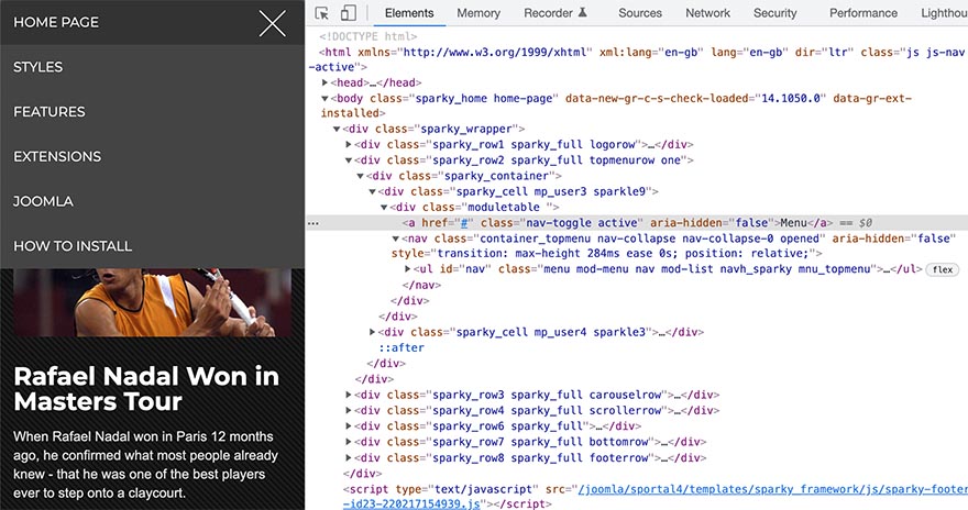
Our Joomla templates come with the menus that are optimized for mobile devices (responsive mobile menus). These kind of menus are also known as hamburger menus because they are converted to a "hamburger-like" icon on smartphones. By default, the mobile menu comes in dark color scheme (light fonts on the dark background). The example image is from the Sportal template. However, the mobile menu looks similar in the other templates. This tutorial explains how to change the colors of the mobile menu.
There's no option in the template settings to change the mobile menu color. However, it's easy to add some custom CSS code and change the mobile menu background and font colors.
To change the mobile menu's colors, go to the template options and under Custom > CSS tab add the following CSS after (below) the last }
.nav-collapse.opened > ul {
	background: #eeeeee;
}

.nav-collapse.opened li.active, .nav-collapse.opened li:hover {
    background-color: #dddddd;
}

.nav-collapse.opened li.active a {
    color: #000000 !important;
}

.nav-collapse.opened li a, .nav-collapse.opened li span {
	color: #333333 !important;
}
Also, you can add the same code in the template file /css/custom.css and upload it by FTP if you are adding your custom CSS this way.
The above CSS code will change the mobile menu colors and create the mobile menus fonts dark on the light background. You can change the colors from the above example and use the colors that are more appropriate for your website.
You can also change the mobile menu icon, and it's explained in the Responsive section of the Sparky Framework documentation.
Also, you can learn more about adding custom CSS code in the Sparky Framework.