We are witnesses to a flood of responsive websites and templates. All the promises that, if your site uses them, it will look great on all screen sizes and all mobile devices based on iOS (iPad, iPhone, and iPod) and Android (Samsung Galaxy, Google Nexus, etc.). But how actually you can test this. Should you go to your favorite electronic store and buy all those devices?
Well, you can, and this is probably the most reliable way to test your site on all those devices that are popular today. However, new devices with new OS versions are announced almost every day. So, buying all those devices is simply not possible (or too expensive). Therefore, we must find an alternative way to test our site, ideally on our desktop computer.
First things first... Check what your visitors use mostly
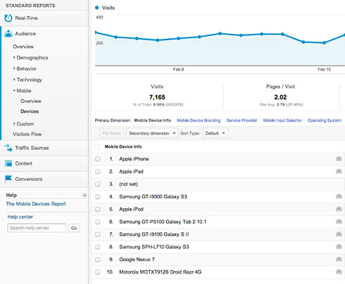 Free Google Analytics tool (everybody probably already know about this service) is the easiest way to check what devices your visitors use while visiting your site. If you are already using Google Analytics, sign in, and check your site. Under Standard Reports < Audience tab, you'll notice the Mobile link. Under Overview, you can check how many visitors are accessing your site with mobile devices (and how many are not). This information will give you a better idea of how many of your visitors are on mobiles and how many potential customers you're losing if you don't optimize your site for mobile devices. Under Devices link, Analytics will give you the list of all devices that are used while accessing your site. This is very important information because you would wish to test your site on devices that the majority of your visitors are using. It's probably not crucial to optimize the site for a device that's used by 1 visitor only.
The list of the widely used devices is probably expected. The majority of users are on iOS (iPad and iPhone) and on Android (Samsung Galaxy, Google Nexus...). This situation could be changed in the future when new devices hit the markets. So, make sure you keep yourself updated regarding this matter.
Testing site on iOS without iPhone or iPad
 This part will probably cause a headache for all Windows and Linux users. To test iOS on the official iOS Simulator developed by Apple, you would need a Mac, actually Mac OS X (Mac's operating system). I said actually because it's possible to run Mac OS X on some PC configurations or as a virtual machine on PC. However, this exceeds the scope of this blog post, so we'll assume that you already have a machine with Mac OS X running and operational.
You would need to download and install Xcode. The installation is straightforward. Xcode is an integrated development environment for apps for Mac, iPhone, and iPad. However, we need only a part of this package called the iOS Simulator. When you run Xcode, under the Xcode menu, select Open Developer Tools and click iOS Simulator. The simulator of all iOS devices (with or without Retina display) will start. Now, you have a fully functional and usable iOS device on your screen, so you can start your testing. Open Safari browser, type your site address and enjoy (or start crying). To change the iOS device, go to Hardware > Device and select an option. Apple's devices are not listed per brand (for example, iPad3), but per screen types, they are using. However, if your site works great on all offered screen sizes, you can be 100% sure that your site looks great on all Apple's mobile devices.
Testing site on Android without Android device
 Google (developer of Android mobile operating system) also have a similar tool as Apple's Xcode, however, it can be installed on all operating systems, including Windows, Mac OS X and Linux. Android SDK can be downloaded from official site and this is the first (and the only official) way for testing your site in an Android environment without an Android device. When you run the Android Developer Tools application, you should create an Android Virtual Device and start it. When you create the device, you can select screen resolution. After running the virtual device, you will notice it's an emulation of the Android environment is very slow, even if you have a fast computer with a lot of RAM.
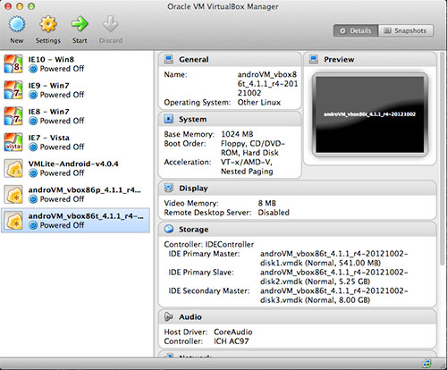
Therefore, for emulation of Android on PC, Mac or Linux, I would recommend running a virtual machine under Oracle's free VirtualBox. The important thing is that you have the latest version of Virtual Box and VirtualBox Extension Pack that can be downloaded from the VirtualBox official site. Installation of VirtualBox is straightforward, and if you need help, read the official documentation. After you downloaded and installed it, all you need is to find an appropriate Android image file and run it. Downloading Android image files is legal, as Android is a free open-source system. You can find the image files for both Android-based mobile phones and tablets on the Internet. These files have extension .ova and are compatible with PC, Mac, or Linux.
 After you downloaded the .ova file, double-click it and Virtual Box will import it (it make take some time). When it's done, Android device(s) will be shown on the VirtualBox list. Select it and click Start. Android devices will start loading as if you power on your Android phone or tablet. When it's started, unlock it (as you do with a phone or tablet), and start a browser. Then enter the address of your site, and test.
You'll notice that running Android under VirtualBox is much faster than with an official emulator. New (or older) versions of Android require finding and installation of new .ova files which is a fast and straightforward process.
Things to avoid
There are many websites on the Internet that offers the ability to test your site on mobile devices. Responsivator and similar are actually not emulators of mobile devices and results that you get from them could be different from what's actually seen on the mobile screens. Those websites usually offer just a collection of iframes that sizes as per the mobile device's screen size, but they render the site using a normal desktop browser, not a mobile browser. We strongly recommend you avoid such services when testing responsive features of your site.
Testing HotThemes products
If you are about to test our products, we recommend you to remove iFrame from our template selector when testing, especially when you don't get expected results when testing any responsive template. Our aim is to make our products responsive whenever it's possible. The examples of our responsive templates are Responsive Joomla template, Joomla Wedding template, One Page template, Food Spirit (one page), Responsive Portfolio template, etc.
The Sparky Framework could also produce responsive websites, so we strongly recommend you to try it.