To activate the Accordion Menu type, open the Menus tab, click on your menu and select the Accordion Menu option from the selector. Many new parameters will become available.
This menu type shows the menu items lined vertically. It’s appropriate for menus located in the sidebars, left or right hand side from your content. You can also use it in different locations, as appropriate.
The menu items from the first level are displayed vertically. The menu items from the second level will be revealed when visitor move mouse pointer over or click (depending of the parameter value) the first level menu item. The same is valid for all deeper levels. So, this menu type changes its height and open deeper level menu items dynamically, like an “accordion”.
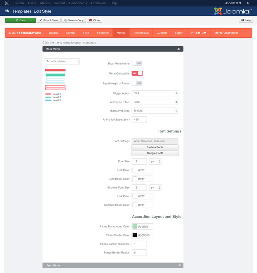
Show Menu Name parameter allows you to include the menu name above the menu items.
If Menu Collapsible parameter is enabled, the accordion menu will be collapsed when visitor move mouse pointer over or click (depending of the parameter value), if there are children menu items. Disabling this parameter will disable the main feature of this menu type.
If the Equal Height of Panes parameter is enabled, the panes with children menu items from the second and deeper levels will always have the equal heights, regardless of the number of menu items in them. The height will be selected per the highest pane and used for all the remaining panes.
Trigger Action parameter has two options: mouse over and click. It allows you to select whether to show children menu items as soon as the mouse pointer is over the parent menu item or to wait for a click.
Animation Effect parameter has two options: Slide and Bounce slide. This animation effect is used when the panes with children menu items are revealing.
Third Level Slide parameter has two options: To right and Drop. It defines which direction will be used when pane with the third and deeper level menu items is revealing.
Animation Speed parameter defines the duration of the animation in milliseconds.
Font Settings
Font Settings, Font Size, Link Color and Link Hover Color parameters are related to the first level menu items. Sublinks Font Size, Sublinks Link Color and Sublinks Hover Color parameters are related to the second and deeper level menu items. All these parameters allow you to select properties of the font that will be used for your menu items. They work the same way as those we explained in the Style section (read this section for more details).
Accordion Layout and Style
This set of parameters defines the layout and style of your Accordion menu.
Panes Background Color parameter allows you to select background for the accordion menu panes.
Panes Border Color parameter allows you to select border color for the accordion menu panes. This option has no effect if the “Panes Border Thickness” is set to 0.
Panes Border Thickness parameter allows you to set border thickness for the accordion menu panes. To disable the border, enter 0 in this parameter.
Panes Border Radius parameter allows you to set rounded corners of the accordion menu panes. This parameter should be entered in pixels.
Sample
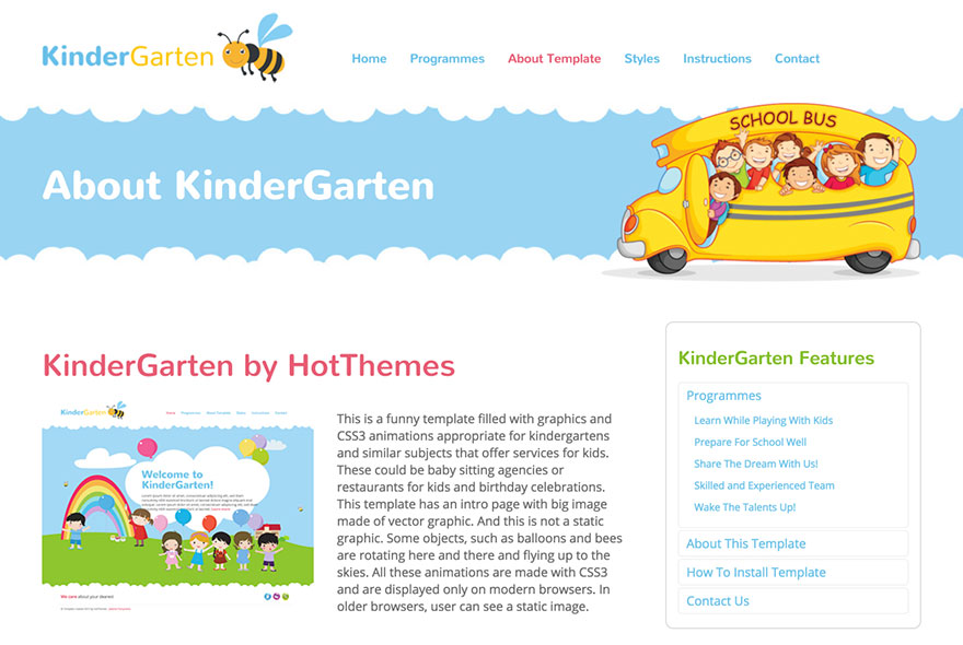
This sample is from the Kindergarten template. This template is available for all premium members.