To activate the Drop-down Menu type, open the Menus tab, click on your menu and select Drop-down Menu option from the selector. Many new parameters will become available now.
This type of menu is very often used on websites for the main navigation. The first level menu items (parents) are lined horizontally. When visitor move mouse pointer or touch the screen over the first level menu item that has children menu items, a pane with vertically stacked children menu items will be revealed using the selected animation effect. The menu items from the third and deeper levels, will be displayed in the separated panes when visitor move mouse pointer or touch screen over their parents.
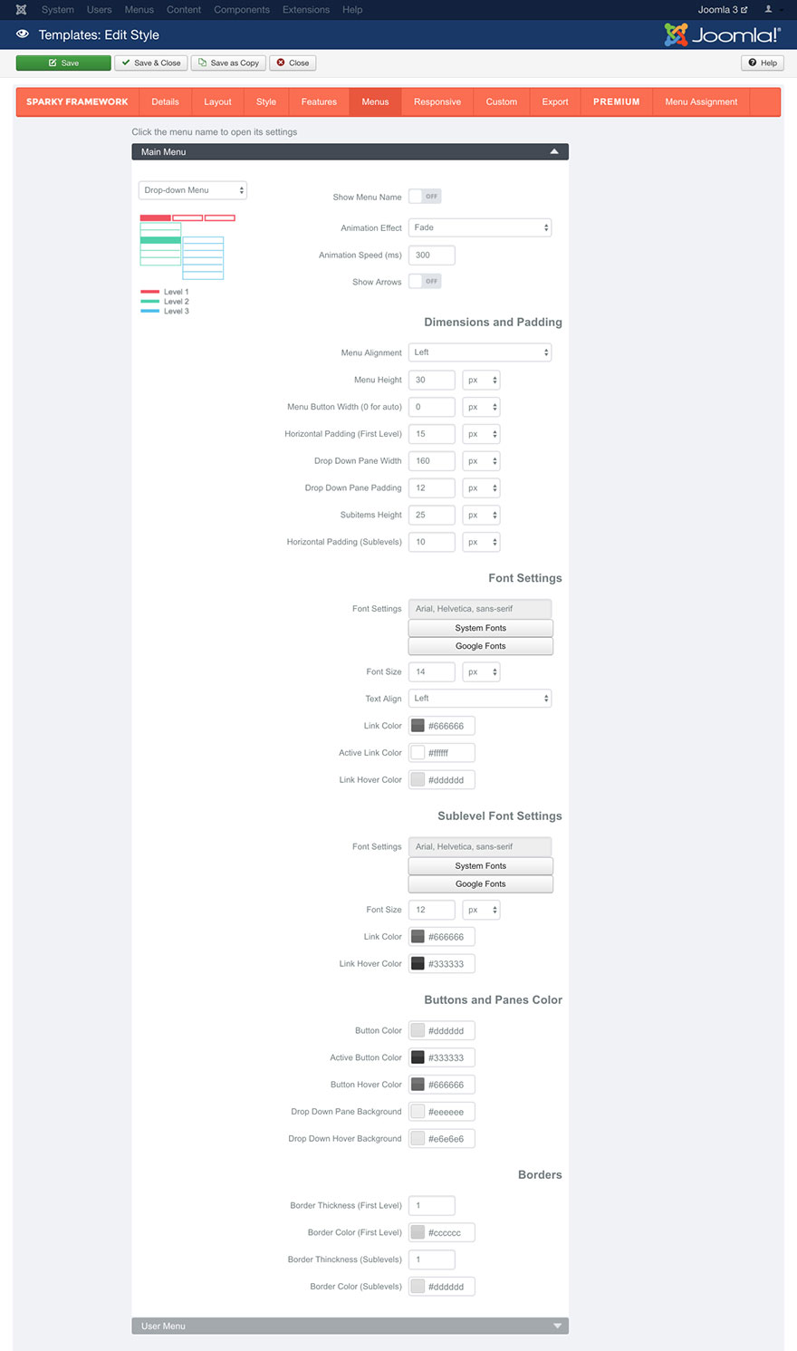
Show Menu Name parameter allows you to include the menu name above the menu items.
Animation Effect parameter allows you to select one of 3 available effects (Fade, Slide or Show) or to disable animation effect by selecting the None option.
Animation Speed parameter defines the duration of the animation in milliseconds.
Show Arrows parameter will show a down direction arrow for all menu items from the top level that have children menu items. It will also show a left (or right for RTL languages) direction arrow for each menu item from the second and deeper levels that have children menu items. The arrow icons are small PNG images arrow_down.png, arrow_left.png and arrow_right.png and they are located in this folder:
/media/templates/site/sparky_framework/images Dimensions and Padding
This set of parameters is dedicated for positioning and dimensioning of the menu items.
Menu Alignment parameter allows you to align the top level menu items by left or right hand side or center them on inside the container.
Menu Height parameter defines the height of the top level menu items.
Menu Button Width parameter allows you to define a fixed width of the top level menu items. If you enter 0 here, the menu items width will be selected automatically for each menu item and the menu items will have variable widths.
Horizontal Padding (first level) parameter allows you to add some horizontal space around each menu item from the top level.
Drop-down Pane Width parameter is related to the children menu items. It defines the width of the pane that’s revealed when the visitor moves the mouse pointer or touch the screen over the menu item that has children's menu items.
Drop-down Pane Padding allows you to add some space around pane that contains children menu items.
Subitems Height parameter defines the height of the menu items from the second and deeper levels.
Horizontal Padding (sublevels) parameter allows you to add some horizontal space around each menu item from the second and deeper levels.
Font Settings and Sublevel Font Settings
Font Settings, Font Size, Text Align, Link color, Active Link Color and Link Hover Color parameters works the same way as those we explained in the Style section. Please read this section for more details.
We will just mention that Active Link Color parameter defines the color of the active (current) menu item. If visitor is on the page that’s linked with a menu item, this menu item will be in active state on this page.
Text Align parameter is related to all menu items from all levels. Note that for the first level menu items this parameter will have effect only if Menu Button Width is defined (not set to 0).
Buttons and Panes Color
This set of parameters defines the background color of the first level menu items as well as the color of panes that contain menu items from the second and deeper levels.
Button Color is the background color of the first level menu items.
If visitor is on the page that’s linked with a menu item, this menu item will be in active state on this page. Active Button Color parameter will be used when this menu item is in active state.
Button Hover Color will be used when visitor moves mouse pointer over the menu item.
Drop-down Pane Background parameter defines the overall background color of the panes that contain children menu items.
Drop-down Hover Background parameter defines the background color of the children menu items when mouse pointer is over a menu item.
Borders
You can set border around your top level menu items. You can also set border for the panes that contain children menu items.
There are two Border Thickness parameters that allow you to define the width of the border of the top-level menu items as well as the width of the border of the panes with children's menu items. Both parameters are in pixels.
There are also two Border Color parameters that allow you to define the color of the border of the top-level menu items as well as the color of the border of the panes with children's menu items.
Sample
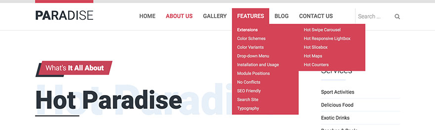
This sample is from Hot Paradise template. This template is available for all premium members.