To activate the Mega Menu type, open the Menus tab, click on your menu and select Mega Menu option from the selector. Many new parameters will become available now.
This type of menu is often used on websites for the main navigation. The first level menu items (parents) are stacked up horizontally. When visitor move mouse pointer or touch screen over the first level menu item that has children menu items, a pane with vertically stacked children menu items in one or multiple rows will be revealed after the selected animation effect.
You can have up to 3 levels of the menu items with this menu type. Note that if you have menu items on deeper levels, they will be ignored.
This menu type is similar to the Drop-down menu, but it allows you to put more complex content in the drop-down panes for menu items that have children. Also, the menu items from the second and the third levels are displayed at once, in the same drop-down pane.
If you have children's menu items from the second level only, it will work similarly to the Drop-down menu. However, if you have menu items from the second level and from the third level, they will be grouped into the horizontal row(s). Each of the containers of this row(s) has a second-level menu item and all belonging third-level menu items are below.
It’s also possible to put Joomla modules in the drop-down panes. You can put a module position instead of the third-level menu items. In this case, you will have a second-level menu item and the module(s) below it. There are 10 module positions in Sparky Framework reserved for the Mega Menu. These module positions are from "megamenu1" to "megamenu10".
It’s possible to set the maximum number of columns in the pane. If the number of the second-level menu items is greater than the maximum number of columns, the remaining second-level menu items (together with their belonging third-level menu items or modules) will be placed in the next row below.
It’s complicated to describe how this menu type works, but we believe it would be much clearer to you when you see some examples.
If you want to use the Mega Menu you should follow the menu structure carefully!
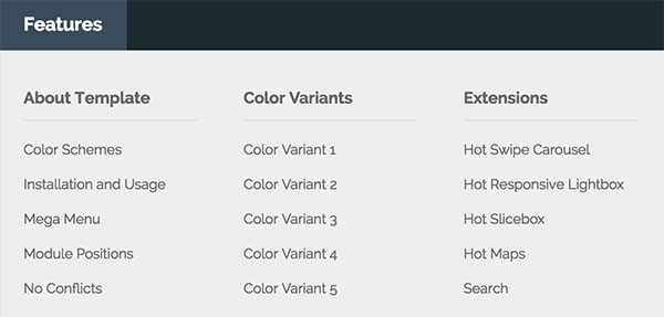
Menu Structure without Modules
This is an example of the Mega Menu without modules. In this example, you have one first-level menu item, 3 second-level menu items and each of them contains 3 third-level menu items.
This is the resulting menu output:
And this is how your menu should be structured in Joomla:
- Features (first level)
- About Template (second level)
- Color Schemes (third level)
- Installation and Usage
- Mega Menu
-
Color Variant
- Color Variant 1
- Color Variant 2
- Color Variant 3
-
Extensions
- Hot Swipe Carousel
- Hot Responsive Lightbox
- Hot Slicebox
Menu Structure with Modules
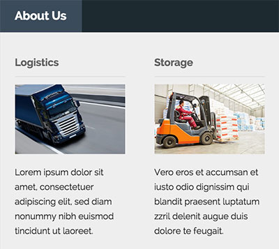
This is an example of Mega Menu with modules. In this example, you have one first-level menu item, 2 second-level menu items. Both of these second-level menu items are parents of the module positions “megamenu1” and “megamenu2” (they are in the third level).
And this is how your menu should be structured in Joomla:
- About Us (first level)
- Logistics (second level)
- Text Separator (third level)
- Storage
- Text Separator
- Logistics (second level)
It’s important to remember that the third level menu items here should be of the “separator” type. You can use whatever you want for the menu item names, it will be disregarded.
If the Sparky Framework finds a text separator menu item in the third level, and if the Mega Menu type is selected for this menu, instead of showing the menu item, it will show a module position. The first match will use the position “megamenu1”, the second match will use the position “megamenu2”, and so on (up to 10 module positions).
When you set this up, you should simply create and publish your modules in these module positions and they will appear in the Mega Menu’s drop-down pane(s).
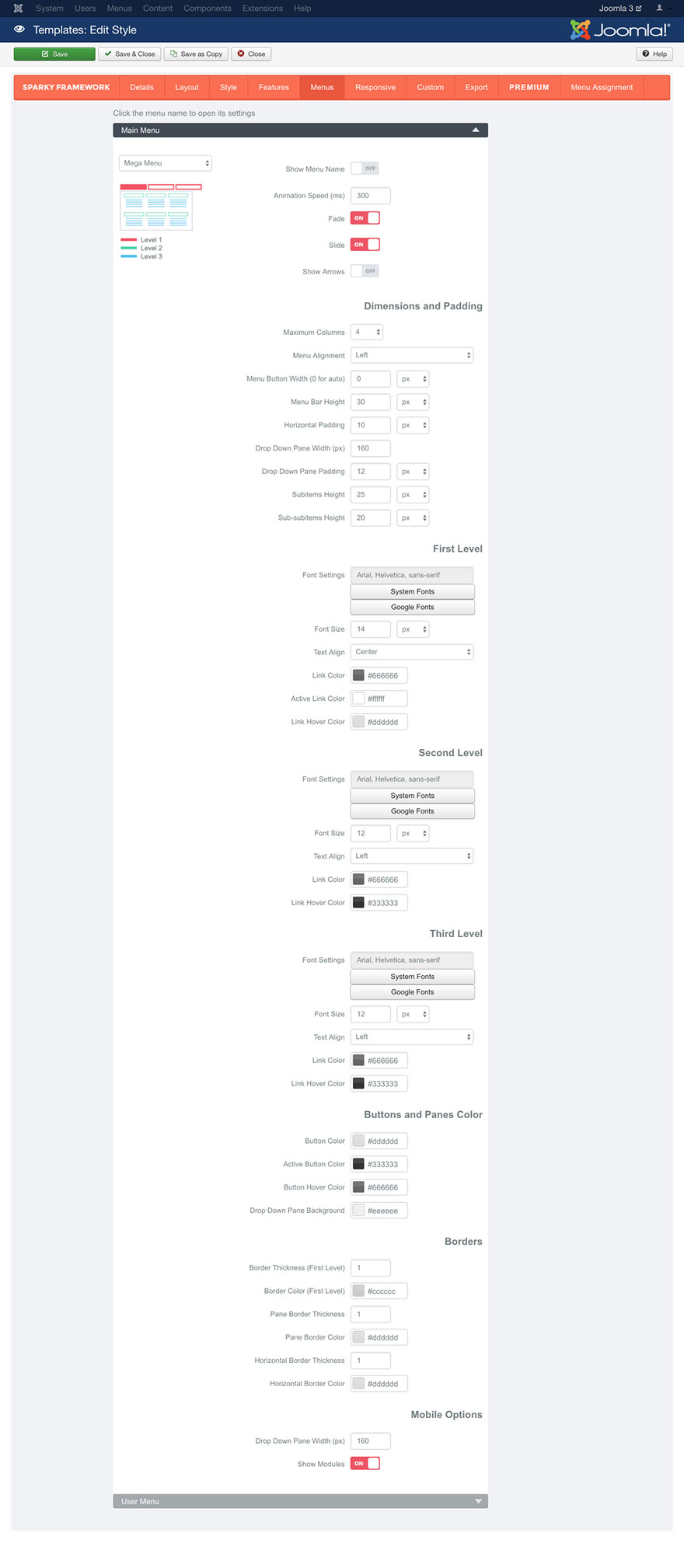
Parameters
This is the most complex menu type in the Sparky Framework, therefore it has many parameters.
Show Menu Name parameter allows you to include the menu name above the menu items.
Animation Speed parameter defines the duration of the animation in milliseconds.
There are 2 animation effects available for this menu type. You can enable either the “Fade” effect or the “Slide” effect. You can also enable both of them to create a combined animation effect. Also, you can disable them both if you don’t need any animation effects.
Show Arrows parameter will show a down direction arrow for all menu items from the top level that have children menu items. The arrow icon is small PNG image arrow_down.png and it’s located in this folder:
/media/templates/site/sparky_framework/images Dimensions and Padding
This set of parameters is dedicated for positioning and dimensioning of the menu items.
Maximum Columns selector allows you to define maximum number of columns in the drop-down pane. If there are more second-level menu items than the maximum number of columns, the remaining second-level menu items (together with their belonging third-level menu items or modules) will be placed in the next row below.
Menu Alignment parameter allows you to align the top level menu items by the left or by the right hand side or center them in the container.
Menu Button Width parameter allows you to define a fixed width of the top level menu items. If you enter 0 here, the menu items width will be selected automatically for each menu item and the menu items will not have the same width.
Menu Bar Height parameter defines the height of the top level menu items.
Horizontal Padding parameter allows you to add some horizontal space around each menu item from the top level.
Drop-down Pane Width parameter is related to the children menu items. It defines the width of the single column in the pane that’s opened when visitor move mouse pointer or touch screen over the menu item that has children menu items.
Drop-down Pane Padding allows you to add some space around the columns that contains children menu items from the second and the third levels.
Subitems Height parameter defines the height of the menu items from the second level.
Sub-subitems Height parameter defines the height of the menu items from the third level.
Font Settings for First, Second and Third Level
Font Settings, Font Size, Text Align, Link Color, Active Link Color and Link Hover Color parameters works the same way as those we explained in the Style section (read this section for more details).
We will just mention that Active Link Color defines the color of the active (current) menu item. If visitor is on the page that’s linked with a menu item, this menu item will be in an active state on this page.
Text Align allows you to align text inside the menu item container. You can select different alignment for different levels of menu items.
Buttons and Panes Color
This set of parameters defines the background color for the first level menu items as well as the color of the pane that contains menu items from the second level and the third level.
Button Color is the background color of the first level menu items.
If visitor is on the page that’s linked with a menu item, this menu item will be in active state on this page. Active Button Color parameter will be used if the menu item is in active state.
Button Hover Color will be used when visitor moves mouse pointer over the first level menu item.
Drop-down Pane Background parameter defines the overall background color of the panes that contain children menu items.
Borders
You can set border around your top level menu items. You can also set border for the panes that contain children menu items.
The parameters Border Thickness (First Level) and Border Color (First Level) define thickness and color of the border for the first level menu items.
The parameters Pane Border Thickness and Pane Border Color define thickness and color of the border for panes that contain children menu items.
The parameters Horizontal Border Thickness and Horizontal Border Color define thickness and color of the horizontal border between the third level menu items.
Mobile Options
The Mega Menu is rendered differently on mobile devices. Regardless of the Maximum Columns parameter, a smaller number of columns for the second and the third level menu items will be used on mobile devices if they can’t fit on the screen. “Drop-down Pane Width” parameter allows you to change the column width on mobile devices. For example, you can set a smaller column width to allow more columns to fit inside the row on mobile devices.
Show Modules parameter allows you disable the modules in the Mega Menu on mobile devices. If your menu is too complex for mobile devices, this parameter can be useful.
Sample
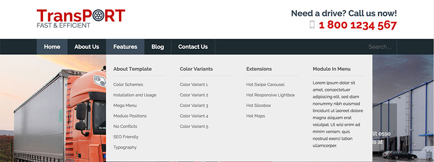
This sample is from Hot Transport template. This template is available for all premium members.
- About Template (second level)