“Retina” screen is a popular name of screens that have double pixel density. For the “normal” screens, one pixel is one dot on screen (the smallest element of the screen). However, for the “retina” screens, each pixel is divided into two pixels horizontally and vertically. Therefore, one pixel on the “normal” screens is equal to 4 pixels on the “retina” screens (2 x 2 = 4).
The “Retina” screens have a clearer display of fonts and all vector graphics.
But, what about bitmap images (jpg, png and gif)? These images will be displayed the same way as on the “normal” screens, unless we provide each image in two resolutions: a higher resolution image for the “retina” screens and a normal resolution image for the “normal” screens.
So, you wanted to make images look better on the “retina” screens and you prepared two versions of your image. But, how to achieve that the normal resolution image shows on the “normal” screens and the higher resolution image shows on the “retina” screens only.
<img> element in the modern HTML got a new property: srcset. This property allows us to attach two or more image files to a <img> container. It also allows us to define the screen density when each of these image files should be used.
HTML code of an <img> element with the srcset property looks like this:

In this example, the size of the image for the “normal” screens is 200 x 200 pixels. However, for the “retina” screens, the size of the image will be 400 x 400 pixels, because they have double pixel density (2x). On the “normal” screens, the browser will load file “myimage.jpg”. However, on the “retina” screens, file “myimage-2x.jpg” will be loaded. “2x” after the image file inside the srcset property tells the browser to load this image on all screens with double screen density.
Of course, we will provide two images, one with resolution of 200 x 200 pixels (myimage.jpg) and another with resolution of 400 x 400 pixels (myimage-2x.jpg).
Note that screens could have different pixel density, in example 1.5x or 4x. However, single (1x) and double (2x) screen densities are the most commonly used.
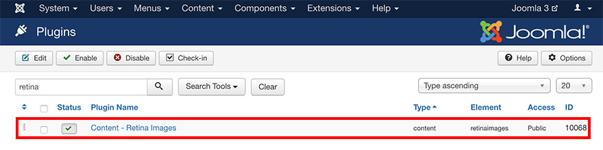
Check if the plugin is installed
To check if this plugin is installed and published, do the following:
- Login to your Joomla Administration panel.
- Go to Extensions > Plugins (Joomla 3.x) or System > Manage > Plugins (Joomla 4.x).
- In the search field enter word “retina”.
- One of the results should be plugin “Content - Retina Images”.
- Make sure that Status of this plugin is published.
The Sparky Framework can work without this plugin. If you think this plugin is not useful to you, feel free to unpublish it.
How to install the plugin if it’s not installed
This plugin is included in the main Sparky Framework package file. If you don’t have this plugin installed, you can extract it from the main package and install it separately:
- Download Sparky Framework from our site.
- Unzip archive “sparky-framework-joomla-vX.X.X.zip” (where X’s are version numbers).
- Inside the “packages” folder, you will see the “retinaimages” folder.
- ZIP the folder “retinaimages".
- Login to your Joomla Administration panel.
- Go to Extensions > Manage > Install (Joomla 3.x) or System > Install > Extensions (Joomla 4.x).
- Select ZIP file you made in the step 4 and click Upload & Install button.
How Retina Images Plugin Works
To reach the plugin’s options page, do the following:
- Login to your Joomla Administration panel.
- Go to Extensions > Plugins (Joomla 3.x) or System > Manage > Plugins (Joomla 4.x).
- In the search field enter word “retina”.
- Click on plugin “Content - Retina Images”.
This plugin has only one parameter: Image name extension. This parameter allows you to set the file name suffix for images of higher resolutions, prepared for the “retina” screens.
The Retina Image plugin will “scan” the content of your Joomla articles and custom HTML modules. If it finds an image element, it will check if the image with the same name plus prefix from the plugin parameters exists in the same folder where the original image is located. If such an image exists, the plugin will add the properly formatted srcset property to the <img> element automatically.
So, the plugin saves you from the additional work. If you provide the higher resolution image that should be used on the “retina” screens in the same folder where your original image is placed, it will be used on the “retina” screens. You just need to follow the naming convention. If you don’t provide the higher resolution image, the same image will be shown on all screen types and the srcset property will not be added to the <img> element.
Sample
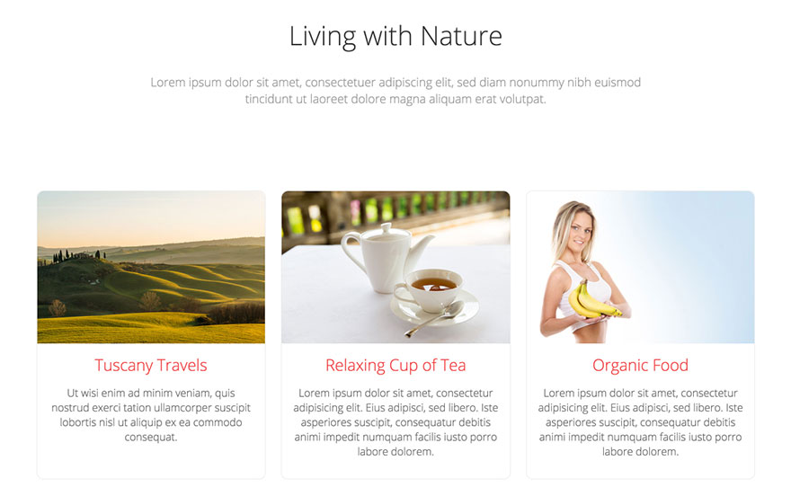
Different images for different screen densities. A sample from the Hot Natura template. This template is available for all premium members.