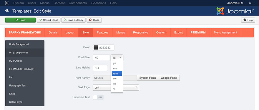
In the Sparky Framework, you can use all CSS units that’s used in the modern web design practices. Each option in the Sparky’s template options page which is dimension type, allow you to select an appropriate unit. Default unit for all dimension type parameters is pixel (px). Feel free to use the units you are comfortable with and these you understand well.
CSS units available in the Sparky Framework are:
- px (pixels): Each dot on your monitor represents one pixel. Simple and easy. This is doubled on the “retina” screens (they have double pixel density).
- em: Relative to the font-size of the element (2em means 2 times the size of the current font size).
- rem: Relative to font-size of the html (root) element (2rem means 2 times the size of the html font size).
- vw: Relative to 1% of the width of the browser window size. If it is 50cm wide, 1vw = 0.5cm.
- vh: Relative to 1% of the height of the browser window size. If it is 30cm wide, 1vw = 0.3cm.
- %: Percents of the parent element. If it is 50%, element will have 50% size of the parent element’s size.