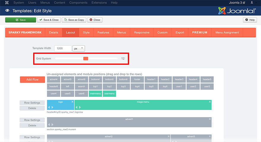
Once we defined the width of the site, we should start defining the inside area. The first step is defining the Grid System. This parameter is a number between 1 and 24 (including these two numbers). To change the value, drag the slider to the left or to the right to decrease or increase the value.
Your site width will be divided into equal columns. The number of the equal columns is defined in this parameter.
Imagine your site inside a net of horizontal and vertical lines. Between any two horizontal lines of the net, we have a row. Site height is not fixed, therefore, we can have as many rows as we need.
But, site width is fixed. Even if we used relative units to define site width, it’s fixed by the window width. So, if we need to use more than one element in a row (in an example, logo and top menu in the first row), we need to split the row somehow.
Basically, the value in Grid System is maximum number of columns we can have in our layout and it’s valid for all rows. You are probably wondering why we have the possibility to use up to 24 columns when an average website has 2 or 3 columns only?
Because all the columns have the same width. To achieve a better flexibility in sizing of our columns, we are using bigger value for the Grid System.
To explain this, let’s allow the use of 2 elements in each row. We can set the Grid System parameter to 2. All rows in our layout now can accept 1 or 2 elements. When your drop and element into the row, it will use 1/2 of the site width. If you want an element to use the full width, drag its right side to the right to increase it’s width.
But, what if we wanted to have 2 elements in a row and the first element should use 1/4 of the site width while the second element should use 3/4 of the site width? It’s not possible with a grid system of 2 columns! We should increase the grid system to 4 columns. Now, drop the elements into the row and increase the width of the second element to use 3/4 of the site width. Even if we are using only two elements in a row, we need a grid system of 4 columns to define the element’s widths more precisely.
Another example. What if we need 3 elements in a row and the first element has a width of 1/6, the second element has a width of 3/6 and the third element has a width of 2/6? How many columns do we need? Of course, we need 6 columns (regardless of the number of elements, which is 3), so we will set the Grid System parameter to 6 in this situation and resize our elements to use 1/6, 3/6 and 2/6 of the site width.
Grid System is defined for your entire layout (for all rows in your layout). You can’t make one row to use, in example, 3 columns and the row below it to use 4 columns. Now, you are probably wondering, what if I need 3 equal elements in the first row (each uses 1/3 of the site width) and 4 equal elements in the second row (each uses 1/4 of the site width)? In this case, you can use 12 columns grid system and then make all elements from the first row to use 4/12 of the site width (1/3 = 4/12) and all elements from the second row to use 3/12 of the site width (1/4 = 3/12).

We hope you understand the idea behind the grid system better now. The most often used grid system has 12 columns, because number 12 can be divided by 2, 3, 4, and 6. It allows you to have elements of 1/12, 2/12 (1/6), 3/12 (1/4), 4/12 (1/3) and 6/12 (1/2) of the site width.
Which grid system you will use depends on the design of your site.
The Sparky Framework gives you the ability to change the grid system later. But, keep in mind, if you are changing the Grid System parameter, your entire layout will be cleared. You will see a confirmation dialog after you change this parameter that warns you about it. If you confirm, all rows and elements you had in the layout will be removed, so you need to re-create rows and drag and drop elements again into the rows.
Always define an optimal grid system for your site before you start making the layout.
Sample
The first row has 3 elements, the second row has 4 elements and the third row has single element. So, let's use the 12 grid system. This is a sample from the Investments template. This template is available for all premium members.
