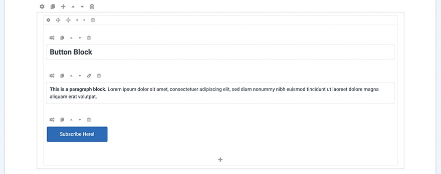
Buttons are often used to navigate visitors to the sections of a website. "Call to action" buttons lead visitors to make an action (subscribe, open a link, buy...). You can use this block to create and style such buttons.
When a new button block is created, a placeholder button with default text will be inserted into the page. You can change it immediately by clicking the Block Settings icon or leave it like that and change it later.
 Button Block Settings
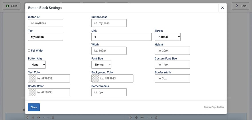
Button ID
Unique identifier of this block. It's useful for CSS or custom coding. If you don't need this, leave this field empty.
Button Class
Class name to this block in order to style it in your template's CSS file. If you don't need this, leave this field empty.
Text
Enter the text that will be on the button here.
Link
Enter the link for your button here. You can leave this empty, but in this case, your button will have only a decorative function.
Target
If you entered a link for your image, in this option you can select whether to open it in the same or new window.
Full Width
The width of the button is defined by the amount of text and padding value. However, if you enable the Full Width option, your button will use the full width of its parent container (column).
Width and Height
Width and height values are not mandatory and by default, the width of the button is defined by the amount of text and padding value. However, by using the Width and Height fields, you can explicitly set the button dimensions.
Button Align
By default, the button container is not aligned. Using this option, you can align it to the left or to the right or make it centered.
Font Size
Select predefined font size for the button (small, normal, medium, large or huge). For example, use large text for the important buttons and small text for buttons that are less important. The default value is normal.
Custom Font Size
ExpliExplicitlyitelly sets the font-size value to the block. You should enter a value and units. For example, valid values are 18px, 1.2em, 1.6rem, 150%, etc.
Text Color
Select a text color for the button using the color picker or by entering the HEX value manually.
Background Color
Select a background color for the button using the color picker or by entering the HEX value manually.
Border Width
If your button should have a border, enter the border-width value here. This value is usually in pixels, so valid values would be 1px, 3px, 5px, etc.
Border Color
If your button should have a border, enter the border color here. Select a color for the border using the color picker or by entering the HEX value manually.
Border Radius
If you need a button with rounded corners, enter a border-radius value here. This value is usually in pixels, so valid values would be 5px, 10px, etc.
Example
Block Operations
To learn how to duplicate, move and delete blocks, visit the Blocks page of the Page Layout section.